The American Express was founded in 1850 in New York, and now it is one of the world’s top joint stock companies. Over its history, it has placed great emphasis on logo design.
What is the symbol of American Express company?
The symbol of American Express is a heraldic image of a Roman gladiator, executed in a turquoise-green and gray color palette, with the portrait enclosed into a vertically oriented oval frame. Even though the primary logo of the company has only white lettering on a blue square, the gladiator portrait can be seen on all cards and checks, issued by the bank.
Meaning and history
Though the history of one of the most famous American banks starts in the middle of the 19th century, its visual identity hasn’t been changed much throughout the years. The logo of American Express has undergone only three redesigns, and the current version of its emblem almost completely repeats the one, created for the bank in 1974.
What is American Express?
American Express is the name of a financial company, which was established in the united states in 1850 and today is engaged in providing payment card services to the population. American Express is considered to be one of the most reputable and valuable brands in the world, being present all over the globe.
1850 – 1890
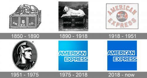
The very first badge for American Express was created in 1850 and stayed with the company for forty years. It was a beautiful logo in black-and-white, with a large chest, featuring an uppercase white “Am. Ex. Co” lettering, being guarded by a graceful black dog, laying on top of the chest, and looking very peaceful and elegant.
1890 – 1918
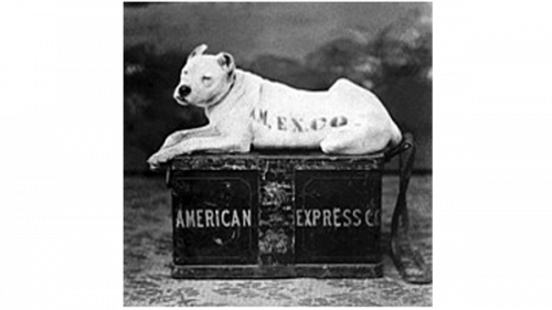
The redesign of 1890 has changed the dog on the American Express logo to a white one. The bulldog was having the black capitalized “Am. Ex. Co” inscription written on its side. As for the black chest, it was also decorated with an inscription, but it was the complete narrowed uppercase American Express Co” wordmark, unlike the previous version of the badge.
1918 – 1951
In 1918 the American Express badge gets another redesign. This time a completely different concept of the logo was introduced by the company. The new badge featured a blue and red globe with white meridians, and a white uppercase “World Service” inscription on it, placed in the center of the logo, between two arched lines of lettering: “American” on top, “Express” at the bottom. The characters of the wordmark were set in red and outlined in white and blue.
1951 – 1975
The first depiction of the current company’s symbol, a Roman Gladiator, was introduced by American Express in 1951. The portrait of the warrior, turned to the right, was set in the vertically oriented ellipsoid medallion, and drawn in black and white with the thin horizontally-stripes texture. It was a powerful and distinctive emblem, which looked strong and professional.
1975 – 2018
In 2006 the logo was refreshed by adding some gradient shades to its blue background. It made the image look dynamic and sleek, adding some motion and volume to the bank’s visual identity.
2018 – Today
In 2018 the famous Pentagram agency redesigned the American Express logo again, keeping the style, introduced in 1974, but refining the contours of the inscription and elevating its blue shade to a more intense one. The letter “C” on the new logo is overlapped by the next “A”, and this little detail makes the logo look different and contemporary. The ends of the letters “S” gained smooth diagonal cuts, which look elegant and stylish. As for the new, darker, shade of blue, it adds more confidence and trustworthiness to the company’s image.
Symbol
The logo’s current minimalistic and robust design was accepted in 1975. It reflects clear and bright future and looks very straightforward and distinguishable.
Shape and colors
The logo is a blue square with the company’s name inside it written in caps. The simple design attracts clients and contributes to the company’s success. There are only two colors: sky blue and white. The letters and banded in white, which makes the name more prominent. Blue emphasizes excellence, high spirits, freedom, and optimism. It is the combination of blue and white that creates a feeling of promising future and inspires clients to make an investment.


