Bank of Baroda, which boasts over 130 million customers, belongs to the Government of India. It was established in 1908. Vijaya and Dena Banks were merged with Bank of Baroda in 2019 to form the country’s third-largest bank.
Meaning and history
The full Bank of Baroda logo contains the name of the company in the country’s two official languages, Hindi and English. It already makes the mark a bit too difficult to grasp. To make matters worse, the emblem itself is already rather detailed. As a result, the full lockup is nowhere near a perfect contemporary logo.
Nevertheless, there is another essential consideration, which has to be weighed up. Heavy and cluttered as it may seem, such a logo does reflect the company’s ambitions reflected in its tagline “India’s International Bank.”
What is Bank of Baroda
Bank of Baroda is the third-largest government-owned bank in India. It has over 8,200 branches. The number of offices abroad exceeds 100. The bank was nationalized in 1969.
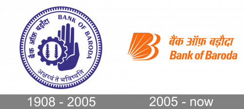
1908 – 2005
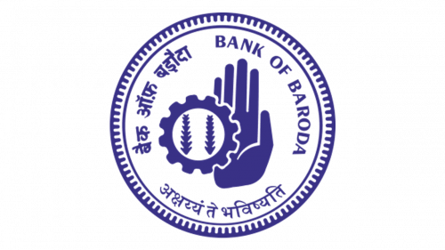
The original logo was a blue round emblem. In its core, they put images of an open palm, a gear and wheat ears inside the gear – to show the bank’s main priorities. Around it, the bank’s name was written in three main languages of the region: English, Gujarati and Hindi (clockwise). All of it was then encircled by two an ornate circle frame.
2005 – Today
Let’s take a closer look at each of the elements.
The emblem, which is nicknamed the Baroda Sun, is a double “B” housing the rising sun. The double “B” is the combination of the initials of the company’s name. The sun has been used to symbolize the company’s desire to become “the source that will help our stakeholders realize their goals.” At least this is how the brand explains it on its corporate website.
This metaphor is based on the interpretation of the sun as “the single most powerful source of light and energy.” The brand mentions that in addition to being a reliable and “one-stop” financial company for its customers, it also strives to provide decent job prospects and offer a maximum return to investors and business partners, pretty much like the sun gives its light and warmth to everything and everyone.
Another aspect of the sun that is symbolic for this particular bank is that its rays spread everywhere. In the same way, the brand is looking to have its networks of branches cross all the possible geographical borders as well as rural-urban differences. The brand also emphasizes that the sun conveys “dynamism and optimism.”
The metaphor is supported by the palette of the Bank of Baroda logo. Orange, along with yellow, has been the color most often associated with the sun.
Composite logo
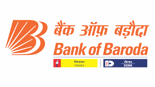
In addition to the double “B” and the name of the bank in two languages, this version also includes smaller logotypes of Vijaya and Dena Banks. While being highly informative, the composite logo is unbelievably cluttered. It works fine when used for corporative purposes, not as a way to attract and retain customers.
Icon
The distinctive “B” makes a great app icon and website icon. While the rays of the sun are almost completely lost at smaller sizes, at least the design remains more or less unique and recognizable. However, this approach wouldn’t have worked for a less-known brand.
Colors and font
The company refers to the shade of orange as vermillion, although this doesn’t seem to be the most precise word possible. Typically, vermillion is described as red with a slight orange undertone, while the Bank of Baroda logo is just orange. Anyway, the pure orange color works even better here as it better represents the sun than the red color does.
The type is traditional enough to work well for a bank. Some of the traditional features are the classic rectangular proportions, the slight variation in the stroke thickness, and the typical shape of the glyphs.
On the other hand, it doesn’t err on the side of being old-fashioned. That’s because the glyphs don’t have serifs and there isn’t a pronounced calligraphic effect.
The italicized letters perfectly fit the tilted “B.”


