

![]() Metal Gear Logo PNG
Metal Gear Logo PNG
The Metal Gear series is undoubtedly among the world’s best-known action-adventure stealth video games. Above all, it is often named a pioneer in stealth video games and the so-called cinematic video games.
Meaning and history
![]()
The first game, designed by Hideo Kojima, appeared in 1987. Konami publishes the games in the series.
1990 – now
![]()
The Metal Gear logo that was introduced during the earliest years was utterly simple – just the name of the brand in heavy, bold capital letters. Apart from their weight, the glyphs had another feature making them slightly different from a “default” typeface – they were oblong.
The writing above was set up in letters so small that they were almost illegible. It read “Tactical Espionage Action.”
1998 – 2000
![]()
For two years, the brand used another wordmark. It could be first seen on the cover of the third game, Metal Gear Solid. It looked more eye-catching due to the red color. What was even more noticeable, the wordmark was more dynamic and memorable. The implied motion resulted from the tilted letters and the horizontal bar below (it directs your gaze horizontally).
The unique touch, in its turn, appeared because of the updated shape of the letters in the Metal Gear logo. For one, many of them had a white horizontal bar going through them. The “G” glyph was specifically spectacular for its unusual angles, while the “M” and “R” stood out because of the stretched ends. These ends, as well as the fact the word started with the “M,” added an uncanny resemblance with the logo of the Metallica band.
Eventually, the company returned to its earlier logo. While it’s not as unique, it’s better legible.
Alternative versions
![]()
As there’ve been quite a few releases within the Metal Gear series, it is only natural that you can come across other versions of the logo.
One of them is executed in blue. The glyphs have soft light blue shades providing some volume. The type is different than in the 1990 or 1998 logos, but the proportions of the glyphs are closer to the former.
Another interesting example of an alternative logo can be found on the cover of Metal Gear Rising: Revengeance (2013). The combination of lighter and darker aqua shades with sharp, angular glyphs creates a fresh icy feel.
Font
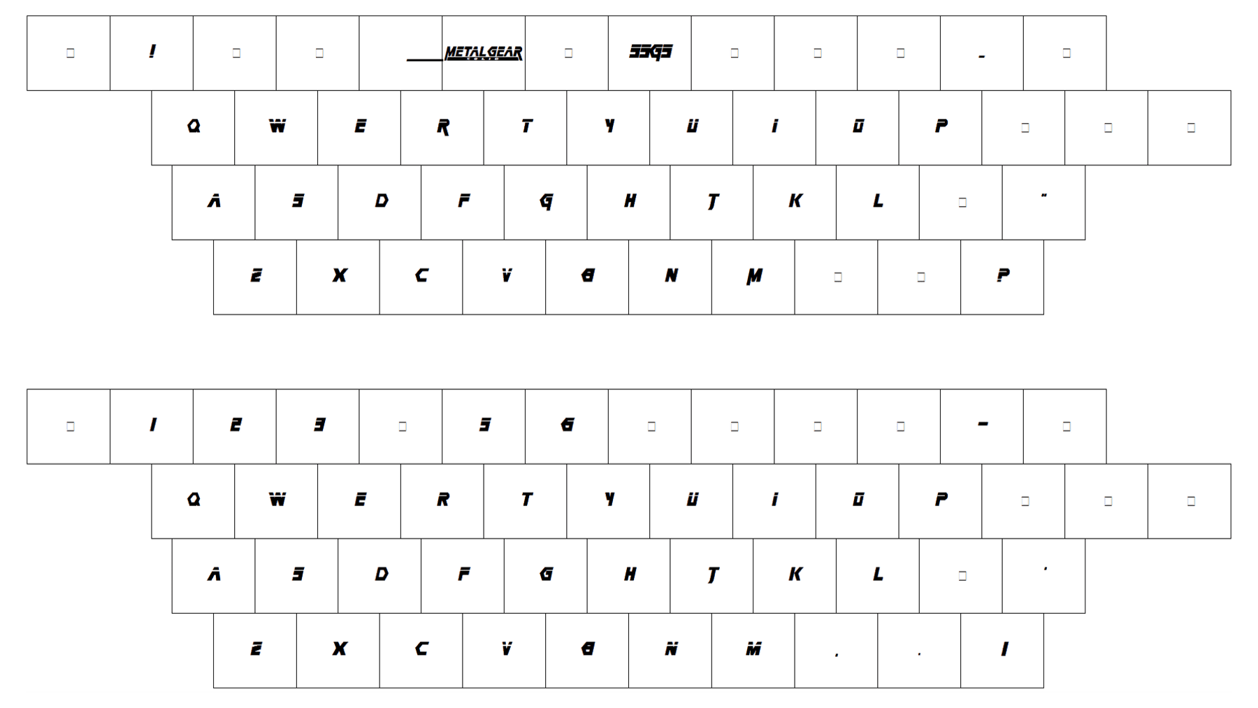
The type on the primary Metal Gear logo isn’t very unique but provides decent legibility. While the company could have opted for something more memorable, they probably decided to stick to the recognizable mark familiar to the fans of the series from various corners of the globe.
Colors
While the default color of the wordmark is black on the white background, the palette can be modified depending on the visual context into which the logo is placed.


