Uno is a shedding-type card game, for which a printed deck is used. Due to its main rules, this American game belongs to the Crazy Eights type of card games.
Meaning and history
Back in 1971, Merle Robbins from Reading, Ohio, invented a game to play with his family and friends. The game turned out to be interesting, and they started spending more and more playing it. Robbins made 5,000 copies and began selling them from his barbershop.
Eventually, he sold the rights to the game to a group of friends. In 1992, the brand became the property of Mattel, a toy manufacturing company founded in 1945.
1971 – Today
The original UNO logo, designed for the famous card game in 1971, is still used by the company. It is a very minimalistic laconic badge in a monochrome color palette, withclean bold uppercase lettering written in a modern sans-serif typeface in black against a plain white background.
1971 – 1992
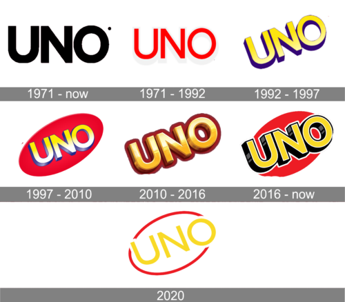
While the Uno logo has gone through at least five modifications, it has always preserved the name of the game as its central element. Also, the name has always been set in an uppercase sans serif type with shades.
On the original logo, the letters were red with white shades. They were placed on a black background. Apparently, the wordmark hadn’t been drawn by a highly professional designer as the shades looked slightly unnatural.
The lettering was oriented horizontally.
1992 – 1997
In 1992 the UNO logo gets a new color palette and style. The lettering is now set diagonally over a solid red background and executed in gradient yellow with a purple shadow. The badge had a lot of light shades, which added some gloss to the whole composition. This version stayed in use for another five years.
1997 – 2010
When Mattel purchased the rights to the game, they developed a new logo for it. The sans serif font of the same style was slightly bolder. The line on which the writing stood was directed upwards. The letters were white and light yellow. The gradient added a 3D effect, which was only reinforced by the trim imitating dimensional glyphs.
The red color from the original wordmark was preserved but this time it was used for the background. The background formed an ellipse directed up, like the lettering.
2010 – 2016
The Uno logo was simplified, which perfectly fitted the main design trends of several recent decades. Now, the name of the game was used without the bright background.
The plainer yellow from the previous logo was replaced by the gold color imitating the precious metal. The letters now seemed to be dimensional and made of gold due to the new shade and the gradient imitating highlights on metal. There were comparatively realistic brownish and reddish shades behind the glyphs.
In addition to the simpler logo described above, there was also a version featuring a red oval in the background. In contrast to the 1992 emblem, the ellipse was oriented higher and had lighter details.
2016 – Today
The brand owners decided to return the heritage red oval on the main logo. This time, though, they made it smaller – the glyphs of the name of the game go beyond its borders.
The rich gold color has been replaced by plain yellow. Even the gradient has disappeared. Yet, the letters don’t look flat. This is because of the black “sides” and white trim going around the glyphs.
The primary logo features only the wordmark and the red oval. There is also an alternative version including five playing cards in the background.
2020
In 2020 UNOintroduced a new version of the logo, which was used by the brand for just a few months. It was a diagonally-oriented yellow sans-serif lettering written against a solid black background and enclosed into a medium-thick red oval, which was overlapped by the “U” on the left, and by the “O” on the right. This badge was quite dark and didn’t evoke that sense of fun and joy, the game tends to give to its players.
Colors
Over its 50-year history, the Uno logo has preserved red as one of its main colors (although it was only a subtle hint in the 2010 version). The yellow, in one shade or another, has been present since 1992.
Font
The classic sans serif type provides excellent legibility. In the earliest version, it is lighter than on the following ones.


