Mercure is a brand of 3 and 4 star hotels, founded by Paul Dibrule and Gerard Pelisson in 1967. Mercure has more than 790 hotel in 63 countries and has been a part of the Accor Group since 1975 (former name – Société d’Investissement te d’Exploitation).
Meaning and history
Accor Hotels is one of the most mobile and progressive hotel operators, the owner of 50 brands, of which 33 are hotel brands. Under the brand Mercure, which is positioned as a brand of the middle segment, it already operates almost 900 hotels in 64 countries around the world, plus several dozen hotels are currently under construction and will be commissioned shortly.
The brand was established in France with its first hotel opened in 1973, and already two years later, in 1975, the label was acquired by Accor. Today Mercure is a chain of creative design hotels, popular with businessmen and tourists, aimed at solvent adults aged 25+.
What is Mercure?
Mercure is the name of a medium-sized 3 to 4-star hotel chain managed by its parent company AccorHotels, a French multinational corporation. TheMercure brand was established in France at the end of the 1960s, and today has almost 900 hotels in more than 60 contours across the globe.
1973 – 1997
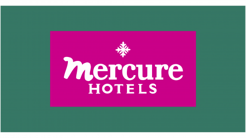
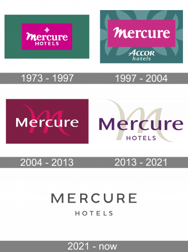
The base of this logo is a pink rectangle placed inside a bigger, dark-green one. All the imagery was placed inside the former, including the ‘Mercure Hotels’ inscription and a snowflake symbol above it. The lettering used a soft, bold serif style, except for the letter ‘M’ – it sported a different, paint-like look as if made by hand.
1997 – 2004
For the 1997 design, they shortened the lower bit of the pink figure to accommodate a big ‘Accor Hotels’ (their owner) wordmark in blue. In terms of additions, there was also a paler flowery ornament throughout the outer green figure. Inside the pink bit, they sanded down most edges and serif in the lettering and made the font much rounder.
2004 – 2013

The 2004-introduced background was instead dark purple with a big pink ‘M’ on it. This one used a similar look as the ‘M’ from the previous design, but thinner, sharper and more elegant. The wordmark itself turned into a more solemn sans-serif writing with basic forms. It was carried unchanged into the next evolution.
2013 – 2021
The most recognizable part of the Mercure logo is it’s color palette. The Mercure Hotels Logo scheme has 2 colors which are rich purple (Palatinate Purple #602460) and grey-beige (Timberwolf #DFDBCF).
The modern style wordmark is usually executed in palatinate purple and located on the beige M background. The M, the brand’s emblem, is very elegant yet contemporary.
The Mercure logo has simple yet sophisticated design, with the main accent on its color, it reflects the brand of Mercure Hotels perfectly. The brand’s slogan “In harmony with people and places” describes its values as well as its approach to design and visual identity.
2021 – Today
The Mercure logo, designed in 2021, differs from the previous versions, being the most minimalistic and laconic of all. It is based ontwo-leveled lettering with the top line set in bold stable capitals, and the bottom — in the same font and gray color, but in smaller size and thinner lines. The composition is set against a plain white background without any graphical additions. Simple, confident, and professional, this badge shows the chain as a progressive and growing one.
Font and color
The bold uppercase lettering from the primary Mercure badge is set in a modern geometric sans-serif font with the distinctive contours of the characters and clean straight cuts of the lines. The closest fonts to the one, used in this insignia, are, probably, Gravesend Sans Medium, or Clean Deci JNL Regular, but with the contours of some letters modified.
As for the color palette of the Mercure visual identity, after the redesign of 2021, it has been minimized to dark gray and white. The pink and purple shades have been completely removed from the concept, and now the badge looks very strict and clean, evoking a sense of professionalism and confidence.


