Food Lion is an American brand of a grocery retail company, which was founded in 1957 and today has more than 1 thousand locations across the USA. The company’s original name was Food Town but it has to be changed in 1983, as the shops with this name already existed.
Meaning and history

Food Lion was founded by Wilson Smith, and Ralph and Brown Ketner in 1957 under the name Food Town. The first store of the company was opened in 1957 in North Carolina and offered a range of grocery products. Until its acquisition by the European Delhaize Group in 1974, Food Town stayed privately owned.
The name of the chain stayed changed for more than two decades, although by that time there were already hundreds of locations across the state. The Food Lion officially appeared only in 1983, with new energy and confident expansion plans.
Today the company owns more than 1100 stores across ten states: North and South Carolina, Virginia and West Virginia, Delaware, Maryland, Pennsylvania, Kentucky, Tennessee, and Georgia.
As for the visual identity, the company has been very loyal to the design, created for it in 1983, and its mascot, George the Food Lion, was introduced with the logo. The badge, based on a heraldic-styled lion and the uppercase lettering has barely changed since then, although the original insignia, used by the company from 1957 to 1983 was completely different.
What is Food Lion?
Food Lion is an American chain of grocery stores, which was established at the end of the 1950 and by today has grown into a huge company with over a thousand locations across ten states of the USA.
1957 – 1983
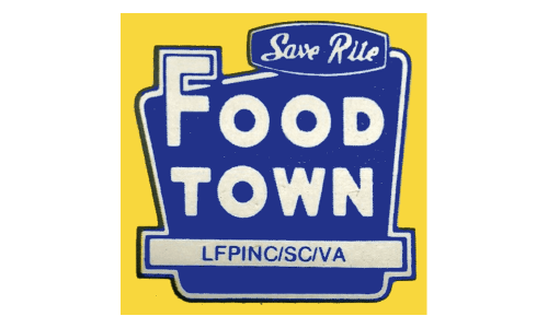
The very first logo for the company, known today as the Food Lion, was designed in 1957 when the name of the brand was Food Town. It was a bright square badge in yellow and blue, with the solid blue trapezoid outlined in white, placed on a yellow background. The name of the chain was set in bold white capitals of a simple sans-serif typeface, mostly on the blue part of the badge, but with the “F” slightly coming out to the yellow one.
1983 – 2007
The brand changed its naming from Food Town to Food Lion in 1983, after finding out another retail-chain had the same name. The new idea came from the Belgium Delhaize Group, which bought the company in the 1970s.
Since 1983 the company had a strong and sharp lion image as its emblem, however, after the redesign of 2014, the logo became even more confident and powerful.
2007 – 2014
The redesign of 2007 has changed the color palette of the logo and drew the company’s mascot, George the Food Lion, in a calm and light shade of blue on a white background. The outline of the softened square and the bold uppercase logotype was set in the same shade of blue, with the contours not being changed.
2014 – Today
Located above the blue all-caps wordmark in a simple sans-serif typeface, the emblem is colored black and has straight bold lines. The lion faces left and its tail is strictly curved, pointing right.
It is a symbol of strength and courage, as well as the power and stability of the company. With a black and blue color palette, the brand looks confident and progressive, ready to face its future.


