Menards is an American chain of home improvement stores found in the Midwestern United States. It has over 340 stores in 15 states.
Meaning and history
The company’s origins can be traced back to 1959 when John Menard Jr. started building post-frame buildings to make money for his college tuition. He founded the company in 1960 but it was only two years later that he purchased land and built an office and shop.
What is Menards?
Menards is an American home improvement store chain, which was established in 1962 and today has 335 stores in 15 U.S. states. The chain is the third largest distributor of home-improvement goods in the country after such giants as Home Depot and Lowe’s. The main goods offered in Menards are lumber, hardware, and paints.
1960
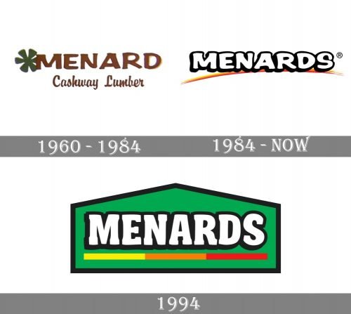
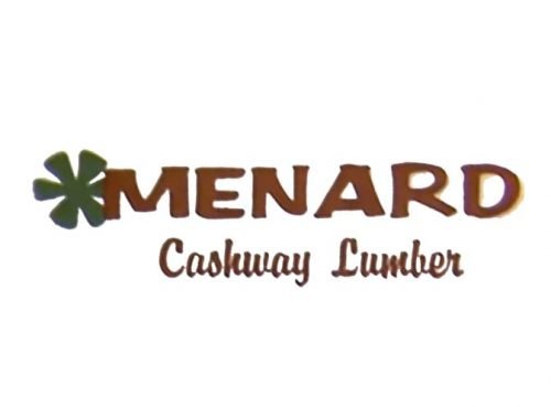
The original name of the brand was Menard Cashway Lumber, which was reflected in the logo. The word “Menard” was larger and featured an elegant and rather bold serif type. The lettering “Cashway Lumber” below was set in a handwritten script.
Half-hidden behind the “M,” there was a green flower (asterisk).
Both below and above the lettering, there were three stripes (dark orange, orange, and yellow) adding a vivid and eye-catching touch.
Since 1984
This is when the wordmark we can see on the store’s exterior now was introduced. It grew simpler and reflected the new name.
The typeface used for the word “Menards” looked very similar to the original one, although they weren’t the same. The letters grew bolder and looked slightly friendlier. They were now white with black borders and subtle black shades adding some dimension to the otherwise flat design. The gaps inside the letters were filled with black, which improved the legibility.
What made the design more unique was a vivid stroke below the wordmark. The colors – yellow and orange – were inspired by the palette of the original logo. They added a youthful, optimistic impression.
Although the green asterisk has disappeared from the main logo, it has given its color to the stores’ exterior.
We should add that some of the stores still feature an older exterior where the wordmark is red and is set in a lighter type. There is no orange stroke there.
1994
While in 1994 the company introduced a new logo, it didn’t become the official and widely used version.
Here, the type was straightened and lost the creative casualness and friendliness of its predecessor. Instead of the artistic stroke, a straight line in yellow, orange, and red was used. The wordmark was placed inside a green house with simple black trim. The house theme created a link with the type of products you could buy in the store.
Colors
The three main colors present on the original emblem are still used in the brand’s visual identity. The hues have been altered, though. Also, white is in a more prominent position now.
Font
The type on the Menards logo looks unique without sacrificing legibility. Also, it has a creative touch that could attract customers who are working on home improvement.


