Aaron’s is an American company, which specializes in the retail of home appliances and furniture. The company was established in 1955 Georgia and today operates all over the United States and Canada, having a yearly revenue of about 4 billion USD.
Meaning and history
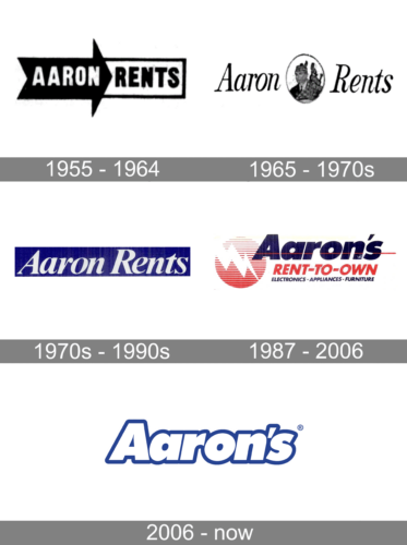
1955 – 1964
The original logo looked more like a sign than a brand image. Nonetheless, it was successfully used for over ten years thanks to its clear and minimalistic appearance. The logo was a combination of a black arrow sign pointing to the right and a white rectangle with a black outline. The arrow held the word “Aaron” printed in a white, sans-serif font, while the “Rents” portion was placed on a rectangle and done in black.
1965 – 1970s
With an update, the logo acquired a more sophisticated thanks to an italicized, cursive style font. The emblem was still done in black and white, but this time, there was no background. The name was split by an oval medallion holding an image of a man. It made the company appear like a well-recognized brand rather, than another renting startup.
1970s – 1990s
The new brand image created an impression of a solid and trustworthy company thanks to a deep blue background in the form of a rectangle. The inscription was done in contrasting white and featured a font similar in style to the previous one only bolder. There were no other elements, which made it look serious.
1987 – 2006
In 1987, the company introduced a bold and busy, compared to other versions, logo. The word “Aaron’s” was printed in large, bold letters of a dark blue color. It was crossed by a thin red line for an additional daring touch. The red was also used for the second line, which described a new service “Rent-to-Own”. There was an additional line that said “Electronics – Appliances – Furniture”. The logo was completed by a striped red circle with a white lightning bolt striking across it.
2006 – Today
The Aaron’s visual identity concept is built on the principles of simplicity, friendliness, and reliability. The logo of the retailer is composed of a single wordmark with a tagline and an icon, which is usually used on its own.
The blue and white color palette of Aaron’s is a reflection of loyalty, professionalism, and responsibility of the company. The calm and light shade of blue, chosen by the brand, represents confidence and expertise, and also points to the main company’s value — its’ customers and their happiness.
The logotype of the brand is written in an ExtraBold modern sans-serif typeface, in a title case. The font of the italicized inscription in very similar to the popular Futura Pro Extra Bold Oblique.
As for the tagline, “Easy. Beautiful. Affordable.”, it uses a different style of lettering, and is executed in a thinner and stricter Vito Black font.
The Aaron’s icon, which is used for the websites and mobile applications, is a simple letter “A” inside a blue square. The white letter is written in the same Futura font, which is used for the main logotype.
The logo of the American retailer is simple and calm, yet it is very well balanced and contains all the necessary information about the company, its character, approach, and purpose.


