In its early years, the company used a simple black wordmark logo “Tesco Stores LTD” featuring a plain all-cap font. As the supermarket chain was growing, it went through a succession of typographic logotypes. Starting from 1970, red has been the dominating color of the Tesco logo. The current version of the emblem introduced in 1995 sports a bright red wordmark with a blue horizontal bar placed under each letter.
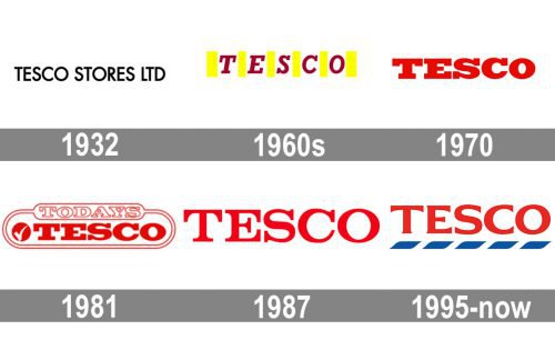
Except for the very first version, the Tesco logotype has always been written in red, a color of power, passion, and confidence. The famous British supermarket chain has been pretty laconic in everything related to its visual identity, making the brightness and lack of details their signifier.
What is Tesco?
Tesco is one of the largest grocery supermarket chains in the world, founded in Great Britain in 1924. Today the company has almost five-thousand locations all over the UK and some European countries, offering its customers a variety of goods including groceries, beverages, pet supplies, and small homeware goods.
1932 – 1949
As the very first logo, Tesco used a simple sans-serif “Tesco Stores LTD” in all capitals, written in black. The clean and neat lines of the letters and a lot of space inside and between the symbols made the logo look confident and modern, yet not overloaded and heavy.
The 1960s – 1970
In the 1960s the Tesco logo was redrawn in a vivid and delightful red and yellow color palette, where the red italicized letters in a bold serif typeface were separated from each other by thick vertical yellow lines. The new color palette of the brand represented energy, power, and happiness.
1970 – 1995
In 1979 the yellow details were removed from the Tesco visual identity, keeping the red logotype as the only element of the visual identity. The new wordmark was written in all capitals of an extended and bold serif typeface with thick smooth lines complemented by massive square serifs.
In 1981 the logotype got enclosed in a double red frame with rounded angles and the “Today’s” inscription in an outlined font placed above it.
1987 – 1995
The logo was redrawn again in 1987, by refining the lines of the letters and making the serifs lighter and sharper. The new inscription looks stylish and laconic and evokes a sense of elegance, timelessness, and power.
1995 – Today
The redesign of 1995 switched the typeface of the red logotype to a modern sans-serif, with the lines of the letters slightly extending to their ends, and their edges cut straight. The new wordmark is underlined by a blue and white bar, with the thin diagonal white elements “cutting” the blue.
Font and color
The modern dusting typeface of the Tesco visual identity looks close to such fonts as Arpona Semi Bold and Aviano Flare Black, but with some lines modified. It looks sleek and trendy, showing the fundamental approach of the company to everything, including design and style.
The red, blue, and white color palette of the Tesco logo is not only a celebration of the national flag of the United Kingdom, which represents the roots and history of the company, but also a reflection of the power, reliability, and expertise of the brand, Alf with its willingness to provide the customers with only the best products.


