Co-op is the name of a British retail company, which was established in 1863 and is based in Manchester. The Co-operative Group has several business directions, including wholesale, legal services, and even funeral care, but the most famous division is the Co-op Food.
Meaning and history
Co-op is not a regular retailer, but a business, owned by the people working for it. The system’s roots trace back to the middle of the 19th century when the Co-op Group was created as a result of a merger between several wholesale and retail societies. And for the first part of its history, the Co-operative Group was mostly engaged in wholesale processes.
In time, the range of Co-op activities has expanded, and today the company offers a variety of services, including legal, educational, and funeral. Although the retail and wholesale still make up the largest part of Co-op, especially in the food and pharmacy segments.
Today Co-op has almost 3 thousand Food retail locations across the country, and has an 85% share in all the co-operative food retail businesses in the UK, being the 7th largest retail company in this segment.
What is Co-op?
Co-op is a shortened name of the British Co-operative Group, a company, focused on retail and wholesale, and owned by its members. Co-op was established in the middle of the 19th century, and today has more than 7 thousand locations across the country.
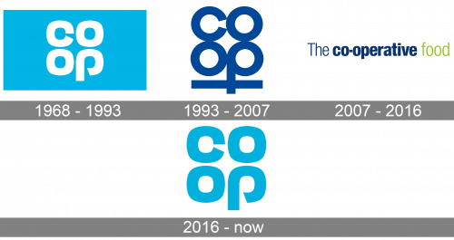
In terms of visual identity, the British Co-operative Group has held several redesigns of its logo during the second half of the 20th century and the first two decades of the 21st. Although today the company has returned to the logo, designed for it in the 1960s, with just slight modifications.
1968 – 1993
The logo, created for Co-op in 1968, featured a very progressive for its times design, and a bright and vivid color palette. It was a square badge in a solid sky-blue color, with the “Co-op’ lettering set in two levels without any “-“ sign. The characters were set in white and written in an extra-bold sans-serif typeface with diagonal cuts of the consonants, and the contour of the “P’ open at the bottom of the loop.
1993 – 2007
The redesign of 1993 kept the disposition of the letters, but changed the style and color of the badge, and added a long and thick underline to the logo. The new badge featured a dark blue inscription on a transparent background, with the “Co-op” lettering in a more traditional sans-serif font, with circular contours of the letters. The tail of the letter “P” was crossing the blue underline, which featured the same color and thickness of the lines, as the bars of the letters.
2007 – 2016
In 2007 the Co-op logo was redesigned again, and this time it was a completely different concept. The new badge featured “The co-operative” inscription in the title case, with “The” set in thin lines, and the “co-operative” — in extra-bold. Although, both parts of the wordmark were executed in one sans-serif typeface and one dark blue color. The name of the group’s activity was added to the right of the logotype in delicate sans-serif, using a bright lime-green color.
2016 – Today
The redesign of 2016 has brought back the Co-op badge, designed in 1968, keeping the cool and recognizable contours of the letters untouched, but switching the colors, so now the inscription is set in sky-blue and placed on a plain white background. The logo looks fresh and friendly, evoking a sense of trustworthiness and reliability, and brilliantly representing the Group’s unusual approach to business.
Font and color
The custom lowercase lettering from the primary Co-op logo is executed in a heavy sans-serif typeface with some interesting elements, such as the diagonal cuts of the bars, slanting from the center of the letters, and an open contour of the “P”. The closest font to the one, used in this insignia, is, probably, Versus Ultra, but with some contours modified.
As for the color palette of the Co-op visual identity, it is based on a pleasant and delightful sky-blue, which is usually accompanied by a clean white background. This combination evokes friendly and kind feelings, showing the customer as the center of the company’s system of interests.


