Marks & Spencer is a popular brand of a fashion, household and interior accessories retailer, established in the U.K. Opened in 1884 by Michael Marks and Thomas Spencer, it became one of the pioneering premium brands in the U.K.
Meaning and history
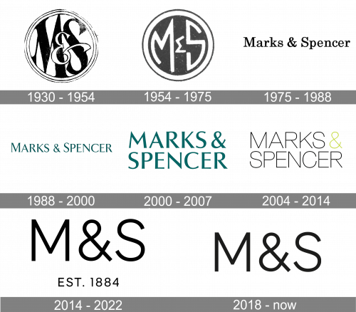
Marks & Spencer is a very significant name in the retail industry. It has a rich history and it’s logo held several redesigns, every change was reflecting the progress of the brand and its movement. The Marks & Spencer logo is a great example of how the company reacts on the preferences and changes of its audience.
What is Marks & Spencer?
Marks & Spencer is a British brand of fashion garments, accessories, and household appliances, which has been on the market since the end of the 19th century. Today the chain has its stores in several countries across the globe and is one of the popular destinations for all-day shopping.
1930 — 1954
The first Marks & Spencer logo was a round emblem with “M & C” monogram inside. The classic lettering in monochrome looks far from the logo we know now, but was quite a bright example for its time.
1954 — 1975
The redesigned logo keeps the shape and sense of the previous one, but the typeface is more geometric now, reminding of the Greek alphabet. The emblem is still composed of the brand’s monogram enclosed in a round-shape frame.
1975 — 1988
The first time, when the full wordmark appeared on the Marks & Spencer logo was in the 1970s. It was executed in a classic serif font, featuring monochrome palette.
1988 — 2000
The wordmark is colored sea-blue now, and the typeface is more confident, with bigger letters and stronger lines. The new color of the logo evokes a sense of calmness and reliability.
2000 — 2007
In 2000 the brand started writing its name in all-caps, the deep-sea color remained. The wordmark looks more eye-catching and powerful now. During this time period the brand creates a new brand identity, with finer letters and new colors, but it starts being used officially only in 2007.
2007 — 2014
The wordmark in a simple sans-serif typeface featuring two colors: black and lime-green. It looks more energetic now, with a youthful spirit. The new logo is a reflection of brand’s creativity and progress.
2014 — 2022

The current Marks & Spencer’s logo is more traditional, than the previous one. It is composed of the brand’s initials, executed in black on a white background, with an additional tagline “EST. 1884”, which shows the brand’s heritage.
The typeface of the wordmark is simple and strict, with bold letter lines. The logo looks light due to enough space left between the letters.
2018 – Today
The redesign of 2018 has simplified the concept of the logo, introduced in 2014, keeping it monochromatic and laconic, and removing the datemark from the bottom of the badge. The new logo, used by the British brand is composed of just the “M & S” abbreviation in a clean leading-weight sans-serif typeface, executed in solid black against a white background.
Font and color
The distinctive uppercase lettering from the primary badge of Marks & Spencer is set in a clean and modern sans-serif typeface with the characters featuring straight lines and cuts of the bars. The closest fonts to the one, used in this insignia, are, probably, Andres Neue Alt 3 Light and Ageo Regular.
As for the color palette of the Marks & Spencer visual identity, it is set in a monochromatic combination of black and white, a timeless scheme, which is always actual, elegant, and powerful.


