

![]() Lowe’s Logo PNG
Lowe’s Logo PNG
The official name of the American retail chain working under the Lowe’s brand is Lowe’s Companies, Inc. As of 2019, the chain includes over 2,000 home improvement and hardware stores located in the United States and Canada. The headquarters are located in Mooresville, North Carolina.
Meaning and history
![]()
Lowe’s Companies is an American home improvement retail chain, which also has branches in Canada and Mexico. Lowe’s main competitors on the global market are The Home Depot, B&Q, and OBI.
The company was established in the USA at the beginning of the 1920s by Lucie Lowe. After the death of the founder, the colony was inherited by his family, and in 1946, it was decided, that Lowe’s stores will be exclusively specializing inhome improvement products.
The company’s growth started in 1961 when it decided to go public. By that time 21 Lowe’s warehouses have already been opened across the country.
Lowe’s business model isn’t new, but it’s effective. Under the roof of one store, a variety of brands offer the customer all types of household items, including tools, lumber, doors, windows, sinks, toilets, etc. Lowe’s also offers such services as delivery, installation, service, and repair.
What is Lowe’s?
Lowe’s is the name of a large American retail chain of household items, which was established in 1921 in North Carolina. Today it is the main competitor to the famous Home Depot chain, with almost 2,4 thousand locations across the United States, Canada, and Mexico.
1921 – 1955
![]()
The badge showcased a solitary straight-line level lettering. The letterforms were composed of capitalized glyphs with strong, forceful characteristics that demonstrated the network’s aspirations to supersede rivals, assert uniqueness and flaunt the range of products. The typeface was sans-serif in style.
1955
![]()
The brand logo served as a concise means of conveying vital information to customers while also making a lasting impression to ensure easy recognition among competing stores. The essential data was neatly displayed on a rectangular field elongated horizontally, featuring geometric glyphs with a broad break.
The font choice was minimalist, with sharp edges and capitalized letters. The black and white color scheme ensured maximum clarity and distinction for the symbol.
1955
![]()
The Lowe’s stores underwent a significant transformation of their logo, resulting in a highly distinctive emblem. It featured a large, bold title, encircled by a ribbon displaying various inscriptions. The letterforms were highly stylized, with unique details added to each.
For example, the letter ‘E’ was modified with diagonal cuts at the ends, while the bottom fragment of the ‘L’ also featured the same diagonal cut. The glyphs were very bold, contributing to the overall impact and readability of the design.
1955 – 1956
![]()
The typographical weight of the letters in the Lowe’s store name remained prominent in the updated emblem, but the arrangement of the inscriptions underwent a transformation. The designers repositioned the words to cluster ‘Lowe’s’ at the bottom and stack them vertically. Additionally, a broad line with rounded ends was added underneath to underscore the name.
1956 – 1957
![]()
Following the reinvention, Lowe’s logo underwent further changes. The new version featured even larger proportions, with the name taking up the entirety of the black rectangle background. The previously diagonal ends of the letters were now removed, resulting in a smooth and uniform appearance.
1957 – 1958
![]()
The emblem went through a metamorphosis, resulting in a singular alteration to Lowe’s stores’ insignia. The previous brand’s title was replaced with a ribbon adorned with assorted inscriptions encircling a larger inscription. The typography underwent considerable enhancements, with letters being granted a sense of originality.
Diagonal cuts were added to the ends of the letter ‘E,’ also manifesting themselves on the lower half of the ‘L.’ The font was notably bold.
1958 – 1962
![]()
The network’s stores’ title retained its boldness, although a significant change in the placement of inscriptions occurred. The inscriptions were repositioned, with the word ‘Lowe’s’ being vertically stacked and underlined with a thick line featuring oval terminations.
1962 – 1965
![]()
A pair of lengthy stripes intersecting the rectangle horizontally were integrated into the emblem. The stripes served as borders, positioned at the top and bottom of the ‘Lowe’s’ wordmark. The font’s height was marginally decreased, lending it a slightly compressed appearance.
The designers opted for a 3D rendering of the title, endowing it with a voluminous look. The glyphs resembled geometric shapes, with the font’s front part painted black and the rest white.
The ‘L’ letter was more prominent than the rest, although all letters remained in uppercase. The left side of the title’s background was a depiction of the globe, underscoring the stores’ worldwide reach. The continents were depicted in gray.
1965 – 1969
![]()
Unlike its predecessor, the latest insignia consisted solely of contour letters. Each letter was outlined with a black border, lending it a strict appearance. The corners of the letters were curved, with the ‘w’ appearing as an inverted “m.” The apostrophe was vertical, rectilinear, and formed like a rectangle.
1969 – 1970
![]()
The 1969 rendition of the emblem featured slim lettering with a robust edge, creating an illusion of a smaller, more delicate typeface. A rectangular apostrophe, resembling a square, was slightly shortened.
1970 – 1997
![]()
The new color palette was adopted for the Lowe’s visual identity in 1965. The logotype was set in the uppercase of a fancy custom sans-serif typeface, with the smooth thick lines of the letters, and the first “L” enlarged. The new color palette of the logo was based on a dark yet calm shade of blue, the color, which reflects such senses as reliability, trustworthiness, and professionalism.
1997 – 2008
![]() In 1997, the company introduced a four-color logo based on a house emblem. Here, the dark blue house, which can be seen on the current emblem, had a bright red and grey outlines. While the four-color version was a primary one, you could also come across a version where grey and red weren’t used.
In 1997, the company introduced a four-color logo based on a house emblem. Here, the dark blue house, which can be seen on the current emblem, had a bright red and grey outlines. While the four-color version was a primary one, you could also come across a version where grey and red weren’t used.
2008 – Today
![]()
Another important difference from the current Lowe’s logo was the text “Home Improvement Warehouse,” which could be seen right under the name of the brand, within the house emblem. Sometimes, one more tagline was added, “Improving Home Improvement.” The tagline was given in black and placed below the house.
Primary symbol
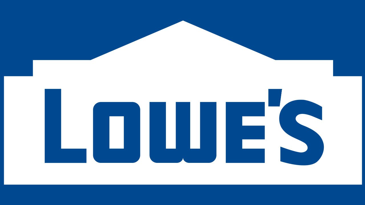
The basic shape of the logo, a house, gives a hint as to what specialization the company has. Inside the dark blue building, the lettering “Lowe’s” can be seen. With a stretch, the glyphs can be interpreted as windows.
Emblem versions
While the house emblem can be used as a standalone logo, the brand also has an extended version. Here, the house is accompanied by the text “Never stop improving,” which is placed either under the main emblem (horizontal logo) or below it (vertical logo). Whatever the position, the tagline is given in light blue, which creates a soft contrast with the dark blue of the main emblem.
Font
![]()
While the company’s brand guidelines name Avenir the main corporate font, the tagline on the logo appears to be based on a somewhat different type. Although it looks as legible and versatile as Avenir, the glyphs are slightly different. For instance, you can notice that the “G” on the wordmark has a rounded lower angle.
What about the type used for the word “Lowe’s”? It looks completely different than the rest of the logo. The shape of the “O” is closer to a rectangle, which makes it resemble a window – a perfect fit for the house logo. The slightly unusual shape of the “w,” in its turn, appears to have been inspired by the distinctive “O.”
Colors
The dark shade of blue featured on the Lowe’s logo (corporate blue) goes under the number 280 in the Pantone system (RGB: 0, 73, 144). The light blue (secondary blue) is PMS 3005.
Font and Color
The customuppercase lettering from the primary Lowe’s badge is set in a heavy sans-serif typeface with slightly narrowed contours of the letters, arched details, and straight cuts of the bars. The closest fonts to the one, used in this insignia, are, probably, Device Heavy or NT Gagarin Anna, but with some modifications and the letter “W” completely redrawn.
As for the color palette ofLowe’s visual identity, it is based on a combination of blue and white, where the blue is used in a smooth medium-dark shade, which looks fresh, clean, and friendly.
Did Lowe’s change its logo?
The Lowe’s retail chain has changed its logo several times throughout the years, with the first badge introduced in 1955, and replaced in 1965. The second version of the Lowe’s logo was redesigned in 1997, introducing a solid blue banner with a shape of a warehouse. The latest redesign of the Lowe’s badge was held in 2008.
What color is Lowe’s?
The official color palette of Lowe’s visual identity is composed of blue and white. These shades can be seen not only on the Lowe’s banner; but also in the design of its stores, and the uniform of its workers. Until 208 the color palette of the chain also contained red, making it up to a traditional patriotic tricolor.
What was Lowe’s old slogan?
The current Lowe’s slogan “Home to Any Possibility” has replaced the old motto of the company, “Do it Right for Less. Start at Lowe’s”, used by the company for two years, from 2019 to 2021. Before that, Lowe’s has another slogan written on its banners — “Never Stop Improving”.


