While the overall structure of the Betfair logo has remained pretty much the same, there have been at least two minor modifications over its more than 20 years of history.
Meaning and history
The Betfair betting exchange was created in 1999 in the territory of Great Britain. Literally, immediately players from all over the world became interested in the platform. The site operates in six languages.
Betfair is a platform where players bet with each other on the results of sports or other events. In contrast to a traditional bookmaker’s office, bettors can set their own terms. This is how the odds are formed, at which they can make a bet.
In addition to the betting exchange, the site also offers visitors such services as a bookmaker, online casinos, slots, poker, minigames, bingo, and virtual sports.
What is Betfair?
Betfair is one of the world’s most reputable betting companies, which began its operations in the UK in 1999. Now Betfair is a betting exchange, bookmaker, casino, slots, bingo, and more, with millions of visitors from different countries.
Before 2000
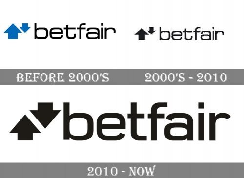
The company was established in 2000. The original logo paired a blue emblem with the wordmark in black. The type was a friendly sans serif one with rounded corners, while the ends of the glyphs were not rounded. It looked pretty flat. The most distinctive letter was probably the “t” with its extended end and horizontal bar.
The emblem comprised two arrows pointing in the opposite directions. To the left, there was the arrow pointing up. It was the larger one. The second arrow (it was pointing down) was smaller. This was supposed to symbolize the money flow coming to the customers.
2000s
The company soon got rid of the blue color leaving the logo black on the white background.
2011
Both the emblem and the wordmark went through a subtle update. The arrows are now equal in their size and shape.
Font and Color
The modern lowercase lettering from the official logo of Betfair is set in a stylish designer font with rounded angles of the square-shaped characters. The closest typefaces to the one, used in this insignia, are, probably, Phoebe Medium, or RM Squarial Medium, but with some modifications of the contours.
As for the color palette of the Betfair visual identity, here everything is strict and laconic — the badge is executed in the most minimalistic scheme ever, black-on-white, and it creates a timeless insignia, which represents a professional and stable company.


