Marshalls is a chain of off-price department stores headquartered in Framingham, Massachusetts. It belongs to TJX Companies. Its core range of products includes clothing and home fashion. The company’s roots can be traced back to 1956, when Alfred Marshall, together with a group of like-minded people, created the “Brand Names For Less” concept“.
Meaning and history
The Marshalls logo has gone through multiple modifications over its more than 65-year history. It is not to say that the company has been too experimental – every update has looked more like part of gradual, cautious evolution rather than a revolution.
What is Marshalls
One of the major American retailers, Marshalls offers off-price family apparel and home fashion. The number of outlets in the US is over 1,120 (2020), and there are also about a hundred stores in Canada.
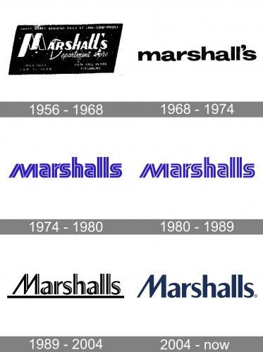
1956 – 1968
The original sign already featured a prominent name of the brand. The letters were rather bold, with the lines varying from thick to thin. The most notable part was probably the “M”, which was formed by a ribbon.
1968 – 1974
The ribbon “M” was replaced by a cleaner and better legible glyph. This time, the wordmark was straightened and looked by far more regular. Although it was better legible, it also became more generic.
1974 – 1980
An unusual touch was introduced – a fine white line that ran through each of the glyphs. In addition to the black-and-white version, a logo in blue was introduced. The shape of the glyphs wasn’t the same as in the previous wordmark, but there still was something similar: the majority of the letters were lowercase and had a classic shape.
This is the first version where the apostrophe was dropped.
1980 – 1989
The white line running through the letters grew somewhat bolder. Other than that, the Marshalls logo looks the same.
The problem with this wordmark is that its legibility isn’t up to scratch.
1989 – 2004
A more elegant and refined design was introduced.
The letters had lost much of their weight – they now looked lighter and more elongated. The “M” was capitalized. Most notably, though, the shape of the glyphs had been refined – you could now see rounded ends on the “a’s”, and there were notable modifications in the thickness of the lines. Also, the white lines inside the glyphs were modified to look elegant, not sporty, like in the previous version. We can say that this version has some qualities that are associated with “feminine” designs, in contrast to its “masculine” predecessor.
In the primary logo, all the letters, with the exception of the “M”, were lowercase. However, there was also an uppercase version. The style was the same.
Apart from the new shape, the logo also featured a different shade of blue. It was softer, calmer, and more unique than its vibrant predecessor.
2004 – present
This is another step in the gradual evolution. The result is a better legible and cleaner wordmark, which still retains the refined style of its predecessor.
The white line completely disappeared, so the glyphs are now solid. The color grew darker, which created a better contrast.
Colors and font
While the color of the Marshalls logo is dark enough to stand out on the white background, it’s not just generic black. It is a rare shade, which opens up only if you take a closer look.
The type looks basic but has a slight elegant touch due to the transitions from thick to thin. The unique feature is the “M” adding a touch of dynamism.


