

![]()
Bharat Petroleum Logo PNG
Bharat Petroleum is a large Indian company, which was established in 1891, and turned into the modern gas and oil corporation, the whole world knows today, at the beginning of the 1950s. Being the second-largest oil group in its region, Bharat Petroleum has a perfect reputation and is owned by the government of India.
Meaning and history
![]()
The visual identity of the reputable gas and oil corporation hasn’t changed at all since the creation of its logo in 1952. Before that the group, formed in India at the end of the 19th century, mostly used simple logotypes as its visual identity basis, and was more concentrated on the official styles, using it mainly for documents.
What is Bharat Petroleum?
Bharat Petroleum is the name of an oil corporation from India, which was established at the end of the 19th century and has several predecessors. Today Bharat Petroleum has its confident place in the Fortune biggest corporations ranking and has a yearly revenue of about 55 billion USD.
With the expansion of the company’s activity, the need for a bright and memorable logo appeared, and it was created. The Bharat Petroleum logo is composed of a bright two-colored emblem, which is placed above the solid and stable inscription.
The blue circular emblem with yellow elements in the middle (resembling two drops and located as yin yang symbol) is set in a white background above the solid yellow banner where the bold blue inscription is placed in two levels. The whole composition is enclosed into a thin yellow frame and has its bottom horizontal line thickened and colored blue.
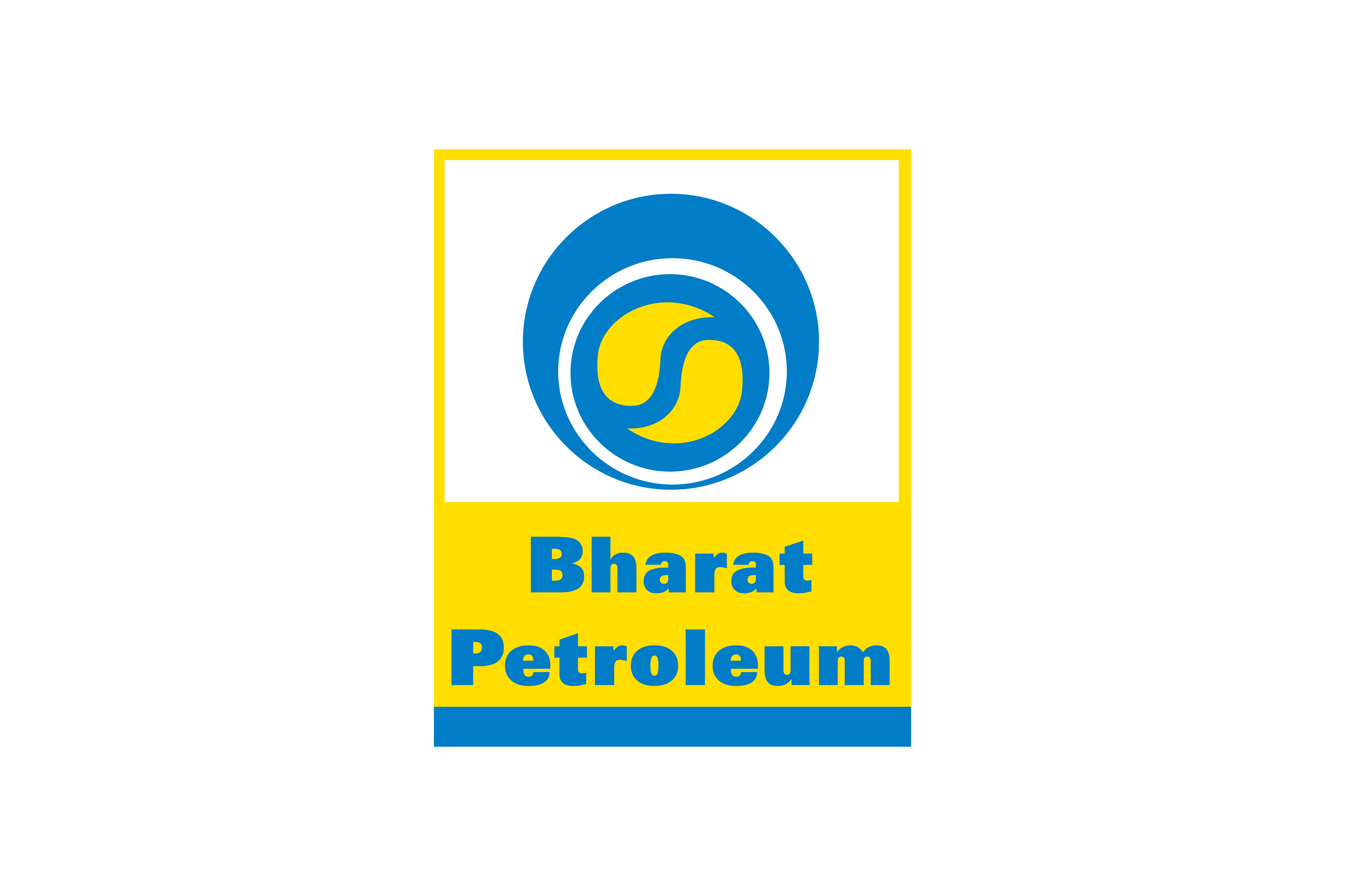
The Bharat Petroleum emblem boasts a solid blue circle with has a thick white circular contour inside, and the yellow “yin yang” enclosed into it. The while line balanced the heavy and intense symbol, adding lightness, though not making the sense of solidness and stability disappear. As for the yellow elements, they make the whole image look friendlier and more energetic.
As for the lettering, it is written in the title case, with two parts of the company’s name set one under another. The inscription is executed in an ExtraBold sans-serif typeface, which might look too simple, but brilliantly balanced and complements the emblem of the brand, evoking a sense of fundamental and professional approach, and showing Bharat Petroleum as the company, which is in the first place concentrated on the business activity, and productivity.
Font and Color
The heavy title case lettering from the Bharat Petroleum official logo is set in a traditional ExtraBold sans-serif typeface which looks pretty simple yet extremely confident. The closest fonts to the one, used in this insignia, are, probably, Zurich Std Extra Black and Univers Cyrillic 85 ExtraBlack.
As for the color palette of the Bharat Petroleum visual identity, it is based on a very bright composition of blue and yellow with white background in the upper part adding some air and contrast to the composition. Yellow is a color of energy, while blue balances it, adding a touch of reliability and white stands for loyalty and transparency.


