British Gas has been known among the Big Six – the largest companies in the gas and electricity market in the UK. The company serves around 12 million homes in the UK providing energy and home services.
Meaning and history
The company’s origins can be traced back to the Gas Light and Coke Company established in 1812. The name the British Gas Corporation was adopted after the Gas Act 1972 was passed.
1986 — 1995
Following the Gas Act 1986, the company went through privatization, while its shares floated as British Gas plc.
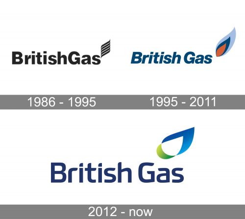
The British Gas logo of this era has the same structure as the following two versions: the name of the brand and a stylized flame above its last letter. In the 1986 logo, the name of the brand is set in a sans serif typeface. The letters are bold enough and have classic proportions making them legible. Only the initials are capitalized, which creates a sort of visual border between the two parts of the name.
The flame above the “s” is made up of five stacked swooshes oriented upwards.
1995 — 2011
This version is already more dynamic and meaningful.
The wordmark has been italicized. It is dark blue. Although it is not exactly the color of the natural gas, it is at least closer to it than the original black.
The flame looks less abstract – both the shape and the color add a realistic touch. Also, it is more tilted, which adds some motion.
2012 — present
The type has lost some of its weight and has adopted a more unique shape.
The flame, in its turn, has grown more abstract and dynamic. In fact, it looks more like a drop than a flame now. The blue of the wordmark has grown lighter.
Font
The combination of rounded and sharp elements in the 2012 logo better fits the shape of the flame above. Due to this, the two parts of the logo merge better.
Colors
Blue has been used as the color of natural gas. The hue of the wordmark is a little too dark, while the “flame” is bright enough and almost realistically blue. The green addition may symbolize the fact that the company wants to show it cares about nature.


