

![]() Jaguares Logo PNG
Jaguares Logo PNG
Although the Jaguares are a pretty young team, their logo has already gone through a complete overhaul. It now looks edgier and “sportier.”
Meaning and history
![]()
Founded in 2015, the professional rugby union team is based in Buenos Aires, Argentina.
2015 — 2018
![]()
The head on the earliest Jaguares logo was highly stylized. The designer embellished the creature with an elegant pattern consisting of curls and swirls.
2019 — Today
![]()
Similar to the previous version, the current one features the head of a jaguar with its mouth open. However, this time, it looks different. The curls and swirls have been replaced by more true-to-life spots. The head is now facing to the side. The overall mood is unmistakably aggressive, whereas the jaguar on the previous logo could have been either aggressive or giving the cry of anguish – it was difficult to figure out.

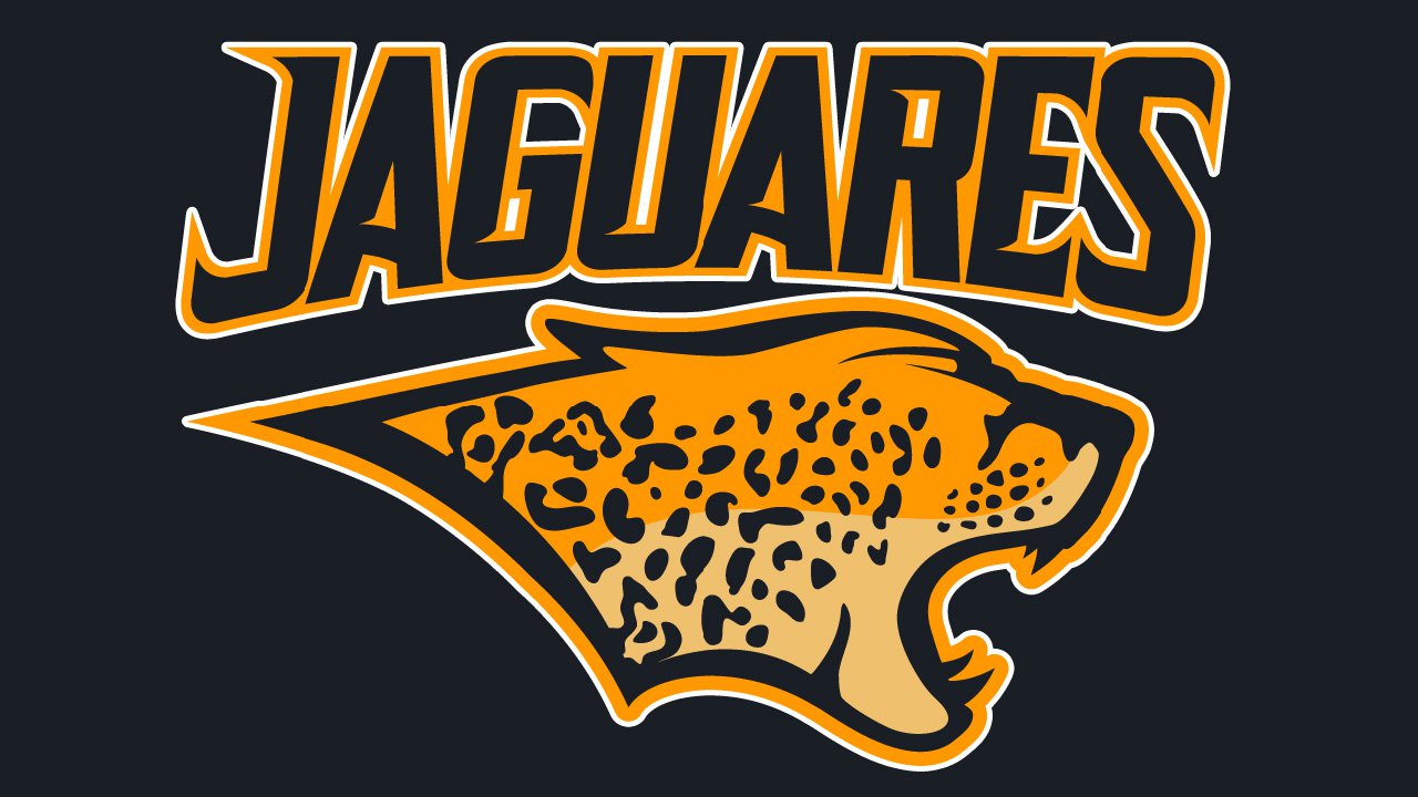
Although the current logo looks more professional, it’s also somewhat generic and doesn’t give an insight into the individuality of its author (which isn’t necessary for a sports logo, though). The author of the original logo worked more like an artist than a designer.
Font
The unusual letters have distinctive sharps ends and serifs “rhyming” with the sharp fangs and ears of the creature depicted on the emblem.
Colors
![]()
The gold, orange, and brown colors of the Jaguares logo were inspired by the colors of the jaguar’s fur.


