

![]() Maine Mariners Logo PNG
Maine Mariners Logo PNG
The Alaska Aces have relocated to Portland, Maine to begin the 2018-19 season as the Maine Mariners. It is the newest ice hockey team in the ECHL.
The name “Mariners” came from the Name-the-Team contest. It was announced at the end of September in 2017. A month later the club revealed the logo and the color palette.
Meaning and history
![]()
The Maine Mariners, a professional ice hockey team based in Portland, Maine, were founded in 1987 by an enthusiastic group led by local investors. This team, affiliated with the National Hockey League’s Philadelphia Flyers, has a rich history that showcases a blend of struggle and success. In their initial years, the Mariners quickly gained popularity, drawing in large crowds and fostering a deep connection with the local community.
The team’s main achievements are highlighted by their remarkable performances in the ECHL, where they showcased exceptional skill and teamwork. The Mariners have been celebrated for their resilience and sportsmanship, often competing fiercely against top-tier teams. Their journey in the league has been marked by significant victories and memorable matches, contributing to their reputation as a formidable opponent in ice hockey.
Currently, the Maine Mariners continue to hold a prominent position in the ECHL. They maintain a strong fan base and are known for their dedication to the sport. Their ongoing participation in the league symbolizes not just their competitive spirit but also their commitment to maintaining professional ice hockey’s legacy in Maine. The team’s current standing reflects their continuous efforts to achieve excellence in the sport, making them a significant entity in the world of ice hockey.
What is Maine Mariners?
The Maine Mariners are a professional ice hockey team competing in the ECHL, known for their spirited performances and deep-rooted connection to the Portland community.
1995 – 1996
![]()
In 1995 the team, known today as The Maine Mariners, was called the Anchorage Aces hockey team. And the logo, designed in that year was all built around the logotype. It was a gradient blue “icy” circle in a red and white framing, with the wordmark overlapping it slightly diagonally. The “Aces” part of the lettering was enlarged and featured a stylized extra-bold sans-serif typeface, in which the bright blue letters looked solid and strong. The black hockey puck was drawn on the letter “A”, replacing its horizontal bar. As for the additional lettering, it was all executed in black and white and placed above and under the main inscription.
1996 – 2003
![]()
The redesign of 1996 brought a very important element when Aces’ logo — a white polar bear in a blue hockey uniform and helmet was drawn above the text banner, holding the hockey stick and grinning its huge teeth. The animal evoked a sense of danger and strength, and brilliantly reflected the purpose and character of the hockey club.
2003 – 2017
![]()
The name of the team was changed to the Alaska Aces in 2003, and this is also when the new logo saw the light. It was a modern and cool badge in a white, blue, and black color palette with small green elements on the top part. The logo featured an image of a polar bear with long sharp claws and fangs, placed on a black and blue background, which was repeating the shape of the hockey puck. Above the bear, there was a geometrically-stylized mountain and trees image, and under — the two-leveled inscription, underlined by three white snowflakes. The lettering featured a blue “Alaska” in small caps and a light gray “Aces” in a sharp custom typeface. Both parts were set on a black background and slightly diagonally oriented.
2018 – Today
![]()
It is an utterly new logo. At first sight it may seem that it consists of only the name of the team and two elements ‒ the letter “M” and Neptune’s trident. Actually, it is full of imagery and symbolism. All the elements are directly related to the state of Maine.
The letter “M” and the trident form the abbreviation ME that stands for Maine. The middle spear of the trident is stylized to look like a pine tree. It is a tribute to the evergreens for which Maine has acquired the nickname “the Pine Tree State”.
The star is the same as in the state flag. The lighthouse, a subtle image depicted in silver on the letter “M”, reminds of Maine’s historical lighthouses.
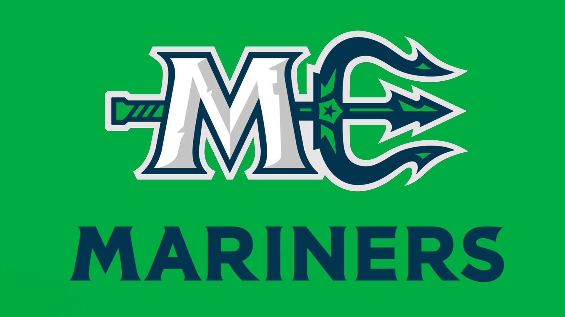
The colors are not without meaning either. The blue color implies the sea. The green indicates to the luxurious forestry which the state is famous for.
The logo shows the Mariners’ desire to build strong links with the community.


