Magnum is a renowned brand primarily recognized for its luxury ice cream bars coated in thick chocolate. Belonging to the vast portfolio of Unilever, a global consumer goods conglomerate, Magnum has successfully established its presence in numerous countries worldwide. It constantly innovates its flavors and offerings, appealing to gourmet ice cream enthusiasts. While Europe remains a strong market, Magnum continues its expansion across Asia and the Americas. The brand’s commitment to indulgence and quality ensures its position as a top-tier ice cream choice.
Meaning and history
Originating in Belgium, it was the brainchild of Miko, a subsidiary of Unilever, the global consumer goods giant. Magnum was introduced as the first premium ice cream for adults, encased in a thick layer of Belgian chocolate.
The 1990s witnessed Magnum’s rapid spread across Europe, as its distinctive taste and luxurious appeal resonated with consumers. With consistent innovation, Magnum introduced novel flavors, from classics like almond and white chocolate to adventurous ones involving fruits and spices.
In the early 2000s, the brand undertook global expansion, venturing into markets in Asia, Latin America, and the US. Each region was met with unique flavors tailored to local tastes, ensuring Magnum’s universal appeal.
No significant ownership changes occurred as Magnum remained under Unilever’s umbrella since its inception. However, production methodologies underwent refinement. In its commitment to sustainability, Magnum took steps to source cocoa beans from Rainforest Alliance Certified™ farms, bolstering its eco-friendly reputation.
Collaborations with fashion icons and celebrities further elevated Magnum’s status. Limited editions, pop-up stores, and interactive campaigns became part of Magnum’s brand story, making it more than just an ice cream but an experience.
Magnum stands as a testament to luxury and innovation in the world of frozen delights, retaining its crown as the premium ice cream bar, all under the watchful eye of Unilever.
1989 – 2003
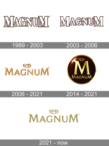
In the early days of Magnum’s inception, the emblem featured a bold serif font, with the initial and concluding ‘M’ characters noticeably larger than the rest. This distinctive design laid the foundational blueprint for subsequent logos the brand adopted up until 2014. Over the years, such branding nuances play a pivotal role in establishing brand identity and resonance with consumers. Consistency, intertwined with periodic refreshes, ensures that a brand remains both recognizable and modern. It’s fascinating how something as simple as typography can leave a lasting imprint on consumer perceptions and be emblematic of a brand’s evolution. Every logo iteration tells a story, capturing the essence of its time while paying homage to its roots.
2003 – 2006
In 2003, there was a subtle transformation of the logo, giving it a more three-dimensional appearance while softening its edges. Such changes, while seemingly minor, can greatly influence the brand’s perception among its audience. The shift from a sharper design to a more rounded, three-dimensional one might indicate a move towards a more modern or accessible image. Logos serve as the silent ambassador of a brand; they reflect its ethos and evolution. A tweak in design can resonate with changing times, market dynamics, or a strategic shift in brand positioning.
2006 – 2021
In 2006, Magnum underwent a comprehensive rebranding, encompassing both a redesigned logo and revamped packaging. The emblem transitioned to a lustrous gold hue, adopting a sleeker, more refined typeface. The twin ‘M’s mirrored each other, providing a symmetrical appeal. Concurrently, Magnum introduced a distinctive “seal” feature, imprinting an ‘M’ insignia on each ice cream’s flank. This strategic move wasn’t merely cosmetic; it signified Magnum’s commitment to brand consistency and uniqueness. By integrating subtle changes like these, the brand reinforced its premium stance in the market. Such updates reflect the evolving tastes and preferences of consumers, ensuring the brand remains current and resonates with its target audience, while also retaining the essence of its storied legacy. Through these visual cues, Magnum strengthened its brand recall, setting a higher benchmark in the realm of ice cream luxury.
2014 – 2021
In honor of marking a quarter-century milestone, Magnum underwent a brand transformation. The revamped logo prominently showcases a radiant gold ‘M’, ensconced within a rich chocolate-hued circle. Positioned directly below this emblematic ‘M’ is the word ‘Magnum’, albeit in a more compact and understated font. This design choice reflects a blend of modern elegance with a nod to the brand’s storied legacy. By placing emphasis on the ‘M’, Magnum seeks to create an instant brand recognition, while the understated brand name beneath it serves as a gentle reminder of its enduring legacy. The fusion of contemporary design with classic elements encapsulates the brand’s journey over the past 25 years, evolving with the times yet staying true to its core values and rich heritage.
2021 – Today
The logo showcases the brand name “MAGNUM” in a bold, elegant typeface, predominantly in a refined golden hue. Positioned above the central “A” is an abstract heart motif, which intertwines to form a continuous loop, echoing sentiments of love and passion. Beneath the brand name, the words “ice cream” are inscribed in a more subdued, finer script, emphasizing the product’s nature.


