Bertolli is an Italian food brand. The company was established in 1985 in Tuscany as an olive-oil manufacturer. Today there are various sauces and canned meals produced under the Bertolli label and distributed across the globe.
Meaning and history
Bertolli’s visual identity is luxury and authentic, a great reflection of the company’s heritage and quality.
The Bertolli logo is composed of a horizontally located badge with a wordmark on it and a coat of arms above. The bright red and gold color palette of the emblem symbolizes the power and passion of the company, as well as its energy and progress. Gold adds a value of legacy and history, making the logo look elegant and sleek.
The white lettering of the wordmark is executed in a bold classic typeface with straight clean lines. Executed in all capital letters, the inscription features an enlarged letter “B” and a black shadow of all the lettering.
1991 – 2001

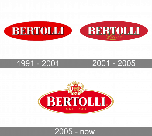
The logo of the Italian brand, created in 1991, featured a very classy yet minimalist badge, which had a horizontally stretched oval shape, red color for the background, and massive white lettering on it. The inscription was set in all capitals of a strong and traditional serif typeface, having its white letters outlined in black and accompanied by a delicate black shadow.
2001 – 2005

Compared to the previous design, they added a slight green tint around the edges and added the word ‘Lucca’ in golden, cursive letters right beneath the main wordmark.
2005 – Today

The redesign of 2005 turned a minimalist and laconic badge into a luxury and royal-style emblem. Keeping the shape and color palette of the original version, the logo was refined and modified. The golden crest is now placed in the upper part of the badge and the lettering is complemented by a gold tagline color which says “DAL 1865”. The frame of the emblem is now outlined in gold and white, which adds confidence and strength to the whole badge.
Font and color
The iconic Bertolucci logo featured very elegant lettering on it. Its uppercase inscription is executed in a classy and chic serif typeface with massive shapes, elongated lines, and distinct serifs. The font of the inscription looked pretty close to URW Antiqua ExtraNarrow Extra Bold and FS Sally Pro Heavy, but with some lines modified.
The combination of red, gold, and white, the badge of the brand is based on, is a representation of a powerful and reputable company, reflecting its authority and expertise and pointing to Bertolli’s value of quality above all.


