Lotus is the name of a luxury automobile marque from Great Britain, which was established in 1948 by Colin Chapman. Today the brand, which produces one of the world’s most famous racing and sports-cars, is owned by Zhenjiang Geely Holding Group.
Meaning and history
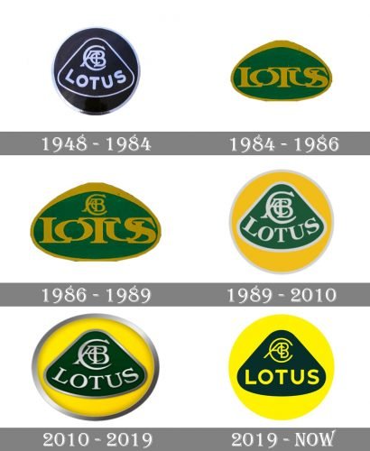
The Lotus car marque features a truly iconic badge, which has been redesigned five times throughout the brand’s history, but only two of six versions were slightly different from the original emblem, created in 1948. The company values its legacy and only slightly modified its emblem from time to time, just to keep it up-to-date.
1948 – 1984
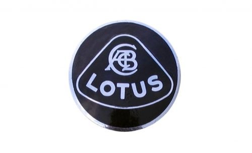
The original Lotus emblem was introduced in 1948 and stayed untouched for almost fourth years. It was a circular black badge in a thin silver outline. In the middle of the circle, there was a triangular contour with the monogram and the marque name in it. The triangle featured rounded angles and a slightly arched base. It is not just a shape, but an abstract representation of a lotus flower.
The monogram, placed on the top part of the logo, featured intertwined “ACB” letters inside a bigger “C” and stands for the name of the brand’s founder — Anthony Colin Bruce Chapman.
Along the arched side of the badge, the “Lotus” inscription in all capitals was written in a bold sans-serif typeface with softened angles.
1984 – 1986
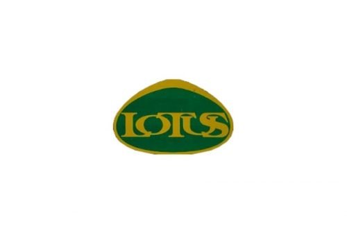
The logo was first redesigned in 1984. The circular shape was gone, and only the smooth lotus shape left on the badge — it was extended and now looked more like an oval. The color palette of the emblem was also switched — it was the dark green background with a golden frame and lettering. On the first version of this design, there was only the name of the brand written on the badge in all capitals of the bold serif typeface, with letters slightly overlapping each other.
Two years later, in 1986, the “ACBC” monogram was brought back to the emblem and placed above the main inscription.
1986 – 1989
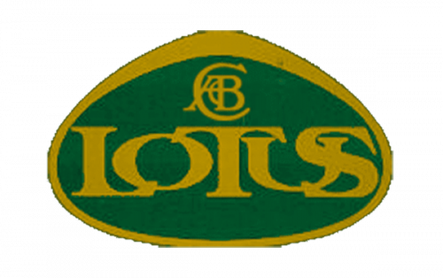
The lotus emblem from 1986 had only one extra element compared to the previous version. It was an elegant golden “ACBC” monogram, placed above the brand’s name on a dark green background. It did not change the style or the mood of the badge, and did not affect the recognizability of the logo, but added some sophistication and a visible affiliation to something luxurious and expensive.
1989 – 2010
The company gets back its original badge in 1989, changing its color palette to green (for the lotus) and yellow (for a circle). The lettering in serif typeface was colored silver and featured an enlarged monogram above it.
When used on the official documents, the logo featured the same monochrome palette as the version, designed in 1948.
2010 – 2019
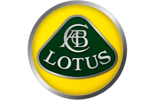
The redesign of 2010 bright volume and elegance to the iconic logo, by making the silver details gradient and glossy and by adding some delicate shadows to the frames and letters. The composition and color palette remains untouched, though the yellow of the badge becomes a bit lighter.
2019 – Today
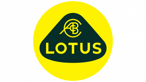
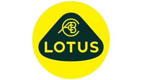
In 2019 the logo gets redesigned again. The badge is simplified and flattened, all the silver details are removed and the contours of each element — cleaned. The “Lotus” wordmark is now set in a straight line and gets a new strict yet modest sans-serif typeface.
As for the monogram, it’s font was also changed to a thin sans-serif, and now you can see its similarity with a steering wheel.
Font and color
The new minimalist Lotus logotype is executed in a solid and bold sans-serif typeface, with straight and laconic lines. The typeface is very close to such fonts as Lucifer Sans SemiExpanded Bold and Wardrum Bold, but with one unique detail — the sides of the “T” horizontal bar are cut diagonally.
The green and yellow color palette of the Lotus visual identity is definitely the most eye-catching element of the logo. This bright and youthful combination represents success, happiness, and growth, evoking a smile and a sense of confidence in the legendary brand.


