 Los Angeles Angels of Anaheim Logo PNG
The Los Angeles Angels of Anaheim is the old name of the baseball team Los Angeles Angels. The longer name was used for a decade from 2005 to 2015. In fact, the name itself first appeared in 1903 – at the time it belonged to the first sports team located in Los Angeles.
Meaning and history
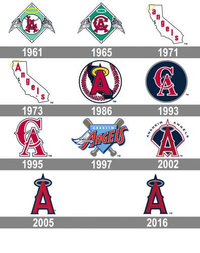
The franchise is based in Anaheim, California. It has gone through as much as ten logotypes since it joined the American League in 1961. The original Los Angeles Angels of Anaheim logo was built around a winged basketball; then the team chose a logo featuring a stylized depiction of California on the map. The current emblem sports a large red “A” with a halo at the top.
What is Los Angeles Angels of Anaheim?
Los Angeles Angels of Anaheim is the name of the baseball club from California State, which was established in 1961. Today the club competes in Major League Baseball and is managed by Joe Maddon.
1961 — 1964
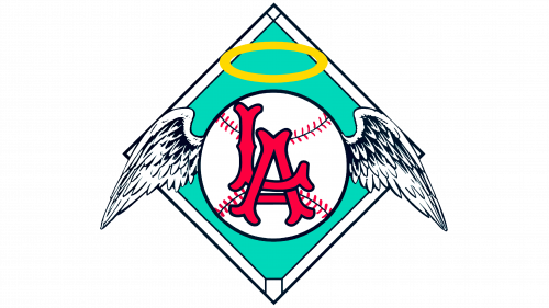
The very first logo for Los Angeles Angels of Anaheim was created in 1961 and stayed with the club for three years. It was a bright green rhombus in a thick white outline. In the middle of the rhombus, the white baseball with black and red-stitched and a red “LA” monogram was placed. Two wings were coming out from the ball to the sides and a yellow halo symbol was set above it.
1965 — 1970

The redesign of 1965 replaced the “LA” lettering on the white baseball with the “CA”, standing for California. The lines and contours of all the elements were strengthened and emboldened, and the color palette was a bit changed. The green of the rhombus became calmer, white the yellow halo turned white, which made the whole image more balanced and professional.
1971 — 1972
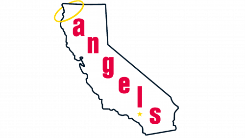
In 1971 the club starts using another logo concept — it is a white contoured California State with the lowercase red “Angels” lettering along with it. The thin yellow halo was “hanging” on the upper left peak of the symbol. The black contour, red lettering, and yellow symbol made the white California State contour more energetic and vivid.
1973 — 1985
The redesign of 1973 was all about the typeface of the “Angels” inscription. Now the lettering was set in the title case near the font of the wordmark turned more modern and clean. The capital “A” was very geometric and pointed, which made the whole logo sharp and powerful.
1986 — 1992
In 1986 the Los Angeles Angels logo was changed again. This time it was a stylized baseball in white red and black, with a sharp red “A” in dark red with a black outline. On the top of the letter, there was a delicate yellow halo. The black element of the logo was the solid contour of the California State, placed behind the red letter.
1993 — 1994
The redesign of 1993 introduced a new version of the logo. It was a solid dark blue circle in a thin gray outline with a red monogram on it. The monogram was composed of two intertwined letters “C” and “A” in a wishbone typeface, with red bodies and white outlines. The top of the letter “A” was decorated by a light gray halo, balancing the circular frame of the badge.
1995 — 1996
The circular badge was replaced by just a red and white “CA” monogram, outlines in thin black, and placed on a white background. The contours of the letters were refined and clean, and on a new background, the gray halo became more visible and stable.
1997 — 2001

In 1997 the club decided to try something new — a completely different from all the previous versions badge was created. The stylized sky-blue crest was placed on two crosses wooden baseball bats. The red script “Angels” lettering was diagonally set in a blue crest and outlines in white. There was also the “Anaheim” inscription set along the top part of the crest, written in the uppercase of a modern sans-serif typeface, with two solid white squares in the sides.
2002 — 2004

The sky-blue crest turned into a cool geometric shape with an arched top and pointed triangular bottom in 2002. The new badge got its color palette elevated to dark blue, red, and white. The stylized letter “A” in a wishbone typeface with an elongated and pointed top was drawn in gradient red in the middle of the badge. The gray halo was placed on its sharp peak. The “Anaheim Angels” inscription was arched above the crest and written in the uppercase of a fancy modern sans-serif typeface with its letters slightly extended.
2005 — 2015

With the redesign of 2005, the blue background was removed and now the dark red letter “A” in a blue outline was placed on a white background with no additional lettering. The light gray halo was still there and with this new composition, it started looking more visible and solid.
2016 — Today
In 2016 the logo, created in 2005, was slightly refined and got its contours cleaned and emboldened. The sharpness and geometry became two main features of the new Los Angeles Angels of Anaheim visual identity.
Colors
MIDNIGHT BLUE
HEX COLOR: #003263;
RGB: (0,50,99)
CMYK: (100,86,34,25)
PANTONE: PMS 2955 C
RED
HEX COLOR: #BA0021;
RGB: (186,0,33)
CMYK: (18,100,99,10)
PANTONE: PMS 200 C
MAROON
HEX COLOR: #862633;
RGB: (134,38,51)
CMYK: (31,94,73,31)
PANTONE: PMS 202 C
SILVER
HEX COLOR: #C4CED4;
RGB: (196,206,212)
CMYK: (23,13,12,0)
PANTONE: PMS 538 C


