While the LIU-Brooklyn Blackbirds logo has featured a blackbird since at least 1989, it has gone through two notable modifications.
Meaning and history
The inception of the LIU Sharks athletic program is rooted in the historical amalgamation of the athletic departments of Long Island University’s Brooklyn and Post campuses in 2019. This strategic consolidation was aimed at creating a singular, more formidable athletic identity under the banner of LIU Sharks, thereby elevating the university’s stature in intercollegiate sports. The LIU Sharks, participating predominantly in the NCAA Division I, represent the pinnacle of the university’s athletic aspirations, showcasing talent across a spectrum of sports disciplines.
Throughout their journey, the LIU Sharks have carved out a notable niche in the realm of collegiate sports. The women’s rugby team, in particular, has emerged as a powerhouse, garnering widespread acclaim and setting a high bar for performance and sportsmanship. Additionally, teams in basketball, baseball, and soccer have made significant strides, notching up impressive victories and establishing the LIU Sharks as a name synonymous with athletic excellence and competitive spirit. These accomplishments are a testament to the dedication and skill of the athletes and the strategic vision of the coaching staff.
In the current landscape of NCAA Division I athletics, the LIU Sharks are a force to be reckoned with. Their continuous pursuit of athletic brilliance is mirrored in their regular participation in prestigious national championships. The university’s commitment to enhancing the athletic experience through state-of-the-art facilities and comprehensive training programs ensures that the LIU Sharks remain at the forefront of collegiate sports, excelling both on the field and in academic arenas.
What is LIU Sharks?
LIU Sharks, a symbol of athletic ambition and achievement in NCAA Division I, are renowned for their prowess in sports like women’s rugby, basketball, and soccer, continually pushing the boundaries of collegiate athletic excellence.
1989 – 1995
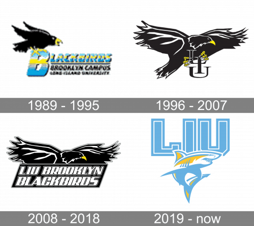
The earlier version, which was adopted in 1989, depicted the bird sitting on the letter “B,” which was the initial of the word “Blackbirds.”
1996 – 2007
In comparison with it, the bird on the next emblem (1996) looked more like an athletic emblem. She was flying with her wings spread wide, and she was holding the letters “LIU” in her claws.
2008 – 2018
On the current LIU-Brooklyn Blackbirds logo (2008), the bird is depicted almost the same, except that instead of the letters “LIU” there is the full name of the team housed in a parallelepiped.
2019 – Today
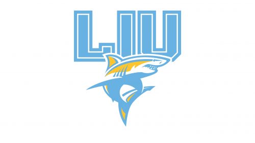
In 2019, the team was renamed to ‘LIU Sharks’. As such, there is now a big ‘LIU’ acronym, made in big turquoise letters. Right below, they placed an image of a shark. It is pretty detailed, and its colors were mainly yellow, turquoise and white.
LIU-Brooklyn Blackbirds basketball
The women’s team began play in 1965. It competed in the 2001 NCAA Tournament and in the 2007 WNIT. The men’s basketball team of Long Island University has appeared in seven NCAA Division I Tournaments, three NCAA Division II Tournaments, and ten National Invitation Tournaments.


