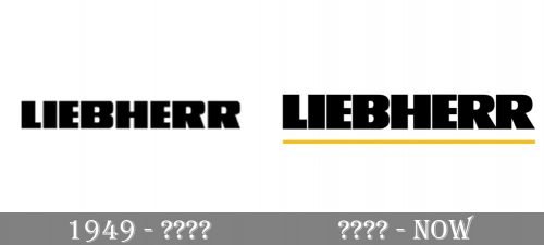
The logo of the Liebherr Group, a Switzerland-based equipment manufacturer, has not changed that much during the company’s more than 70-year history.
Meaning and history
The history of Liebherr began in 1949 with the planning and assembly of the first tower crane. The company was founded by Hans Liebherr, whose aim was to create a powerful family-run machinery company. The distinctive characteristics of the crane, and therefore the main components of the company’s success, were the mobility of the equipment, its easy installation, and reasonable cost.
Liebherr today is a powerful company with subsidiaries all over the world. Liebherr has a total of more than 35 thousand employees. Liebherr has several core competencies – the production of construction machines and qualitative, functional, innovative technical products.
Liebherr is headquartered in Bulle, Switzerland. It was moved there in the mid-1980s by Hans Liebherr himself, to avoid the enormous German inheritance taxes. The Liebherr Group includes many independent divisions. Representative offices are scattered all over the world.
What is Liebherr?
Liebherr is a European mechanical engineering company headquartered in Biberach a der Ries, Baden-Württemberg. The company was founded in 1949 by Hans Liebherr, and by today has grown into one of the world’s most reputable equipment manufacturers.
1949
The Liebherr Group was founded in 1949. While the group has German origins, it has locations in several countries, including Australia, the UK, and the United States, to name just a few. Its original range was based on affordable tower cranes but in the course of time, the brand introduced aircraft parts, commercial chiller displays and freezers, and refrigerators for households.
Since the earliest Liebherr logo was introduced in 1949, it has always featured the name of the company in a rather heavy sans serif typeface. The “weight” of the letters symbolizes the reliability and durability of the products manufactured by Liebherr.
The original wordmark was black on the white background, with average spaces between the glyphs. Later, the glyphs were moved somewhat closer to each other, to make the design more compact.
Today
Eventually, in the current version, the spaces between the letters have grown so small that it slightly damages the legibility. Nevertheless, this approach adds a unique touch and can be interpreted as a symbolic way of emphasizing the quality of the products.
The palette of the Liebherr logo is made up out of several muted shades of blue. The use of the gradient results in a slight 3D effect.
Font and Color
The massive and brutal lettering from the primary Liebherr logo is set in the uppercase of an ExtraBold sans-serif typeface with heavy characters and distinctive contours. The closest fonts to the one, used in this insignia, are, probably, Panorama KG Regular or Mushmouth PB Regular, but with some slight modifications of the contours.
As for the color palette of the Liebherr visual identity, it is super minimalistic, based on a plain solid black for the elements, placed against a simple white background. The black is a symbol of confidence and power, which adds a sense of stability and looks brutal and masculine, representing a company as a reliable and strong one.


