

![]() Letterboxd Logo PNG
Letterboxd Logo PNG
Letterboxd is a social networking platform that was developed for movie lovers. It allows users to track the films they watch, create lists, write reviews, and share their thoughts on movies with a community of other movie watchers. Letterboxd emphasizes the social aspect of film watching, making it a popular spot for discussions. It’s also a valuable resource for discovering new films and exploring various genres.
Meaning and History
![]()
The platform was launched in 2011 by Matthew Buchanan and Karl von Randow, both of whom are New Zealand-based web developers. The platform quickly gained popularity, particularly among film lovers and critics. Over the years, the platform introduced new features to enhance community interaction. A premium version, which was launched in 2015, offered even more advantages. As the company adapted to the changes, it developed a mobile app and launched it in 2018. Overall, Letterboxd established itself not only as a popular platform for film enthusiasts but also as a valuable tool for filmmakers and film critics. In 2022, Letterboxd was acquired by a group of investors.
What is Letterboxd?
Letterboxd is a social networking site designed for film lovers and enthusiasts. Users can log, rate, and review films, create lists, and interact with other members through comments and follow features. While Letterboxd is free to use, it also offers Pro and Patron memberships that provide additional features.
2011 – 2018
![]()
The first thing that catches the attention in this logo is three interconnected circles of different colors. They are supposed to represent the different people coming together to form a community where they can share their different opinions and find something in common. The icon is accompanied by the word “Letterboxd” in a clean and modern slab serif font. The name features a light gray gradient. Right underneath it, there is also a tagline, which uses a more basic font and finer strokes.
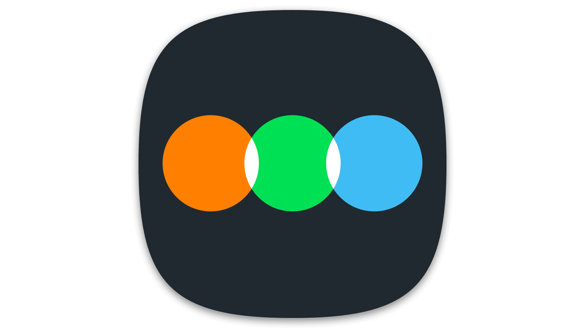
2018 – Today
![]()
The Letterboxd updated logo features a simple yet recognizable design. The company switched to a different font and made the color palette brighter. The inscription uses sentence case and the letters have bold strokes and no serifs. There is also no more tagline.
Font and Color
Atletico Bold font is used for the name. For the tagline, the logo features Forza ScreenSmart Book Italic font. In 2018, it switched to a font similar to TT Interfaces Extra Bold font.
The color scheme uses different shades of gray as the main color and orange, green, and sky blue as the accent colors. The bright colors give it a vibrant and approachable feel. Meanwhile, the gray color balances these out and establishes the brand as a strong, stable, and balanced platform.


