

![]() Leicester City Logo PNG
Leicester City Logo PNG
For most of its history, the logo of the Leicester City Football Club has featured a fox, which is the club’s mascot. However, the way the animal was depicted, as well as the overall design of the logo has been altered not less than ten times.
Meaning and history
![]()
The visual identity of the British football club has a pretty long and intense history with several major redesigns of the logo. One thing has never changed — the club, nicknamed “The Foxes”, has always had an image of their totem animal on the emblem, as the homeland of the team is known for a big amount of foxes in its woods.
1946 — 1950
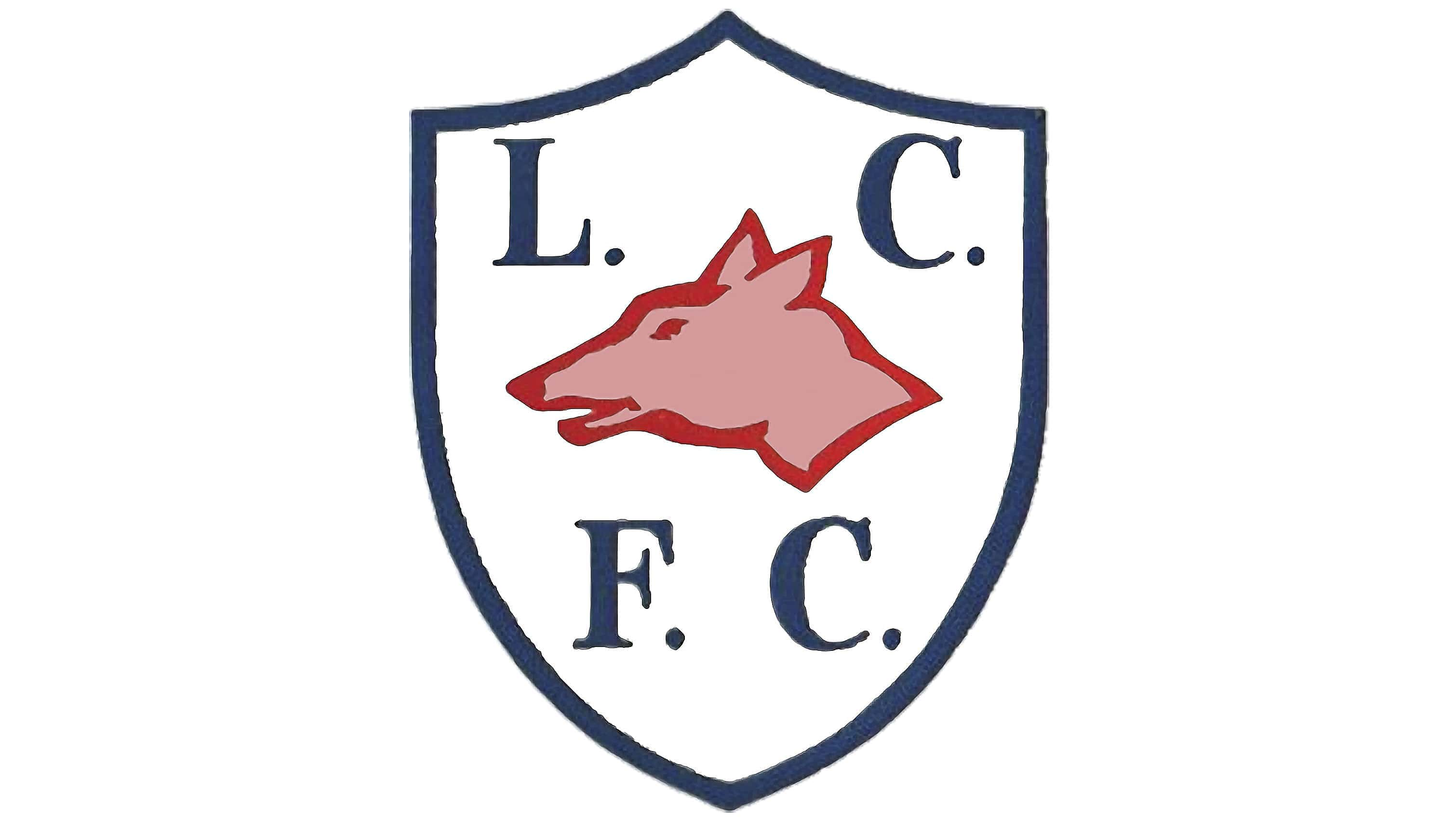
The very first emblem for the club was designed in 1946 and looked simple and minimalist. It was a white crest with a calm blue outline and lettering in the same color.
In the middle of the crest, a red fox profile was drawn. The animal was facing west and had the “L.C.” inscription above it, and “F. C.” under it. The wordmark was executed in a classic serif typeface with elegant serifs and clean lines.
1950 — 1972
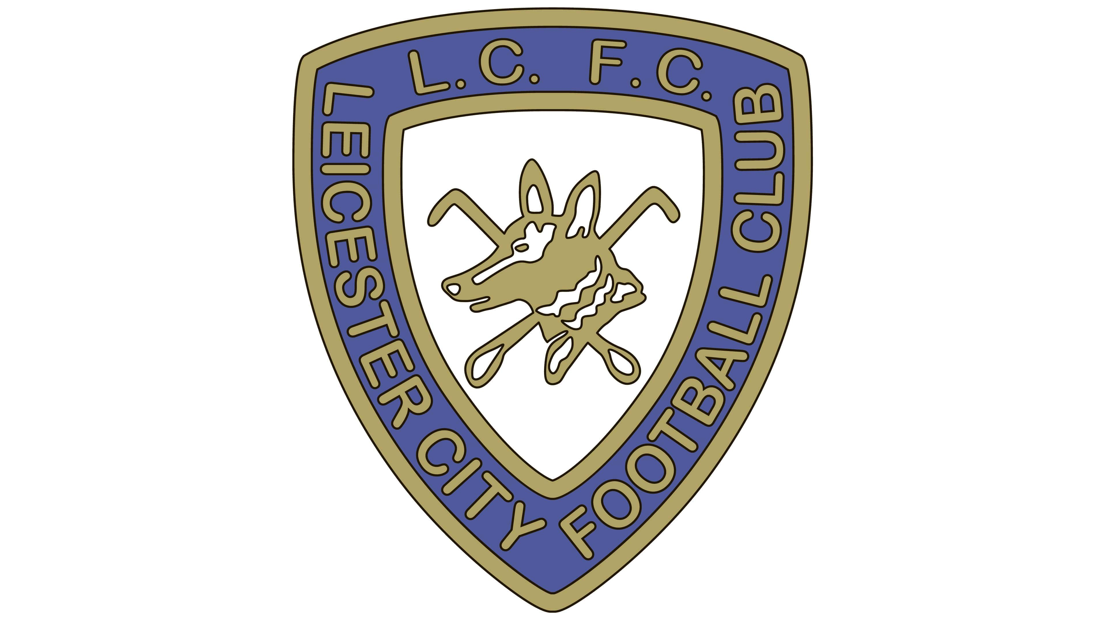
The crest from the 1950s looked much more confident and fancy. It was a more geometric and smooth shield with a thick blue and gold outline. The wordmark was now placed on a blue frame of the crest and executed in the intense gold shade. The typeface was switched to a modern sans-serif.
Inside the crest, there was a white element, also outlined in gold, and having a gold fox portrait in the middle.
1972 — 1983
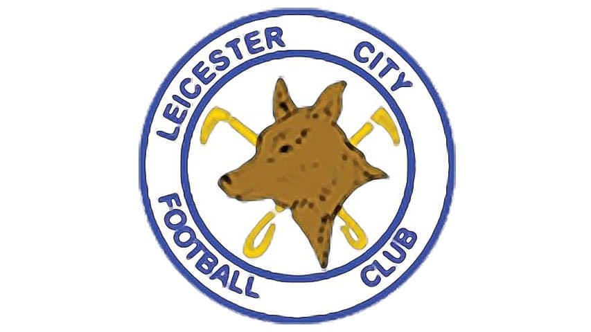
The club changed the shape of its logo to a circle in 1972. The composition and color palette remained the same — fox in the middle, lettering around the perimeter. But in comparison to the previous version, this one is lighter and fresher. Another difference is that the “L.C. F. C.” inscription was removed, only the whole name “Leicester City Football Club” was now written on the emblem’s circular frame.
1983 — 1992

The most minimalist and remarkable logo for the British football club was designed in 1983 and stayed with them for almost ten years. It was a blue contour on a white background, depicting a fox walking to the right. The elegant animal was enclosed into a circle, but its tail and head came out of the framing.
1992 — 2002
The first version of the logo we all know today was designed for Leicester City in 1992. The club decided to keep the circular shape of the badge, and brought back the portrait of the fox to their visual identity.
The logo from the 1990s comprised a blue and white circle with a blue lettering around the perimeter and an orange fox in the middle. The fox’s head was placed on a white flower with five petals, and the flower was enclosed into a solid blue circle.
The inscription was executed in a sophisticated serif typeface, which added elegance and showed the value of the team’s heritage and roots.
2002 — 2009

In 2002 the logo was modified, but the concept and colors remained untouched. The main change was done to the wordmark, which now became enlarged and changed its typeface to a bold and modern sans-serif with strong and solid letters. The blue out tule of the badge also became a bit thicker, making the whole logo more confident and bright.
2009 — 2010
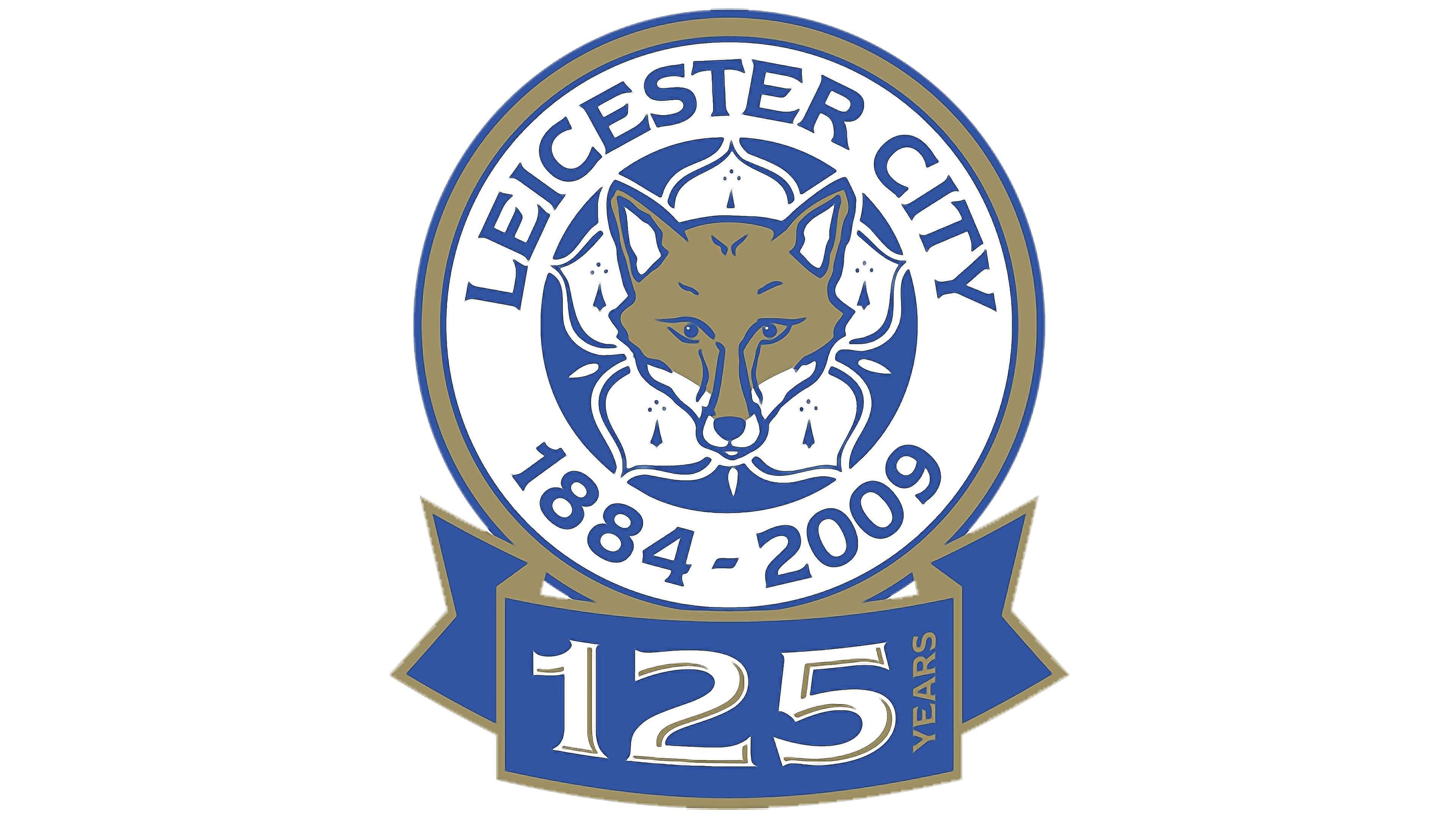
For the club’s 125-anniversary in 2009, the special logo was created. The rounded emblem with a fox gained a darker color palette, and the wordmark was changed to “Leicester City 1884 — 2009”. The blue outline was replaced by a gold one, making the badge look like a medal.
The fox on the emblem now had some white details, which made it look more realistic and vivid.
Under the emblem, the wide blue ribbon with “125 years” inscription was placed. It was a delicate and very elegant anniversary logo.
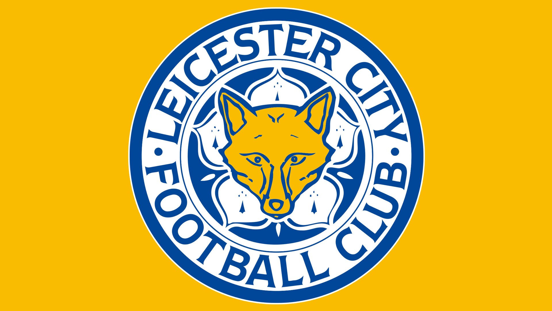
2010 — Today
![]()
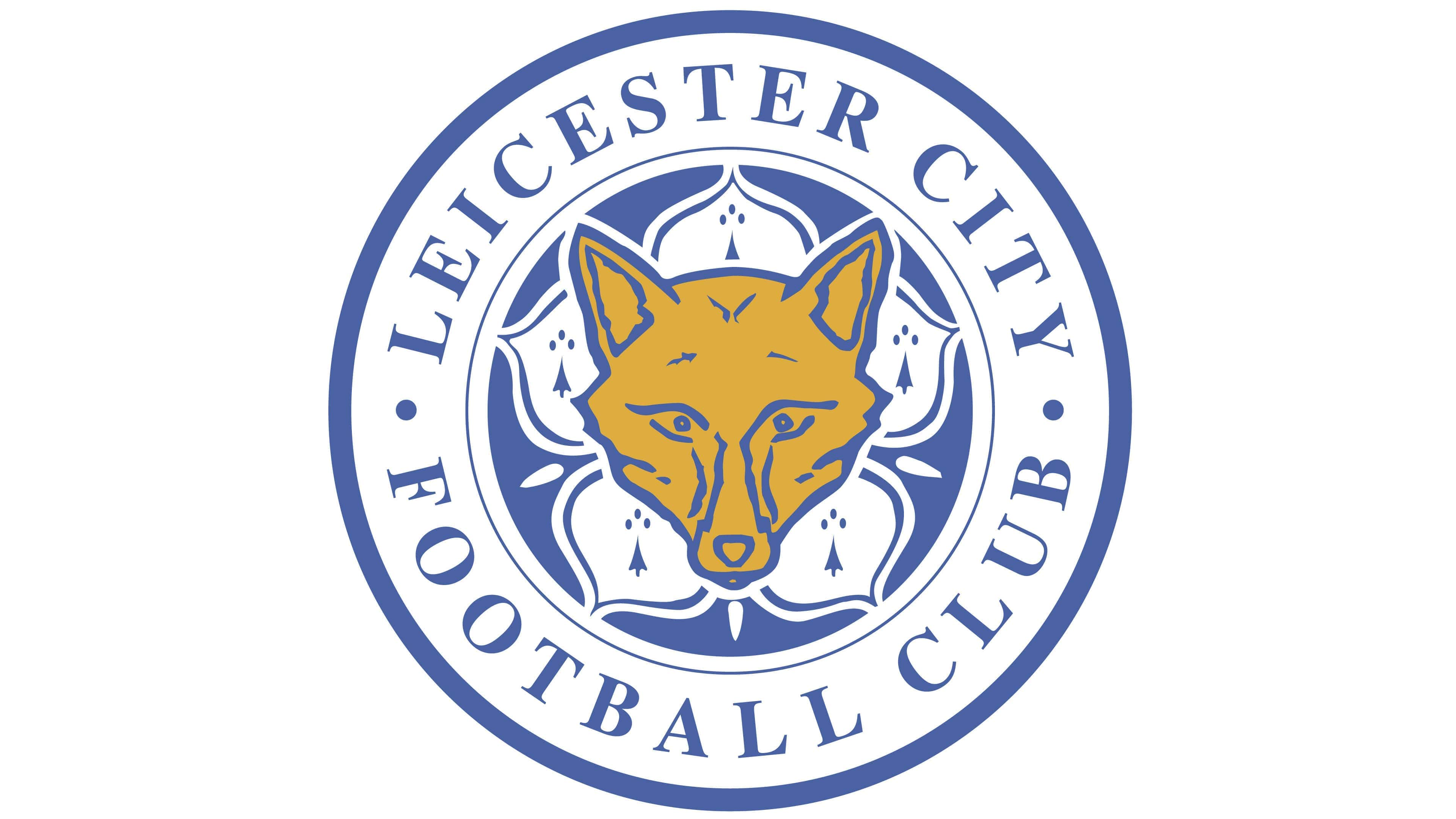
The logo we all know today was designed for the club in 2010 and fully repeats the anniversary one, just without a ribbon and with the old, bright, color palette. The “Leicester City Football Club” is back and executed in a custom serif typeface with sleek sharp lines.
The Leicester City logo is perfectly balanced in terms of thickness of the lines and intensity of colors. It reflects the team’s professionalism and value of its heritage shows the club as a reliable and loyal one and evokes a sense of trustworthiness.
Symbol
If we take a look at the Leicester City Football Club logo adopted around 1946-1948, we will see a side view of a fox. While that was the first time the animal made its appearance on the club’s badge, it has never left the logo ever since.
On the 1948 logo, the fox is pink with the red outline, while on the 1950 emblem it grew gold. The lettering and the shield outline were also gold.
Emblem
In 1972, the club adopted a roundel emblem featuring a comparatively realistic brown fox, which was encircled by the name of the team in blue. The frame was also blue.
The following logo unveiled in 1983 looked refreshingly minimalistic – just an outline of a fox creeping inside a blue circle frame.
In the 1992 logo, the fox’s head was placed inside the flowering plant Cinquefoil. Since then, the emblem hasn’t changed that much, although there’ve been a couple of subtle modifications.
Colors
![]()
The current FC Leicester City logo is dominated by yellow and a muted shade of blue, while white is used as a secondary color. Various shades of blue have been used on the logo since at least 1946, while yellow or gold has also been present on most of the club’s emblems since the 1940s.
![]()
Leicester City Colors
BLUE
HEX COLOR: #003090;
RGB: (0,83,160)
CMYK: (98,75,4,0)
PANTONE: PMS 7685
GOLD
HEX COLOR: #FDBE11;
RGB(253,190,17)
CMYK: (1,27,99,0)
PANTONE: PMS 7408


