

![]() Rayados Logo PNG
Rayados Logo PNG
Rayados, which is translated from Spanish as “The Striped-Ones”, is the nickname of the professional football club from Mexico, Club de Futbol Monterrey. It was established in 1945, and today is one of the strongest teams in Liga MX, the top-tier football league in Mexico.
Meaning and history
![]()
Rayados stands for “Striped” in Spanish, and this name was given to Club de Futbol Monterrey by their fans due to the blue and white striped uniforms of the players. The nickname got stuck since the very first days of the club’s history, and today, more people across the globe know it under its nickname, rather than the full official name.
Today the club, established in 1945, is owned by FEMSA, Fomento Económico Mexicano, S.A.B. de C.V., a large Mexican corporation, engaged in the production and distribution of beverages. The Rayados play on the Estadio BBVA and are managed by Victor Manuel Vucetich, a former football player.
What is Rayados?
Rayados is the nickname of one of the strongest football clubs in Mexico, Club De Futbol Monterrey, established in 1945, and by 2022 is one of the most titled clubs in its country. The nickname Rayados was given to the club because of its striped uniform.
In terms of visual identity, Rayados have always been loyal to the blue and white color palette, and have been using the same design concept since 2000, with the main element taken from the badge, created in 1991.
1950 – 1960
![]()
The original logo of the Club de Futbol Monterrey featured a blue and white composition with a contoured football ball drawn above the blue mountain with the “Monterrey” tagline in a bold script font. The “Club de Futbol” inscription was written across the all in a heavy and sharp serif font with some of the bars slightly flared.
1960 – 1970
![]()
The redesign of 1960 introduced a fully rethought badge of the American football club. It was a crest with a rounded bottom part, a white and sky-blue vertical striped pattern, and a brown-orange football drawn on the bottom of the crest. The top part of the logo featured a solid black banner with a stylized extended white “M”, and a lightweight sans-serif inscription white, written above and under the banner.
1970 – 1991
![]()
In 1970 the Club de Futbol Monterrey badge was redesigned again, with the concept taken from the previous version, but the new color palette, composed of bright blue and white, and different striped patterns, with some thin lines, added to the thick ones. The football was also redrawn and enlarged.
1991 – 2000
![]()
In 1991 the Rayados started using a very modern and minimalistic badge, composed of an enlarged extra-heavy capital “M” in color blue, placed above the title case “Monterrey” lettering in a traditional sans-serif font. The inscription was executed in the same shade of blue as the emblem, which made the badge look very balanced and stable. This version of the badge stayed active for almost ten years.
2000 – 2003
![]()
The first version of the current Rayados logo was introduced in 2000 and stayed unchanged for three years. It was a classic crest with three thick vertical blue lines, two white ones, and a heavy blue “M” outlined in white and placed across the stripes. The letter repeated the contours of the character from the previous version. The crest featured a voluminous gray outline and was accompanied by a small solid blue five-pointed star, signifying the win of the club.
2003 – 2009
![]()
In 2003 Rayados got another win to celebrate, and it was reflected in their logo, in the shape of one more blue five-pointed star, placed above the crest. As for the crest itself, it got the contours cleaned and refined, with the gray outline removed, hence the logo started looking fresher and more professional.
2009 – 2010
![]()
The third star was added to the Rayados badge in 2009. Not the logo started looking more complete and balanced. Another small change, made during this redesign, was in the color palette — the blue got deeper and brighter, getting some purplish hues, and this made the logo look more powerful and energetic.
2010 – 2011
![]()
In 2010 Club de Futbol Monterrey won another championship, and the fourth star was added to the composition. Apart from another star, there were several more changes made to the Rayados badge: the color palette got a bit muted, with the calmer and lighter blue; the “M” became even bolder, which made the white outline of the character extra-thin and almost invisible.
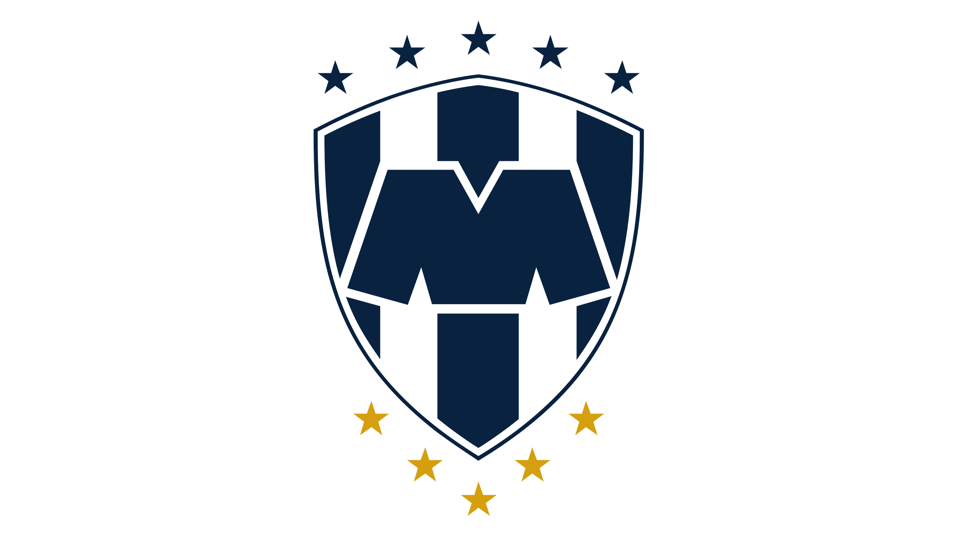
2011 – Today
![]()
The fifth championship was won by Rayados in 2011, and the fifth star was added to the club’s badge in the same year. But this time it was a golden star, which got placed not above, but under the crest. The shade of blue on the logo became dark and deep, close to Navy blue, and in this new palette, the crest of the club started looking sleek and professional.
Font and color
The primary badge of Rayados, or Club de Futbol Monterrey, has no lettering on it, just one stylized hand-drawn character — a capital “M”, executed in extra heavy bars with clean contours and straight cuts of the lines.
As for the color palette of the Rayados’ visual identity, since the very beginning of the club’s history it was based on blue and white, with the gold element, added to the composition in 2011. Blue and white are the colors of masculinity and confidence, which also evoke such feelings as reliability and determination.


