

![]() Lazio Logo PNG
Lazio Logo PNG
Meaning and history
![]()
Almost all the twenty logos the Lazio has gone through over its 120-year history featured an eagle of some kind. The reason is perfectly simple – the team’s nicknamed Le Aquile (The Eagles).
The visual identity of the Italian football team can be split into two main periods — from 1900 to 1925 when it was a “Societa Podistica”, which is a multi-discipline sports club; and from 1925 until today, when the “SS” lettering appeared on the logo, standing for “Societa Sportiva”.
The main element of the Lazio club logo, and Eagle, has left the visual identity of the club only four times, being there since the first days of its foundation. The bird symbolizes courage and freedom, and it also reflects the fighting spirit of the team, as it was a totem-animal for all the Roman warriors and legions.
1900 — 1914
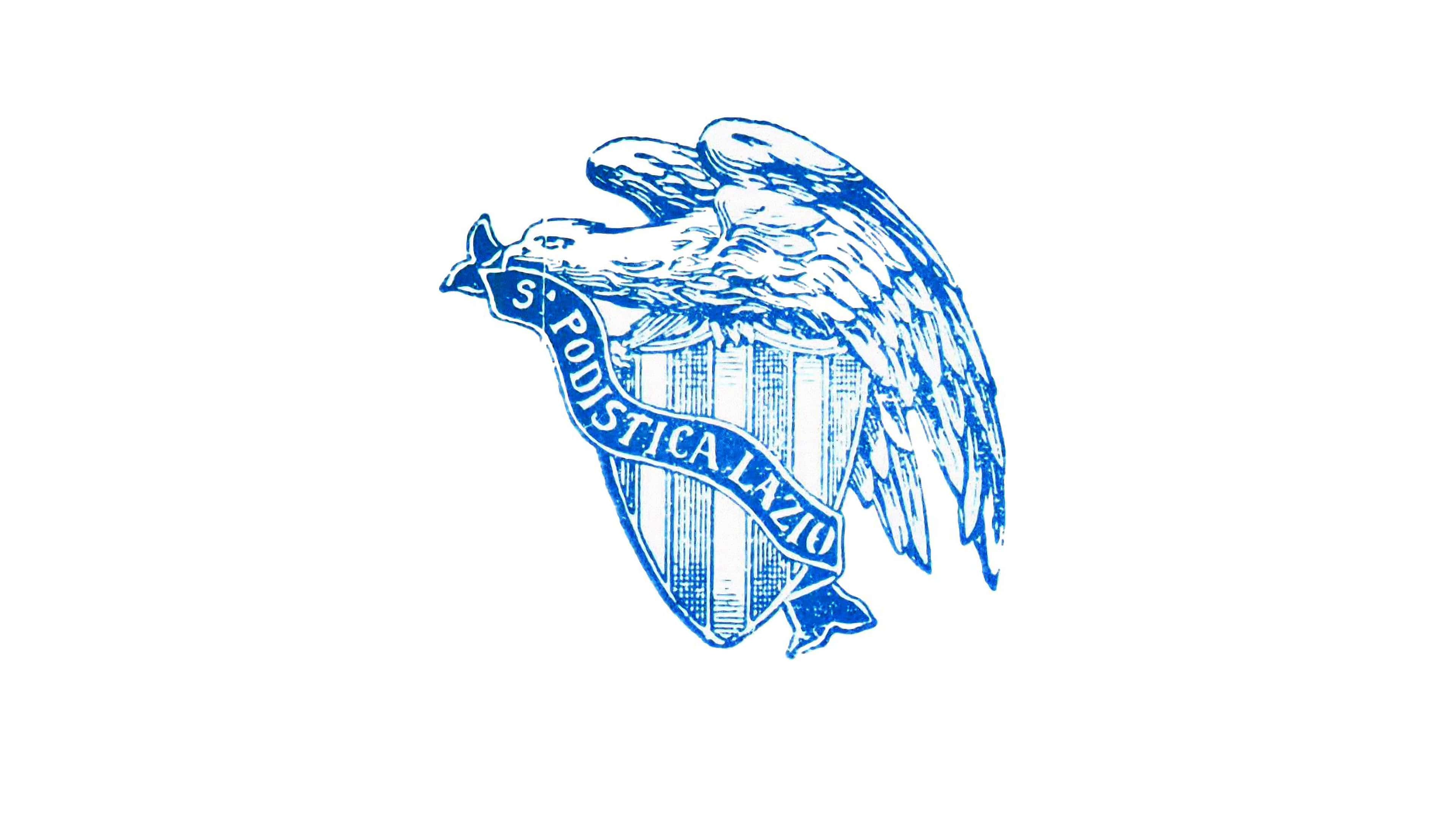
The original Lazio logo was executed in a blue and white color palette and drawn with precise attention to details. It was composed of a triangular shield with a vertical stripes pattern and a huge eagle, sitting on top of it in profile, facing west. The eagle was holding a blue ribbon with a white wordmark in its beak.
The ribbon was curved diagonally on the shield and comprised an “S. Podistica Lazio” inscription in an old-style serif typeface.
It was classy and traditional elegant and sharp logo design, which stayed with the club for 14 years.
1914 — 1921

In 1914 the logo has changed its composition, but the main elements and color palette remained. Now the stripes shield was enclosed in a thick circle and the eagle was flying in the middle of it, with its wings spread to the sides. The “Societa Podistica Lazio” inscription was placed around the frame’s perimeter, and the “Roma” wordmark was written on a rectangular banner under the flying bird.
1921 — 1925
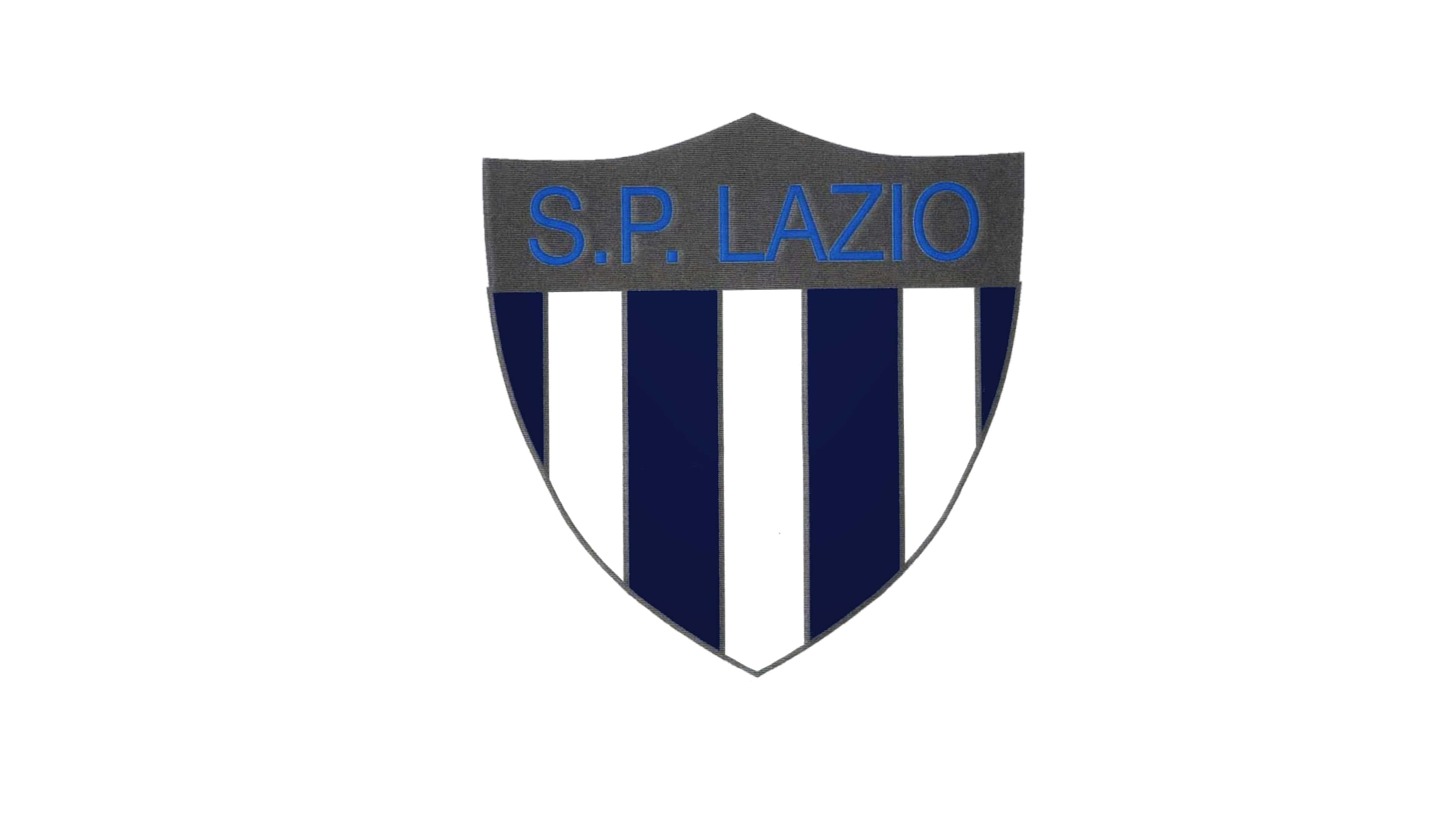
The logo was simplified in 1921. Now it was a clean minimalist shield with four vertical deep blue stripes and three white ones. The top part of the emblem was executed in metallic gray and comprised the blue “S. P. Lazio” lettering in all capitals. No eagle was added to this version.
1925 — 1940

In 1925 the name of the club was changed to “Societa Sportiva Lazio” and it was reflected on the logo’s new design. The blue and white color palette from the original version remained unchanged, so did the stripes shield, but the ribbon turned into a strict bold diagonal banner with the “S. S. Lazio” nameplate in all-caps in it. The middle vertical stripes were replaced by a column.
1940 — 1941
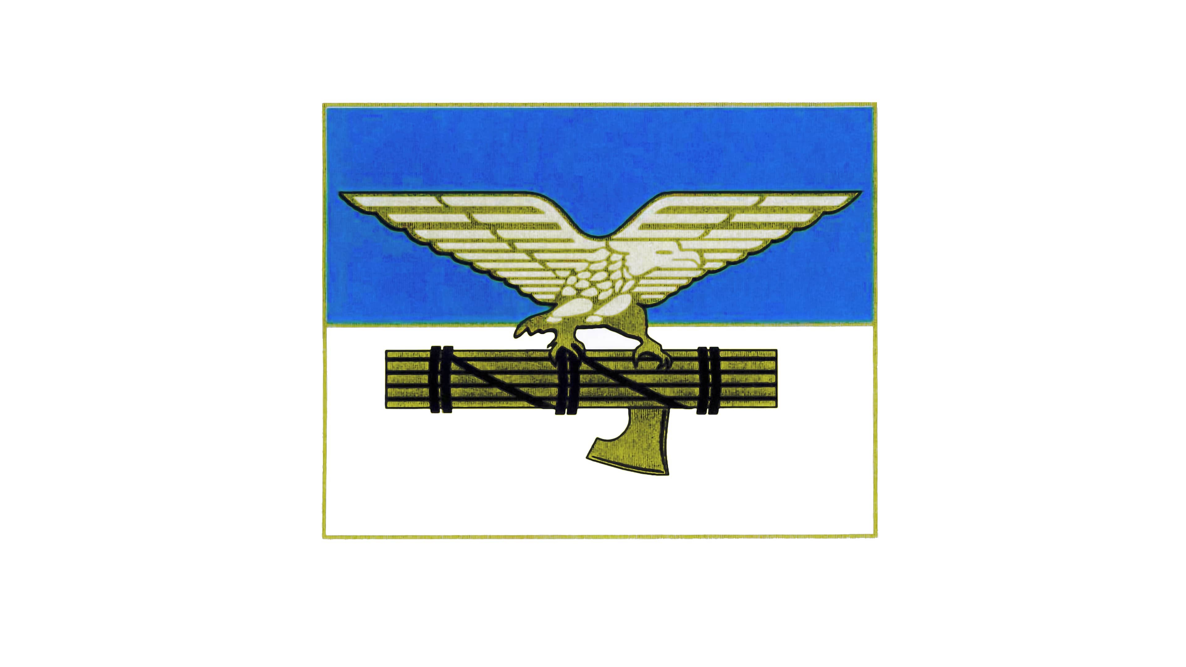
The eagle came back to the Lazio emblem in 1949x now the shield was removed, and the logo was composed of a rectangle, horizontally divided into two equal parts — blue and white. The bird in gold was placed in the middle of a rectangle and was sitting on a horizontal wood column with a hammer attached to it.
1941 — 1943
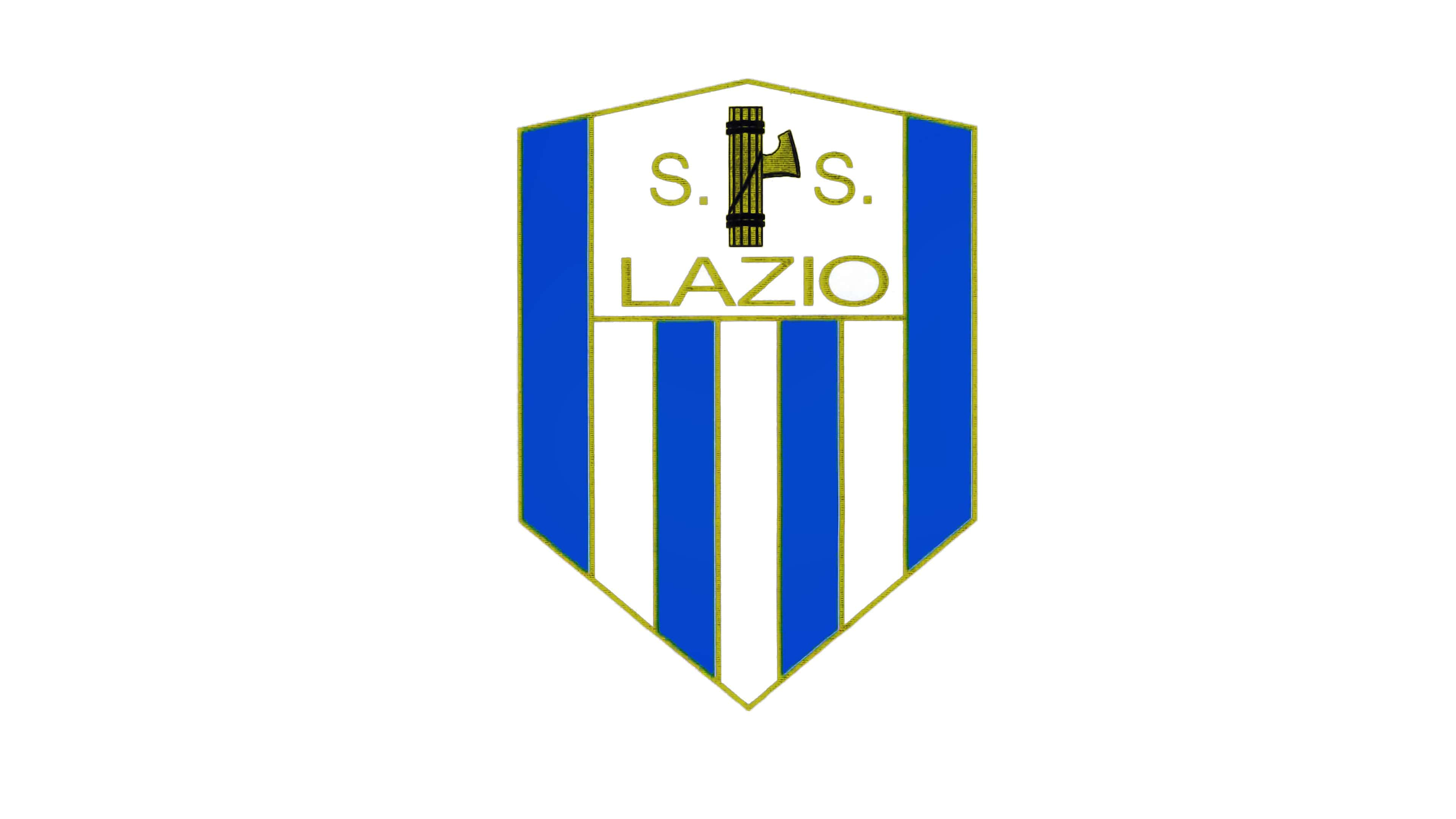
The version of 1941 brings the iconic shield shape back but removes the eagle again. Now the striped blue and white shield is executed in a cleaner and more geometric manner and has its inscription in thin gold letters and a golden hammer placed on a white background on the top part of the shield.
1943 — 1958
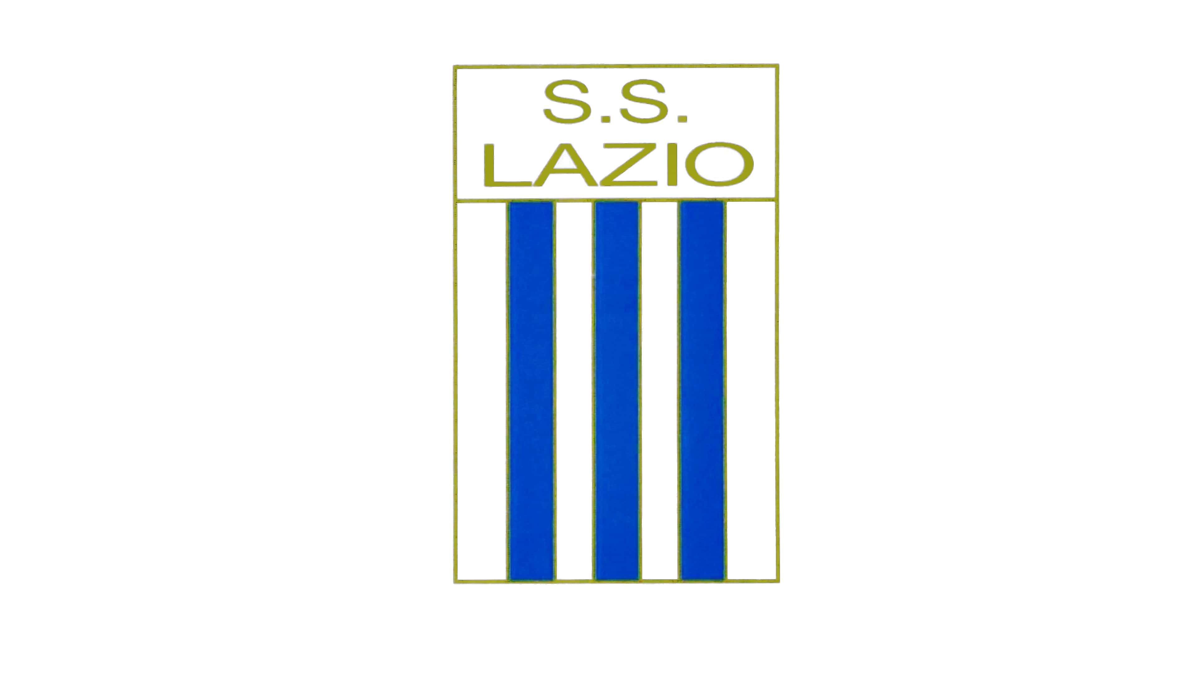
In 1943 the simplified version of the visual identity was designed: the vertically located rectangle features three vertical blue stripes and four white ones, and a solid white rectangle in its top part, where the “S. S. Lazio” inscription in all capitals of a delicate and simple sans-serif typeface is placed.
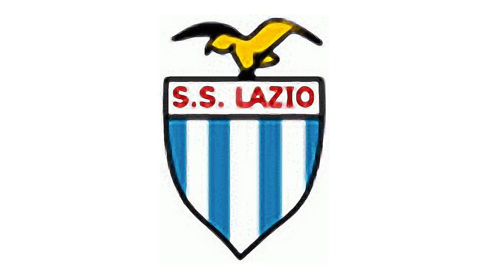
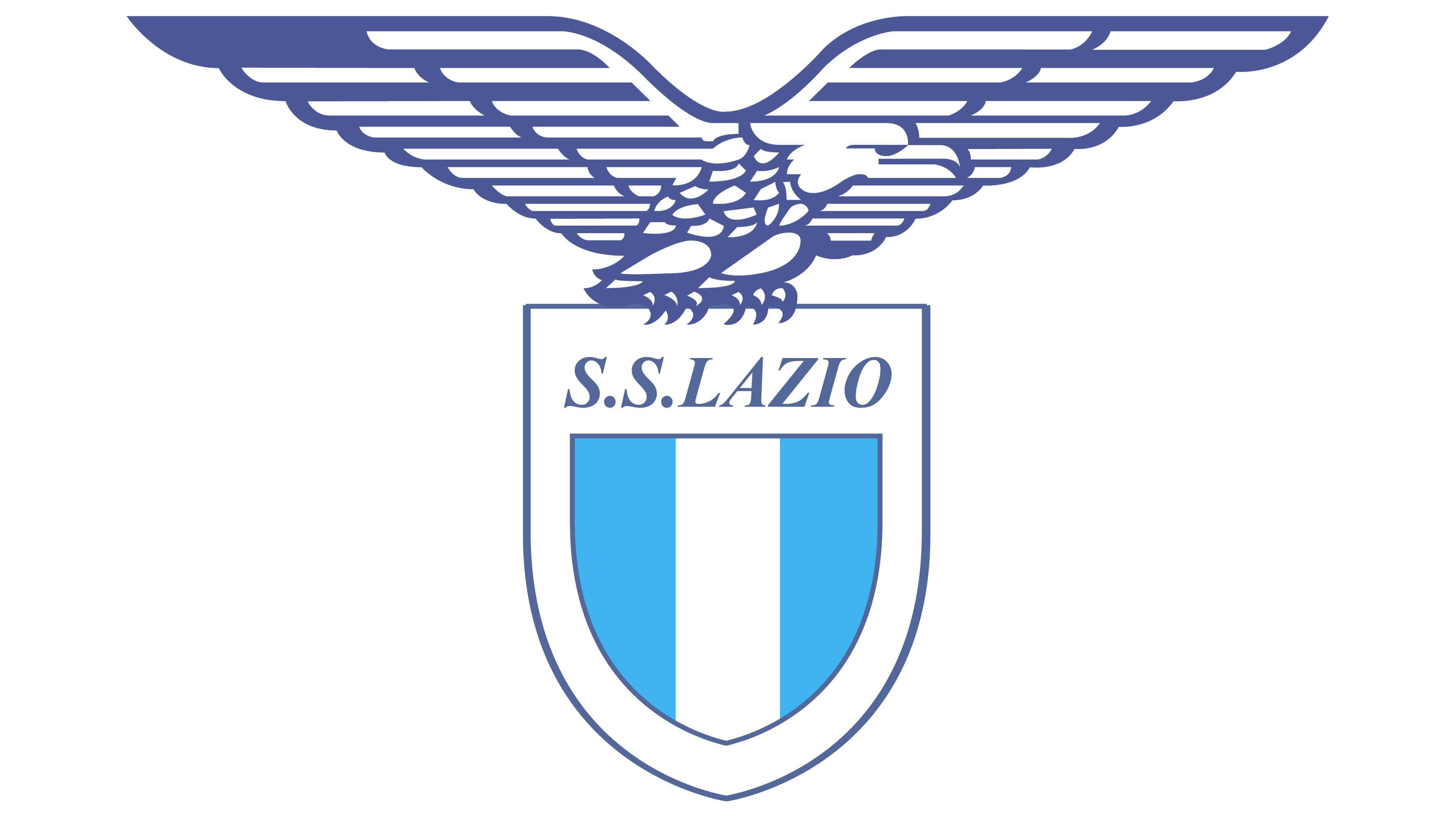
1958 — 1960

In 1958 the eagle comes back to stay. Executed in golden line with its wings spread to the sides, the bird sits on top of the striped shield. The wordmark uses the same color as the eagle and is written in one line on the top of the crest.
1960 — 1961
The logo is being redesigned again in 1970. The color palette switches to brighter and lighter shades and the red color appear in the scheme. Now the red lettering is placed on a white bag round, right under the smooth stylized image of the bird.
1961 — 1962
The emblem from 1961 featured a smooth shield vertically divided into blue and white parts, with the black “SS” lettering on top. The left sky blue half has a bold white diagonal with a delicate black outline, while the right part boasted an image of the golden eagle on top and the yellow football with the “1900” inscription above it.
1962 — 1963
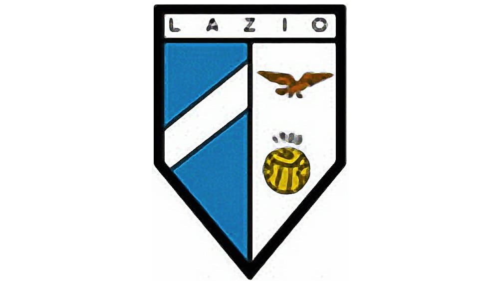
The same composition was used in 1962 but enclosed in more geometric and strict crest shape. The “S.S.” wordmark was replaced by the “Lazio” in all capitals. It was a sharp and stylish logo, reflecting the strong character of the club.
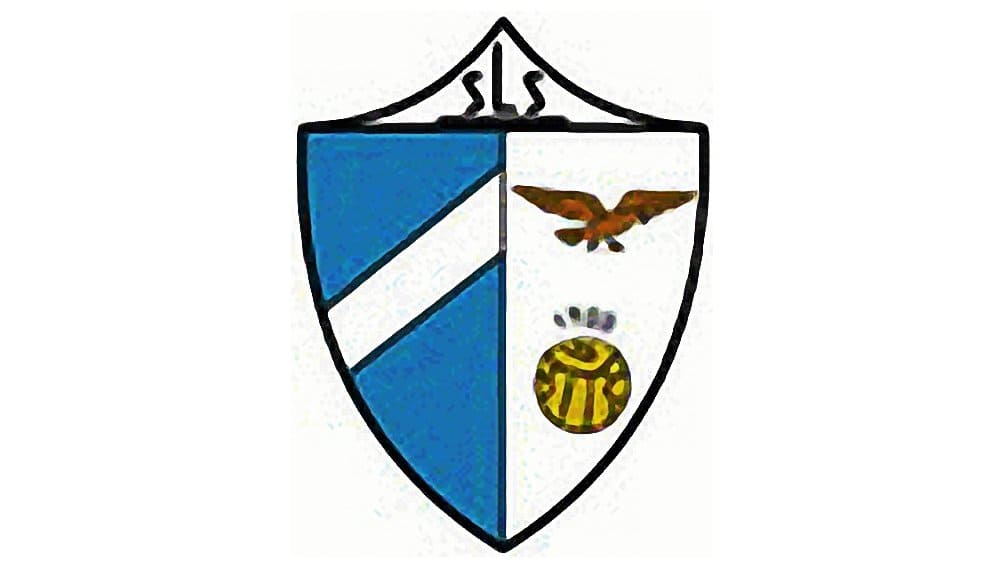
1963 — 1973
The logo, created in 1963 stayed with the club for another ten years. It was a smooth rounded crest, pointed at the bottom, and flattened at its top. The crest was colored sky blue and was diagonally split into two parts by a white line in a black frame. In the left part the golden eagle was placed, the in the right one — the football.
1973 — 1979
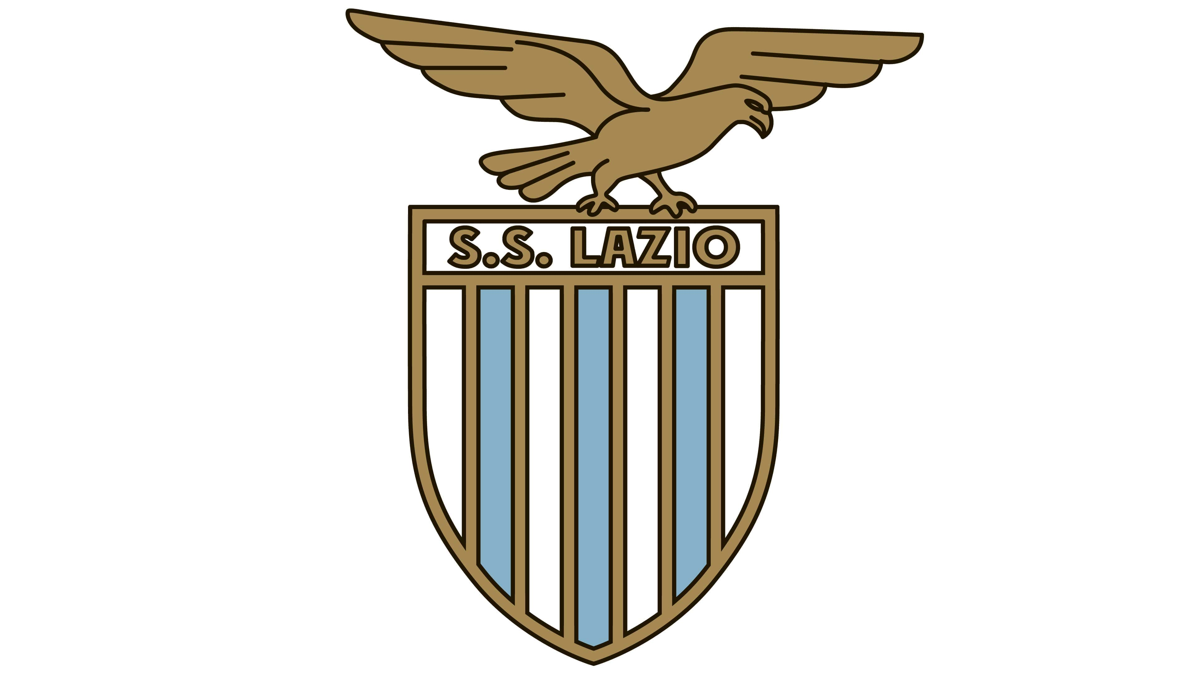
The big gold eagle was placed above the shield again in 1973. With this redesign, the club came back to its visual identity from the 1950s but made it more modern and powerful. The shield now featured six stripes in blue and white, each of them were outlined in a darker shade of blue. The “S. S. Lazio” lettering was executed in the same color, in a classy serif font.
1978 — 1979

The completely new style came to the Lazio visual identity in 1978. It was a modernized blue eagle placed inside a white hexagon with rounded angles. The bottom part of the hexagon was colored sky blue, resembling water. The “Lazio” inscription in a custom sans-serif with rounded lines was drawn in dark blue and placed above the eagle’s head.
1979 — 1982
![]()
The redesign of 1979 kept the blue and white color palette of the previous visual identity version, but modernized the badge and simplified it. The smooth abstract image of an eagle flying to the left with its wings spread was drawn on solid and striped fragments and accompanied by a bold blue “S. S. Lazio” wordmark in a title case of a traditional sans-serif typeface.
1982 — 1987
![]()
The stylized eagle from the 1978 badge was brought back as the only element of the Lazio visual identity in 1982. The image was enlarged and emboldened, drawn in a deep intense blue shade on a white background with no additional lettering or framing around. It was a very modern and strong badge that stayed with the football club for a little less than five years.
1988 — 1993
In 1988 the club brings back its emblem from 1973 but in a new blue and white color palette. The contours of the crest became bolder and more distinct, while the gold eagle turned blue.
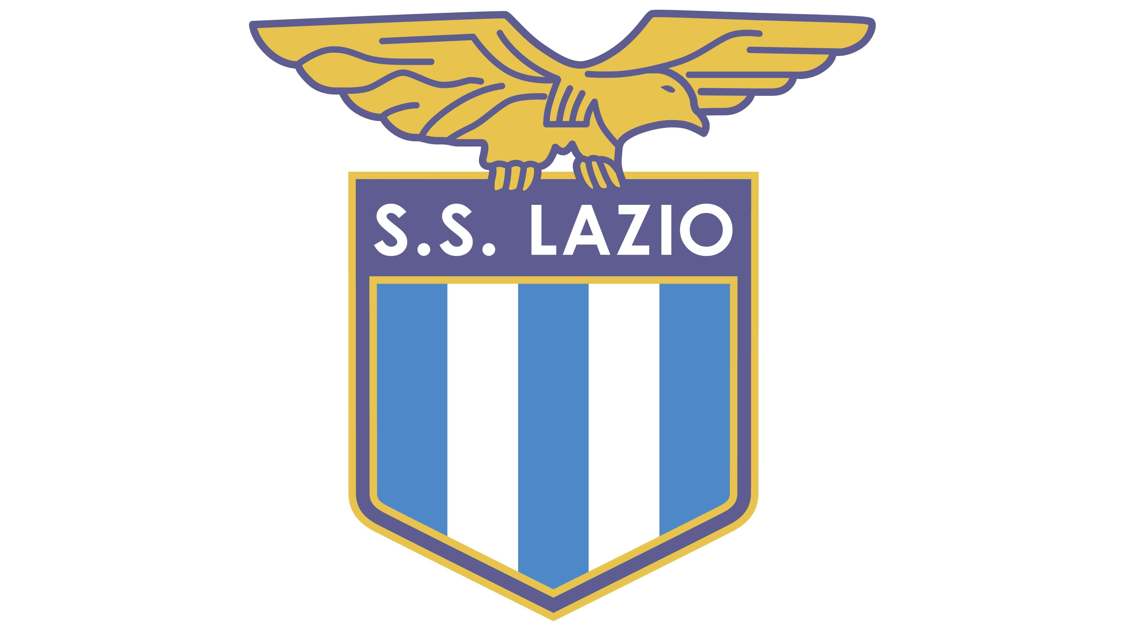
1993 — 1998
The logo design introduced in 1993 stayed with the team for another five years and has the same “eagle-on-crest” composition, but with modified lines and color palette. The yellow gold-tone returned to the bird, while the outline of the shield became purple and yellow. The number of vertical stripes has been reduced to three for blue ones and two for white ones.
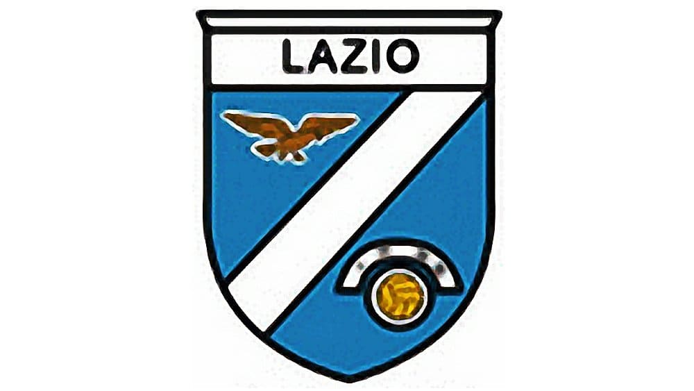
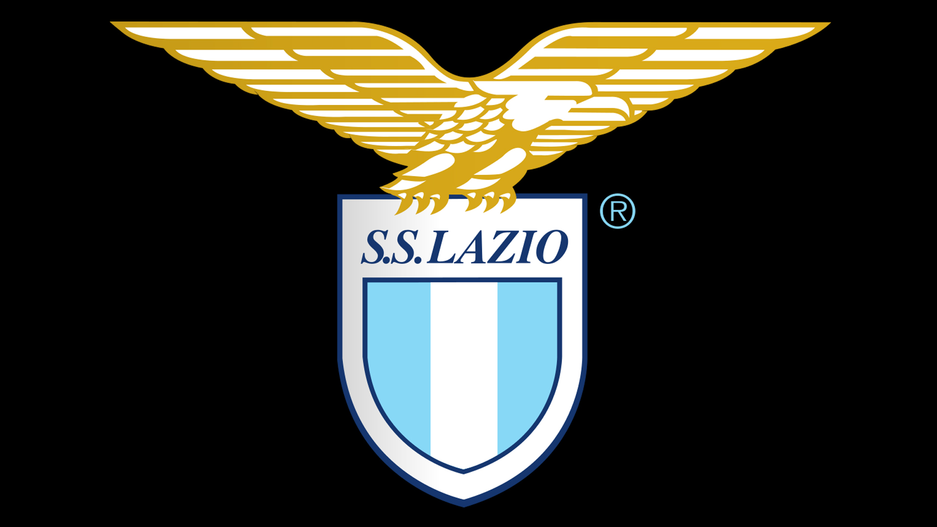
1998 — Today
![]()
The Lazio logo we all know and love today was designed in 1998, basing on several previous versions. It is composed of a smooth white shield in a thin blue outline, with the italicized “S.S. Lazio” inscription in a serif font on top. The middle part of the shield features the same shape and outline and is composed of three thick verticals stripes — two in light blue and one white.
The eagle is golden again, its enlarged spread wings are strong and clean, reflecting power and courage.
For its 100-years anniversary, the club designed a new logo, which repeats the main official version, but has a cursive “100” in white and gold on it and a gold horizontal line under the crest, where the dates “1900-2000” are written in white.

![]()
Lazio Colors
SKY BLUE
PANTONE: 2975 C
HEX COLOR: #87D8F7;
RGB: (135, 216, 247
CMYK: (42, 0, 1, 0)
WHITE
PANTONE: P 1-1 C
HEX COLOR: #FFFFFF;
RGB: (255, 255, 255)
CMYK: (0, 0, 0, 0)
DARK BLUE
PANTONE: 3597 C
HEX COLOR: #15366F;
RGB: (21, 54, 111)
CMYK: (100, 89, 29, 15)
GOLD
PANTONE: 2007 C
HEX COLOR: #D7A819;
RGB: (215, 168, 25)
CMYK: (17, 33, 100, 1)


