LAZ (Lviv Automobile Factory) is a Ukrainian company specializing in the production of buses and trolleybuses. Founded in 1945, the company is located in Lviv, Ukraine. LAZ has a diverse portfolio of urban, suburban, and intercity buses, supplying both the domestic market and various countries around the world. Once a giant in its sector, the company has faced challenges over the years but remains an important player in the Ukrainian automotive industry.
Meaning and history
LAZ, short for Lviv Automobile Factory, was established in 1945 in Lviv, Ukraine. Originally involved in repairing military vehicles, the company pivoted to bus manufacturing and quickly made a name for itself in the field. Among its significant milestones are the introduction of innovative bus models like LAZ-695 and LAZ-4202, which gained prominence for their design and functionality. The company has expanded its reach by exporting to various countries, including Russia, Poland, and even as far as Cuba. However, LAZ has faced economic challenges, including bankruptcy filings. It is working on modernization and seeks to reclaim its market position.
What is LAZ?
LAZ, or Lviv Automobile Factory, is a Ukrainian company known for manufacturing buses and trolleybuses. Founded in 1945 in Lviv, the company has a long history of producing a range of vehicles, from urban to intercity buses. Although it has faced financial difficulties, LAZ remains a noteworthy player in the Ukrainian automotive sector.
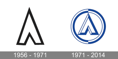
1956 – 1971
The first logo of the company was extremely minimalistic and simple. It was done in white with a black accent and typically placed against a white background. The logo consisted of only the first initial of the brand’s name. It was a Russian uppercase letter “L” and the designers used a sans-serif font. The rather thick white stroke, black border, sharp corners and top of the letter create an image of a determined and strong company. There were no other elements.
1971 – 2014
A more enhanced and colored emblem was presented fifteen years after the earlier version was introduced. The Russian letter “L” was still the center element, but it looked significantly different. Besides replacing black with blue, the designers made this letter three-dimensional, which gave the logo a more professional appearance. A good impression was also achieved by adding a round border. The latter consisted of two lines – white and blue. To add interest, they cut the border in half vertically and flipped the colors, so the white flowed into blue and blue got replaced by white. This interestingly designed border also added dynamics and created a more finished look.


