Kotex is one of the most recognizable and favorite feminine care brands in the world. Kotex was launched in 1920 by Kimberly-Clark, a consumer products corporation with its presence in more than 80 countries.
Meaning and history

The new product appeared on the market in 1920 and immediately became popular, largely due to a successful advertisement in a housewives’ magazine. Cellulose was used as an absorbent in hygienic products.
The name Kotex® comes from the combination of two words, — “Cotton” and “Texture”. The first Kotex packages were pristine white, without any identifying marks. But in 2000 a rebranding took place, an advertising campaign called “Red Point” was launched, and boxes of Kotex blossomed with bright red flowers — gerberas, chrysanthemums, orchids and scarlet butterflies.
What is Kotex?
Kotex is the name of an American brand of intimate hygiene products for women, which was founded in 1920 and is now owned by Kimberly-Clark. The Kotex brand is one of the world leaders in its segment.
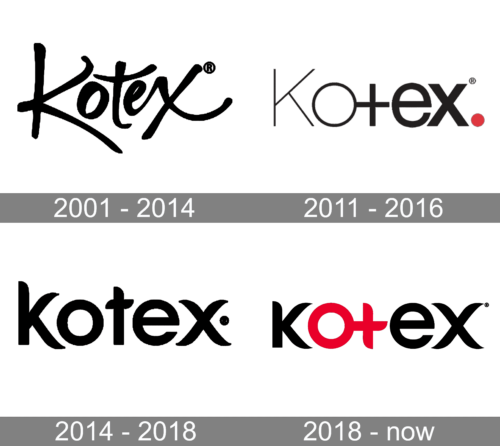
2001 – 2014

Originally, logo was a collection of hand-drawn black letters making up the word ‘Kotex’. It was a very artistic and disproportionate display, which made it altogether pleasant.
2011 – 2016

In 2003, they opted instead for a stricter approach. It’s still the company’s name, except it’s written with more mundane letters. Except for a perfectly round ‘o’ and a cross-like ‘t’, they are just simple serif letters with gradually increasing boldness. The final touch is a little dot in a shape of a red circle on the word’s right.
2014 – 2018
The Kotex logo is an example of minimalistic approach to design. A wordmark in bold custom typeface and a monochrome color palette — that’s it. But it looks really stylish and sharp.
The letter lines are elegant and at the same time playful, the letter “T” looks a little shy, standing between confident “O” and “E”.
Being place on the packaging, the Kotex logo is usually complemented by a red graphics — a lipstick or a flower, with gives it a fresher and more contemporary look.
The Kotex brand combines design and technology and supports women in their constant striving for femininity. The brand won when moved Kotex out of the sanpro segment, making it more about personal care and joy of being female.
2018 – Today

In 2018, they simply repainted the second and the third letters in the previous design red.
Font and Color
The sleek and stylish lowercase lettering from the primary logo of the Kotex brand is set in a custom stylized typeface with sharpened elongated lines of the bars. The closest fonts to the one, used in this insignia, are, probably, Danube Pro, or Yaro Cut Bold, but with some significant modifications of the contours.
As for the color palette of the Kotex visual identity, since the beginning of the 2000s it has been based on the combination of red and black, with white used for the background of all the packages. This tricolor is considered to be the most stylish and distinctive, where black stands for confidence and strength, white — for reliability and trustworthiness, and red symbolized the diminish side of the product and its purpose.


