

![]()
Korn Logo PNG
Korn is an iconic American metal-band, which was created in 1993 by three musician playing in L.A.P.D. group, in California. During its history, the band earned two Grammy awards and numerous of other significant prizes in music industry.
Meaning and history
![]()
1994 – Today
![]()
When the band was trying to make up the name, someone offered “corn”, the musicians started playing with the word and decided to replace “C” with “K”. As some of the band’s members worked for a retail company “Toys R Us”, they borrowed the idea of a mirrored “R” from them. That is how the KoЯn name appeared.
The KoЯn logo was designed by the band’s frontman, Jonathan Davis, who just took a crayon and draw it in one minute. The logo stuck and remained untouched During the whole band’s history.
The custom typeface of the KoЯn logo was imitated by Astigmatic One Eye studio in their Kornucopia font. The childish lines of the letters make the nameplate instantly recognizable.
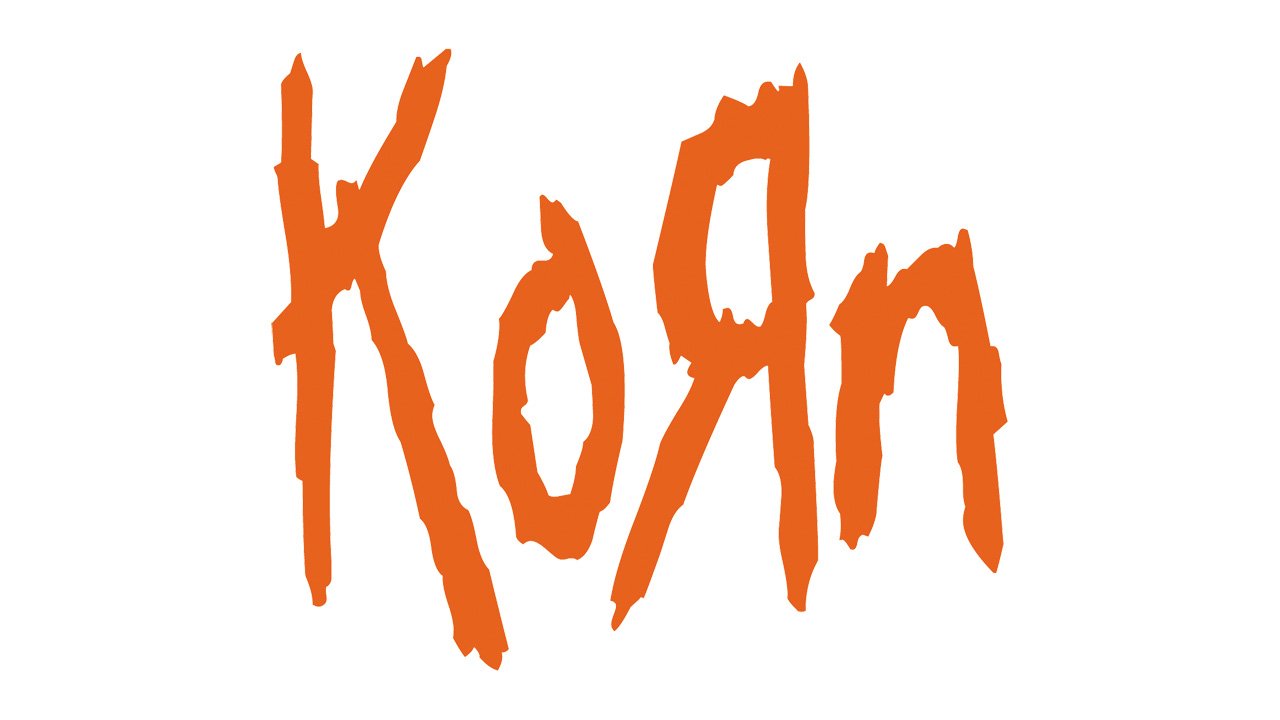
The band’s logo color palette usually features monochrome combination, but sometimes it is executed with the use of a Scarlett red color, which makes it more powerful and evokes a sense of endless energy.
The KoЯn logo is very strong and confident despite the chaotic and amateur lines of its typeface. It looks really stylish and timeless, creating a perfect reflection of the band’s style and approach to music.
1996
![]()
The Korn logo from 1996 was a designer interpretation of the iconic badge, created in 1994. The contours of the blurred inscription were slightly extended and sharpened, but the overall style and execution remained the same. This version of the logo was only active for several months.
Font


