Korail (Korea Railroad Corporation) is South Korea’s national railway operator, owned by the government. Established in 1963, it’s responsible for railroad construction, maintenance, and train services, including the famous KTX high-speed train. Operating primarily in South Korea, Korail also provides international services to destinations like Russia and China. With over 20,000 employees, it is a significant part of South Korea’s public transportation infrastructure.
Meaning and history
Korail, or Korea Railroad Corporation, was founded in 1963 as South Korea’s national railway operator. It is owned by the South Korean government and has played a key role in the country’s transportation landscape. Among its major achievements are the launch of the KTX (Korea Train Express), a high-speed rail service, and the integration of various rail networks across the country to offer efficient and reliable services. Korail doesn’t just operate domestically; it also provides international services connecting South Korea to Russia and China. Currently, the corporation employs over 20,000 people and continues to be a major player in public transportation in South Korea, while also contributing to environmental sustainability through greener travel options.
What is Korail?
Korail is South Korea’s national railway operator, established in 1963 and owned by the government. It manages a variety of train services, including high-speed, freight, and international routes. The corporation plays an essential role in South Korea’s public transport infrastructure.
1963 – 1994
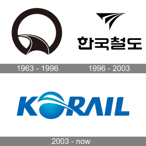
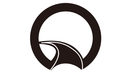
An almost complete black ring served as a frame while a solid black railroad with a thin white line on either side started going from the bottom and curved to the left about halfway up. It is a simple logo that looks timeless and has all the elements to let the viewer know what type of company they are dealing with. The logo was done in white and black. Besides being a classic choice for logos, black also symbolizes formality and power. The white color is a great background that does not distract and often symbolizes perfection.
1994 – 2003
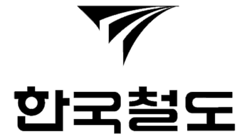
The designers came up with a new symbol for the corporation. It had a triangular shape and depicted a railroad going off into the horizon. Under this symbolic drawing, the logo had “Korea Railroad” printed in Korean. It was slightly longer than the drawing above, which placed more accent on the name. Just like the original, the logo was done in black on a white background.
2003 – now
Besides introducing an English version of their name, the company replaced the black color with blue. The latter is typically associated with trustworthiness and reflects the fact that the company is well-established with a confident position in the market. The logo consists of a wordmark and has the letter “O” replaced by a sphere with a swosh line going through it. The sphere is meant to represent our planet while the swoosh line symbolizes a fast and convenient transfer from one of its ends to the other. The company chose a sans-serif bold font that featured straight cuts combined with cutting edge. The rounded form of some of the ends created a welcoming feeling while adding even more dynamics to the logo.


