Klasky Csupo, Inc. is a Hollywood-based multimedia entertainment animation studio and production company. The company was born in 1982 as the result of the collaboration between producer Arlene Klasky, animator Gábor Csupó, and Attila Csupó. The Nickelodeon’s Rugrats has been often named their best-known project.
Meaning and history
While you can come across about five versions of the Klasky Csupo logo, they all look pretty similar. The company has never dared to replace its familiar and already popular visual brand identity with a drastically new one.
1981 – 1999, 2001 – 2002, 2008 – 2016
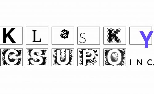
The original logo features a double-line set of boxes each housing a glyph from the company’s name. The boxes look somewhat similar to a frame of a recording, which helps to establish the link between the logo and the sphere where the company works.
Another fun and interesting feature is that many of the letters are uneven and remind of old films. The last “Y” creates a contrast. Not only is it even but, more notably, it is of an attractive violet color. Taking into consideration that the rest of the logo is black-and-white, the letter stands out.
1991 – 2008, 2012, 2021 – present
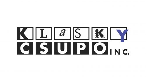
The logo was unveiled in Rugrats. While it may look very much like the original, it has a couple of notable differences.
Most importantly, the legibility of the company’s name has improved greatly. To make the wordmark easier to read, the designers had to sacrifice some of its playfulness and the “film” effect.
In the previous version, the word “Klasky” was almost impossible to grasp at first glance (unless you were already familiar with it). This time, it is was by far easier to grasp, although it still was on the verge of being a random set of letters rather than a single word.
The word “Csupo,” by contrast, started to look so serious that almost nothing reminded of the company’s artistic roots. The lettering “INC.” also grew bolder and slightly better legible.
This version has been used simultaneously with other ones (for instance, it can be seen in the 2016 RoboSplaat!, although other projects of that era feature an updated logo).
2003, 2008, 2016 – present
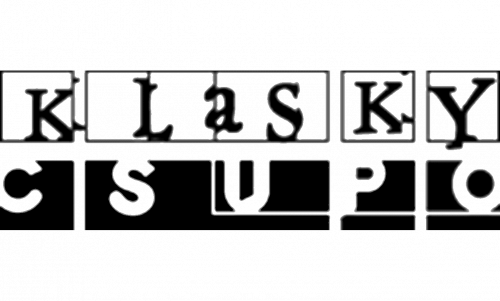
The word “Klasky” has grown bolder and lent some of its playfulness to its “Csupo” neighbor. The writing “INC.” disappeared leaving the design more modern and easier to grasp.
While the Klasky Csupo logo still has a “film” reminiscence and looks playful, we cannot say it could win the first prize in a legibility competition.


