The global chain of family entertainment centers KidZania is headquartered in Cuajimalpa, Mexico, and has around 30 locations worldwide. The number of visitors reaches nine million yearly.
Meaning and history
The Mexican entrepreneur Xavier López Ancona opened the first entertainment center in the fall of 1999.
1999 – 2018
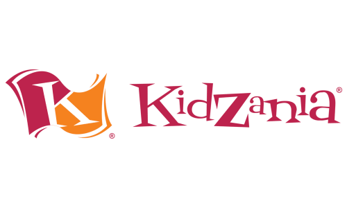
The original KidZania logo already shares much in common with the following one. The most obvious part is the palette. A muted maroon shade paired with a rather dark and soft orange creates an unusual and memorable combination.
The “K” flag is already there, too. Similar to the following logo, the flag is formed by two fields and has a dynamic shape (looks like it is waving). In the original logo, however, the flag has a more intricate and dimensional shape.
The typography is different, too. Here, we can see a playful serif typeface, where each letter has a different size.
There were at least two versions of this logo. In one of them, the flag was positioned to the right of the wordmark. In the other, the flag was placed above, while the wordmark was arched.
2018 – now
This version looks sleeker, flatter, more minimalist, which is totally in line with the design trends of the last two decades.
The type has lost its serifs and was softly italicized. Due to this, there is more motion. More importantly, the slight slope reflects the orientation of the flag, which helps the two parts to better merge.
The flag is flat now due to the disappearance of the “layers” seen along the border.
Font
The glyphs have rather soft ends combining rounded and mildly angular elements. The overall impression, due to the rounded theme, is friendly. The type is neither too heavy nor too light and provides excellent legibility. The letters aren’t very unique, but it’s unnecessary here, as the “K,” the palette, and the flag already provide enough recognizability.
Colors
The palette is among the things making the KidZania logo instantly recognizable. While the shades aren’t overly bright, they still look vivid and optimistic, creating a positive impression.


