Kia is a South Korean automobile manufacturing corporation that was founded in 1944 and was the one to produce the first Korea’s bicycle in 1951. Today, the Kia lineup consists of a huge variety of vehicles in different classes, shapes, and price categories. The company creates crossovers, SUVs, sedans, minivans, and hatchbacks, as well as models for sports and business classes. Among them, there are both ordinary cars with combustion engines and hybrid versions and even full-fledged electric cars.
Meaning and history
KIA Corporation is one of the oldest companies of the Korean automotive era. At the time of its founding, in 1944, the Korean company was called KyungSung Precision Industry. The company’s key focus was individual mobility devices. The company produced components for bicycle technology, in a small facility that was located in present-day Seoul.
In 1952, the company changed its name to KIA Industrial Company. It was, actually, called after one of the bicycle models, manufactured by the company during those years. The combination of these three letters, KIA, has the following meaning – the first syllable KI in KIA means to go out into the world. The second syllable A means Asia. Hence the meaning of the word KIA is interpreted as “to go out of Asia into the world”.
As of 1952, Korea was one of the poorest Asian countries, so bicycle manufacturing was considered a very successful activity. KIA was very popular as a manufacturer of quality bicycles.
In 1955 KIA became incredibly popular and sold a lot of bicycles all over the country. This prompted the company to open a new plant in Shaikhung and start thinking of expanding its activity. This is when the company came to a conclusion about the feasibility of producing motor vehicles, and already in 1957, the first KIA scooter saw the light. It was produced for the local market.
Predicting a huge future for the automobile industry, the Koreans have been focusing on car production since 1960. The first steps were made based on the experience of Japanese manufacturers.
In 1961 the company managed to organize serial production of motorcycles, and already in the next year the first three-wheeled truck was developed, but its serial production was postponed for long 12 years. In 1965, the Korean company entered the U.S. market with its bicycles.
In 1970 the company had almost completely gotten rid of dependence on imports which allowed it to focus on the development of its technology, which eventually led it to even bigger success. In 1971 the Titan and Boxer KIA four-wheeled trucks were introduced to the market. In the same year, KIA changes its name to KIA Corporation and begins collaboration with Japanese concern Mazda, which was already a very reputable player in the Asian automaking market.
Serial production of the first Kia truck was launched only in 1971. But already in 1973, Kia developed its first gasoline engine. And in 1974, the first passenger car KIA Brisa was presented. Brisa became the first exportable Korean car. Kia Corporation begins to produce cars, vans, trucks, and buses.
In 1976, the corporation established several subsidiaries – Kia Service Corp. and Kia Machine Tool Ltd. Subsequent growth was attributed to the acquisition of Asia Motors.
Kia introduced its first diesel engine in its models and also rolled out the Peugeot 604 and Fiat 132 sedans. By the early 1980s, Kia had completely refocused its production on automobiles, and in 1981 it stopped production of motorcycles. At the beginning of the 1980s, there comes a serious crisis in the company, in order to cope with this situation the South Korean company begins an official partnership with Mazda in 1983 and focuses its production on the production of fuel-efficient cars.
In 1987, Kia launched a new model Pride, which was based on the Mazda 121 platform.
In 1990, the company received a new name – Kia Motors Inc.
At the end of the last century, the company plunged into a financial crisis, caused by a sharp decline in sales. The result was the loss of independence: Kia Motors was acquired by the Korean automobile company Hyundai Motor. In 1999, the Hyundai Kia Automotive Group was formed. This has a very significant impact on KIA’s operations – the company begins to move forward at an incredible pace. In addition, Hyundai Motors has got a rich model range and monopoly privilege owned by KIA to supply vehicles to the national army.
In the new millennium, the South Korean brand is actively positioning itself in the arena of the global automotive industry, expanding and updating its model range. The modern stage of the development of the company Kia Motors began with the debut of the model Ria, which took place in 2000.
Since 2001, Kia began to pay more attention to the European market. In the Old World began to deliver small cars Pride and Avella, sedans Shuma II and Clraus II, off-road vehicles Sportage, minivans Carnival and Cares, as well as very popular in Europe station wagon Joice, sports roadster Elan and new Kia Spectra.
Today, Kia Motors Corporation is one of the fastest growing car companies in the world. As part of the Hyundai-Kia Automotive Group, Kia is striving to be among the most popular car brands. Each year Kia’s 12 production plants in eight countries produce more than 1.4 million vehicles sold and serviced through its network of dealers and distributors in 165 countries.
What is Kia?
Kia Motor Corporation, also known as Kia Motors or simply Kia, is a South Korean automobile manufacturer headquartered in Seoul. It is the second largest automaker in the country after Hyundai Motor Corporation, of which Kia itself is a subsidiary. The brand sells about three million cars worldwide each year and owns more than twenty different Hyundai Group companies.
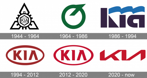
In terms of visual identity, Kia has gone through different stages since its foundation, in 1944. As we can see, the company changed a lot of activities before it started manufacturing cars and its visual identity history shows every significant step of the KIA brand timeline. And the Kia logo history is a depiction of all the main steps for the brand. The only thing that remained untouched in the KIA logo is the presence of the wordmark, but the style and the typeface varied from one redesign to another.
1944 – 1964
The first KIA logo was designed when the company was focused on the manufacturing of bicycles. It was composed of a three diamonds pattern with a gear in the middle. The company’s name was placed inside the gear and framed into another diamond. It was a complicated and strong work for its time. The monochrome palette added a sense of professionalism and authority. This version of the logo was not just a picture of geometric shapes but also carried an important message, namely, it symbolized the unity of engineering and the chemical industry – the gear and the benzene core.
1964 – 1986
In the 1960s the company’s profile changed and KIA started manufacturing licensed cars. The new logo featured a green circle with a diagonal line coming out of it and looking upwards and right. The emblem resembles an upside-down letter Q, but it’s not it. The logo, which appeared on the 20th anniversary of the company, actually combined the first letter of the Korean word standing for the “Automobile industry” and the letter “O” symbolizing the wheel.
1986 – 1994
The Kia logo, which saw the light in 1986, also was very meaningful. The emblem of the 1980s was composed of a symbolic flag with a stylized wordmark, executed in thick bold lettering of a custom typeface, and three waves running through it. Each wave represented one of the Kia corporate philosophies – social development, automotive excellence, and internationalization.
1994 – 2012
The new area of the Kia logo started in 1994. The first version was composed of a horizontally located oval with a wordmark inside. The custom typeface of a wordmark is simple and clear, and the only unique element of the lettering is the absence of the horizontal bar in the letter “A” and a small horizontal stroke, coming to the left from the top of the letter. Despite the visible simplicity of the composition — a wordmark in a frame — this Kia logo also had a strong meaning. The flexible ellipse around the letters symbolizes the globe, which is associated with the firm position of the company in the global market. The new color palette, consisting of red and white, is another important element in the new Kia visual identity. Red is the color of the sun and passionate service to the cause and white stands for purity and loyalty of the brand to its customers.
2012 – now
The redesign of 2012 has refined and enhanced the Kia emblem from 1994, adopting a brighter shade of red and more distinctive lines and contours of the elements. As for the concept, it remained the same, with the stylized wordmark in an oval frame, pointing to the string position of the brand in the international market. The KIA logo from 2012 is an example of minimalist and laconic design, which is stylish and timeless. It has no extras, but the essence of the brand is readable.
2020 – Today
The redesign of 2020 brings a young and futuristic style to the KIA visual identity, by minimizing the elements on the badge, yet keeping the uniqueness and recognizability of the brand.
The new logo is composed of a stylized red inscription, where all three letters are connected with each other, “K” merged with “I” in the top point, and “I” with “A” — in the bottom, and this makes the wordmark look like two Cyrillic letters “КИ”.
The nameplate looks like it has been enlarged and now does not fit in the screen in its whole size. The upper left and bottom right corners are diagonally cut.
At the same time, the new Kia logo looks more sporty and aggressive, showing the “new generation” of the vehicles, produced by the legendary South Korean brand.
The Korean Logo
The most interesting thing about KIA’s visual identity is that the brand has two different logos for international and Korean markets. The logo used in the brand’s homeland is completely different from the one we got used to seeing on the Kia cars in Europe and the United States.
The Korean logo is composed of a blue circle with a thick black outline. Inside the circle, there is a stylized letter “K”, drawn in elegant white lines and standing for the name of the brand. The full wordmark is written around the perimeter of the roundel.
The Emblem
The KIA emblem uses silver metal when placed on the cars. The silver color adds volume and makes it look more sleek and vivid. The KIA emblem looks good and light due to the simplicity of its shape and lines. It is easily complimented with any typeface of the car model name, which is usually placed on the right of the emblem.
Font and color
The Kia logo, introduced in 2020, has a stylized wordmark with no commercial typeface analogs, however, the logo, used by the company since 1994 has a lettering, executed in a font, which can be compared to Posterama Pro 1945 Bold, or CocoBikeR Heavy, with the “A” modified and the small strokes added to the top parts of the characters.
As for the color palette of the Kia visual identity( it is based on two shades — red and white. However, this palette was only adopted in the 1990s. White recalls cleanliness, beauty, and transparency towards customers, while red demonstrates the brand’s determination in matters of development and is part of the company’s slogan “The Art of Surprise”.


