

![]() Kate Spade Logo PNG
Kate Spade Logo PNG
The Kate Spade logo has remained pretty consistent since the brand was founded in 1993. Although it went through an update in 2019, the visual core has been preserved.
Meaning and history
![]()
Kate and Andy Spade founded their brand in early 1993 and named it Kate Spade New York. Today, it is known as a rather popular luxury fashion design house. Since 2017, it has been owned by Tapestry, Inc.
1993
![]()
The original logo featured a tiny black shaded spade above (or, in many cases, below) the name of the brand.
The words “Kate Spade” featured an elegant serif type with pretty traditional proportions. You could notice a couple of unusual details adding a unique touch (for instance, the difference in the width of the diagonal bars of the “k” or the rather small and narrow “s”). All the letters, even the initials, were lowercase.
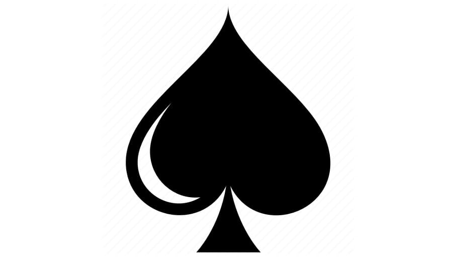
Below the name of the founder, the writing “New York” was placed. While all the glyphs were capitalized here, they were even smaller than the ones used in the previous line.
2019
![]()
While the 2019 logo is heavily based on its predecessor, there is a notable difference. The emblem (which is still a spade) has grown by far larger. It has adopted a more prominent status – in several cases, the emblem can be used instead of the wordmark.
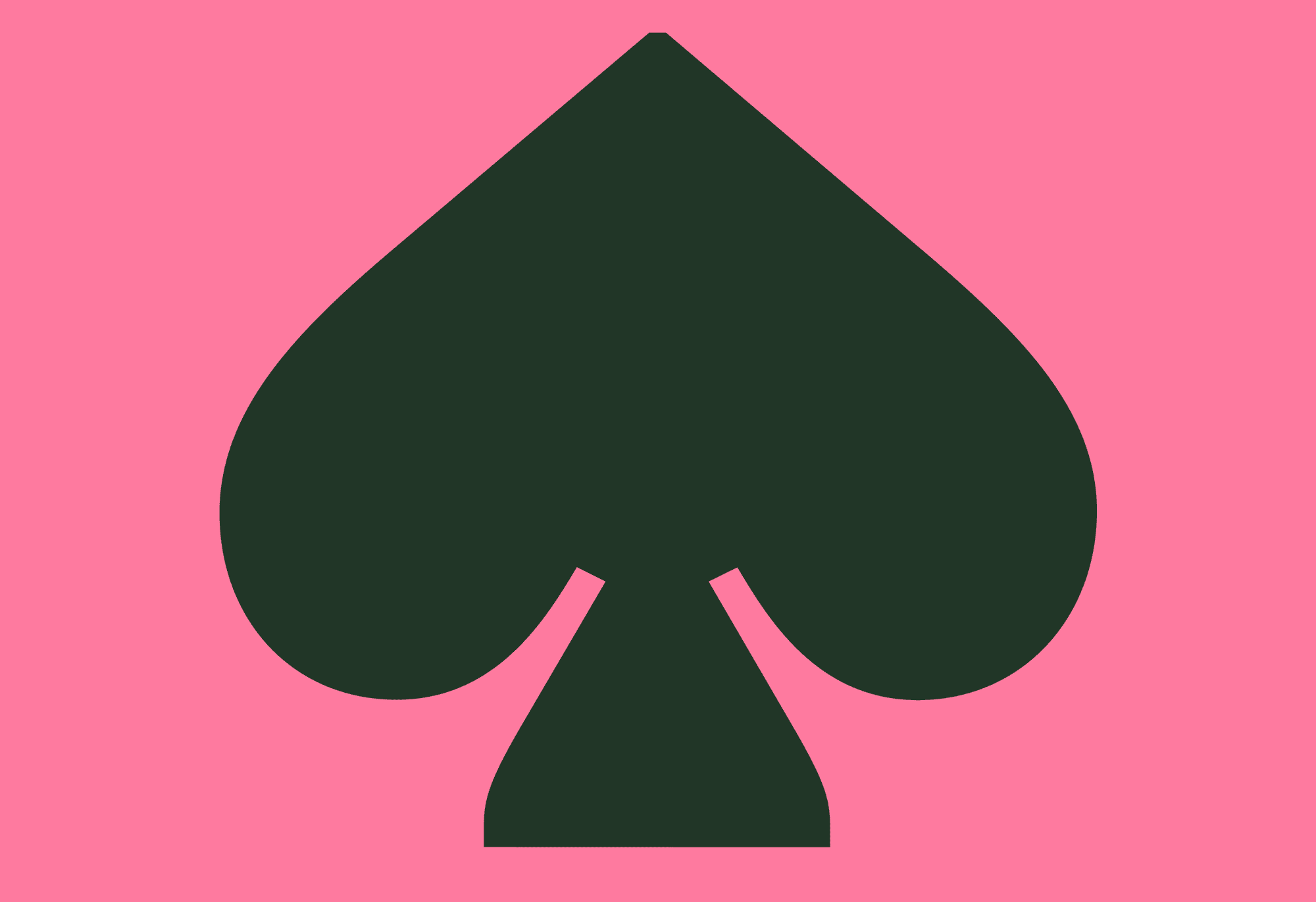
If you take a closer look, you will notice that it is not only the size that has been modified: the new spade has a slightly different shape. The “leg” is now more rounded.
According to the brand’s Instagram, it is “a tonal enamel spade.” To support the updated logo, the company even introduced spades in gold, with faceted elements.
The enamel badge is featured in various shades. The enamel filling is broken down into two parts by a gold line going through the center. The border is also gold.
![]()
The background color of the tag sewn on the clothes is now different, too. The iconic green has been replaced by pink. Introducing the new color, the brand’s Instagram stated: “We call it ‘pink kiss.’”
The new brand identity is reflected in the way the products look, too. The familiar brown handbag dust bags have been replaced by pink ones. Also, the company unveiled bags with a “spade heart twistlock.” To unlock it, you will have to twist the spade upside down.
Colors
While the original Kate Spade logo could be often seen in black and white, the tag featured the letters of the clover green background. The pink tag introduced in 2019 added a feminine or even girlish touch.


