Kaiser is the name of an automaking brand, which was established in the United States in 1945, and ceased all operations already in 1954. The brand was founded by Henry J Kaiser, with the idea of the production of stylish sedans and cabrios.
Meaning and history
Kaiser was a brand with a pretty short life, though it still managed to leave a Mark in the history of the automaking industry. And its logo, designed in 1945, was a brilliant reflection of the company’s fundamental approach to manufacturing and confidence in its knowledge and quality of the product.
There was only one primary logo, used by Kaiser, though the additional badges, placed on the cars could vary from a logotype to geometric badges and Henry Kaiser signatures.
1945 – 1954
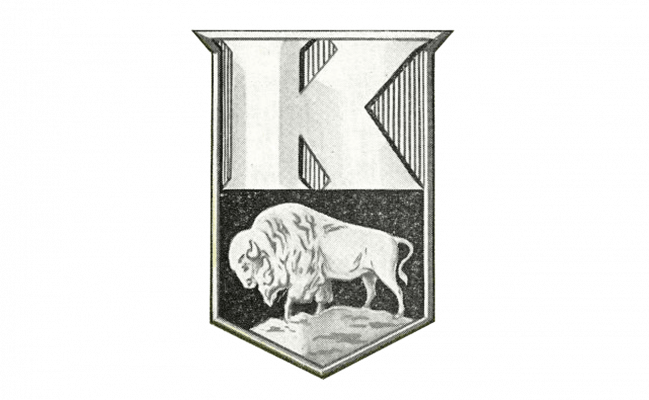
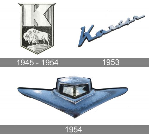
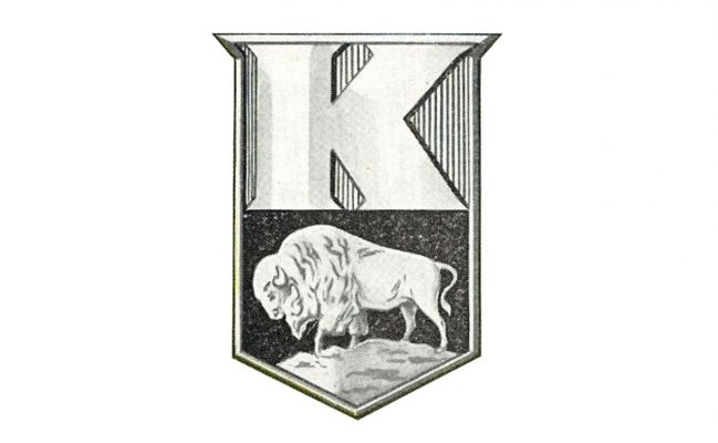
The official emblem for Kaiser was introduced in 1945 and featured a strong and sharp badge, which featured a triangular shield shape with a slightly elongated and sharpened upper line. The badge was visually divided into two parts — with a silver striped bottom, where the massive “K” was placed, and a smaller bottom part with a black background and a silver image of a Buffalo on it.
The sleek and emboldened letter “K” was executed in glossy silver when placed on the brand’s cars, or used a slightly gradient light-gray shade for printed materials and official documents. Its clean contour has triangular sheriffs, which added a sense of style and modernity to the whole badge and balanced the detailed image of an animal, executed in smooth soft lines.
Buffalo on the Kaiser badge is a representation of power and stability, the big and calm animal is a symbol of confidence and determination, and the image with the Buffalo facing left evokes a sense of reliability and protection, making the company’s customers feel safe buying the Kaiser cars.
1953
In addition to the iconic Buffalo badge, the brand started using fancy smooth lettering in its cars. It was a three-dimensional cursive Henry J Kaiser Signature, executed in glossy silver metal. This emblem could be seen on Henry J Kaiser V6 auto with 2 doors, which usually featured bright delightful colors, like yellow and red. The badge fully repeated the original Henry J signature with the elongated and curved tails of most letters, which added playfulness and made the car look even more cool and fancy.
1954
With the release of the Kaiser Manhattan model, a new additional logo was created for the brand. It was also a three-dimensional silver lettering, which was available in three different options “Kaiser”, “Manhattan” or “Kaiser Manhattan”. The inscription was executed in a modern bold cursive with angular letters and some of the lines arched and sleek. All letters were connected between each other and looked elegant yet sharp.
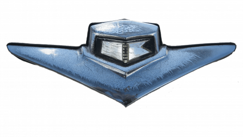
For the bonnet of Kaiser Manhattan, the brand used an emblem, which resembled the aviation badge. It was a black and silver crest, slightly stretched horizontally and having its sides straight and clean, enclosed into a thick silver frame, with the bottom triangular part enlarged and its “wings” spread to the sides. The emblem looked minimalist yet fancy and contemporary.
Font and color
The Kaiser logotype was not the main part of the automaker’s visual identity, though when there was a need in using a text-based logo, the company used a diagonally placed black inscription in a smooth and sophisticated cursive.
As for the color palette, all Kaiser logos were executed in silver or silver and black, a combination, evoking a sense of luxury, style, and professionalism. The silver metallic was and is a common choice for the car brands, as it looks bright and eye-catching on any background, whether it is plain black or delightful yellow.


