Charmin is a brand of hygiene products, established in 1928 in the USA. The label is owned and managed by Procter & Gamble and its products are sold worldwide.
Meaning and history
Charming is probably the most recognizable brand of toilet paper in the world. Its visual identity was always delicate and elegant and the color palette hasn’t been changed since the 1950s.
Charmin is one of the leading brands of Procter&Gamble company, and like only eleven other labels of the global concern, it has a turnover of more than one billion USD. It hasn’t happened recently. Charmin was on top of the P&G portfolio since the end of the 1950s, when it was acquired.
The Charmin brand was founded in 1928 by the Hoberg Paper Company in Green Bay, Wisconsin. In 1950 Hoberg Paper Company changed its name to Charmin Paper Company and continued to produce toilet paper, paper napkins and other hygienic paper products. In 1957 Procter Gamble acquired Charmin Paper Company, and started an international distribution of the Charmin branded products.
What is Charmin?
Charmin is the internationally recognized brand of hygienic products and toilet paper, which was established in the United a states in the end of the 1920s, and is owned by Procter&Gamble. The main market of the brand is North America.
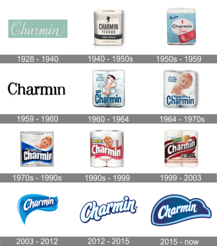
1928 – 1940
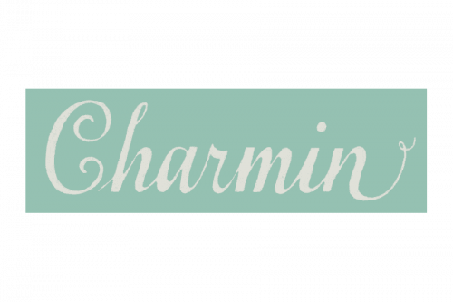 The original Charmin logo was designed in the 1930s and featured a cursive wordmark with the curved letter “C”.
1940 – 1950s
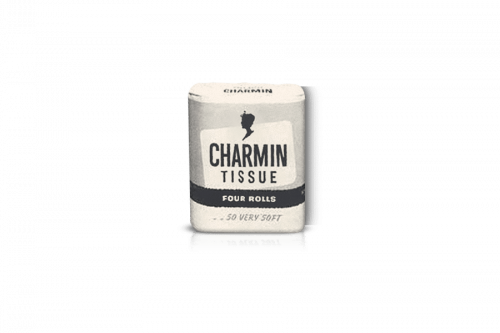 In 1940 the brand decided to create a stronger and more modern visual identity and designed a bold sans-serif logotype.
1950s – 1959
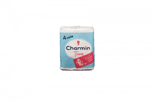 The signature white and blue color palette appeared with the redesign of the 1950s. The white lettering was placed on a bright blue background, composed of two shades.
1959 – 1960
 For just one year, in 1959, the brand was using a very simple and modest logo — ack lettering on a white background color with no additional details. The inscription was set in a title case of a hand-written serif font with smooth bold lines and small yet visible serifs on their ends.
1960 – 1964
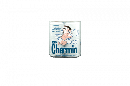
The redesign of 1960 made the inscription bolder and more modern — it was a sans-serif logotype with its jumping title case letters executed in intense blue and outlined in white. On the product packaging, the lettering was accompanied by a sweet image of a baby boy playing with the brand’s paper.
1964 – 1970s
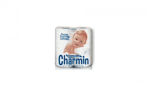
In 1964 Charmin kept the logotype from the previous version but accompanied it by the additional lettering written in white on a thick wavy blue line in a white outline. The graphical element was placed above the upper left part of the inscription. As for the packaging design, the brand started using a photo of a baby instead of a drawing.
1970s – 1990s
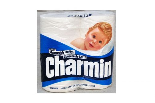
The redesign of the 1970s made the Charmin logotype brighter and stricter. The letters were set in one line and written in bold white sans-serif lettering placed on a dark blue background. The photo of the baby was replaced by a very detailed drawing again.
1990s – 2003

In the 1990s the brand changed its color palette from blue to red and redesigned the logotype, placing it in a wavy red background and writing it in rounded sans-serif letters, which evokes a tender and caring sense. This version of the logo stayed with the label for almost a decade.
1999 – 2003
2003 – 2012
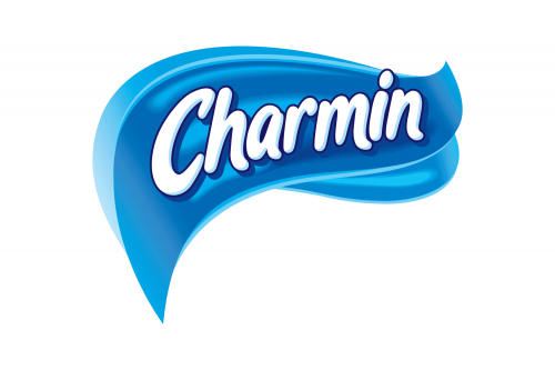 In the 2000s brand got a new style of the lettering – bold and smooth with light blue shades. It started looking soft and friendly.
2012 – 2015
The logotype from the previous version was kept and cleaned, but the blue background was removed in 2012. The contours of the smooth and elegant “Charmin” inscription were strengthened and emboldened and all the letters were evened up in their size, which made the badge look more balanced.
2015 – Today
Redesign was held in 2015 and brought a new shape of the background as well as a refined typeface of the inscription.
The dark blue cloud, outlined in a lighter shade, has a white cursive nameplate on it. The dot above the letter “I” is curved and all the letters have a light blue shadow.
The Charmin logo today looks fresh and pleasant, evoking a sense of comfort and quality. It shows the brand as a reliable and safe and keeps the traditions of the company.
Font and Color
The smooth and elegant title case lettering from the official logo of the Charmin brand is set in a bold designer cursive typeface with slightly elongated lines of the “H” and “N”. The closest fonts to the one, used in this insignia, are, probably, VVDS Sunshine Bridge Script, or Malvie Regular, with some significant modifications of the contours.
As for the color palette of the Charmin visual identity, it is based on several shades of blue, with a light tone used for the outline of the banner and characters, and deep gradient blue for the background. This combination not only symbolizes freshness and cleanliness, but also represents the brand as a reliable and professional one.


