Jockey is one of the most popular American brands of lingerie and underwear, which was established in 1876. Today the company is known across the world and produces not only underwear but also sports apparel and pajamas for the whole family.
Meaning and history
Jockey is a legendary brand, responsible for inventing men’s briefs with the “Y” front. The brand’s visual identity has always been strong and confident and with its last redesign in 2007 the company stayed loyal to its monochrome palette and minimalist approach.
The Jockey logo is composed of a wordmark and an emblem above it. The inscription in all capital letters is executed in a rounded sans-serif typeface, which is slightly narrowed but looks modern and bold. The clear neat lines of the font create a sense of reliability and expertise.
1936 – 1962
The logo in the image depicts the word “Jockey” in a large, bold sans-serif typeface. The lettering is presented in a vibrant shade of blue, making it highly noticeable and giving it a contemporary feel. There is a small asterisk symbol, akin to a sparkle or a glint, positioned at the upper right corner of the “y,” adding a touch of flair and suggesting a sense of quality or excellence. The design conveys a straightforward and confident brand identity that’s easily recognizable and could be associated with simplicity and reliability.
1962 – 2007
The initial Jockey badge featured a bold uppercase lettering in black, placed on a white background, and complemented by just one meaningful yet minimalist graphical detail. That was a stylized image of a jockey, placed on the left side of the wordmark, right above the tail of the first letter “J”. As for the logotype itself, it was executed in stable and traditional sans-serif font with clean rounded contours, straight cuts, and lots of air between the lines of the inscription.
2007 – now
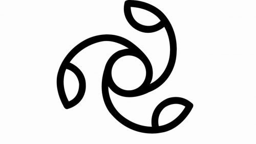
The Jockey emblem changes from the silhouette of jockey to an abstract figure, which resembles a flower or a swirl. The symbol has several meanings, according to the company. And it is very interesting, as shows the seriousness and importance of how the brand wants to be seen by its audience.
Here are a few meanings of the Jockey Swirl: unity, innovation, harmony, and the future. The circle with three curved rays coming out of it and inclined to the left is really full of meanings and is a perfect representation of the brand with a long history and rich heritage.


