MTV’s “Jersey Shore” is a reality television series that first aired in December 2009. Owned by ViacomCBS, the show quickly became one of the network’s most popular programs. The series revolves around a group of young adults, including Snooki, The Situation, and Pauly D, as they navigate their lives and relationships during summer vacations on the New Jersey coast. Primarily filmed in Seaside Heights, the show garnered significant attention and has been praised and criticized for various reasons. It has spun off several other series and remains a cultural phenomenon even after its original run ended.
Meaning and history
“Jersey Shore,” launched by MTV in 2009, became a cultural sensation, spotlighting a unique group of young adults as they enjoyed summers on the New Jersey coast. Founded by SallyAnn Salsano, the show was broadcasted as a depiction of everyday life and drama in Seaside Heights. Its significant achievements include skyrocketing ratings, creating pop culture icons, and generating catchphrases that became widely recognized. Furthermore, the program spurred international adaptations and spin-offs, emphasizing its global influence. Today, while the original “Jersey Shore” series has concluded, its legacy continues through reunion specials and the sustained fame of its cast.
What is Jersey Shore?
“Jersey Shore” is an American reality television series that aired on MTV. Premiering in 2009, it focused on the lives of several young adults vacationing in Seaside Heights, New Jersey. The show became notably popular, influencing pop culture and spawning several spin-offs.
2009 – 2012
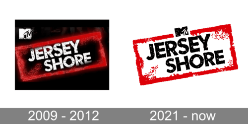
Set against a black backdrop, this logo prominently features the show’s title, “Jersey Shore.” The typography, bold and rugged, encapsulates a raw energy reminiscent of the show’s essence. The vibrant red smear in the background, like a burst of dynamism, amplifies the edginess. At the top left, the iconic “MTV” logo is delicately placed, establishing the network’s ownership. It’s more than just a name; the logo’s texture and color choice evoke feelings of rebelliousness and spontaneity, resonating with the show’s youthful vibe.
2021 – now
This rendition is audacious and in-your-face. “Jersey Shore” is presented in heavy, block letters that exude a sense of brash confidence. The red, almost spray-painted frame emphasizes an urban, graffiti-like feel, further enhancing the show’s unfiltered aura. Scratches and imperfections on the text and frame give it an unpolished look, symbolizing the raw emotions and realness that the show represents. The “MTV” logo, perched above the main title, might be small in size, but its impact remains significant, grounding the design to its broadcasting roots.


