Jawa is a motorcycle brand from Eastern Europe, which was established in 1929 by Frantisek Janicek. Throughout its history, the Czech manufacturer has released dozens of motorbike and moped models, which were especially popular in the 1980s — 1990s.
Meaning and history
Although it is a bit confusing, the name of the European motorcycle manufacturer, Jawa, is not about geography or coffee. “Jawa” is a derivative from the name of the company’s founder, Frantisek Janecek, and the first two letters of the Wanderer brand, as the initial activity of the company was the production of the Wanderer motorcycles under their license.
The first original Jawa model saw the light in 1932 and became much more popular than the Wanderer bikes, so the company started developing its technologies. In three years the company has released a refined version of the bike, with a more powerful engine. Very popular was the 100cc Jawa-Robot produced in 1937.
The pre-war Czech motorcycles were of fairly high quality and almost superseded all imported motorcycles from the Czechoslovak market, although they were still little known outside of it.International success came to the company after the end of World War II. And already in the late 1950s, the Jawa motorcycles were exported to 120 countries across the globe.
The company’s vehicles were very popular until the end of the 1990s but got lost in the 2000s, as too many competitors started appearing, especially Asian brands, which offer low-budget options.
What is Jawa?
Jawa is the name of a motorcycle manufacturer from the Czech Republic, which was established at the end of the 1920s, and started its activity from the production of the Wanderer bikes under their license. The first in-house motorcycle was introduced by Jaws at the beginning of the 1930s.
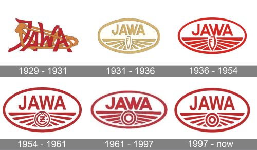
1929 – 1931
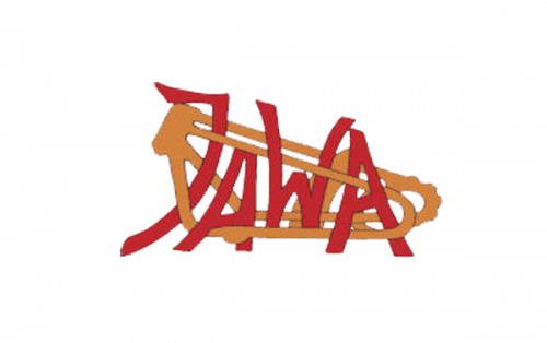
The complicated and dark badge was used by the famous motorbikes manufacturer for just two years. It was a dark red hand-drawn logotype intertwined with two orange elements, resembling the bicycle chains. Each of the logo elements is outlined in a very thin black frame.
1931 – 1936
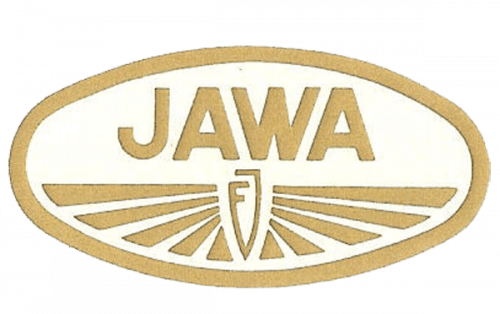
The first logo, which made a basement for the current one, was introduced in 1932. It was a clean and readable (unlike the previous one) badge in a horizontally stretched oval framing with the neat sans-serif “Jawa” wordmark inside. The lettering was placed above the stylized monogram, surrounded by thick lines resembling rays, coming from the center to the sides. All elements of the logo were executed in the golden-yellow shade.
1936 – 1954
The redesign of 1936 changed the color palette of the Jawa logo too dark red on white and emboldened all the colored elements of the badge, leaving less white space between them. The monogram became thicker and more visible, becoming the main signifier.
1954 – 1961
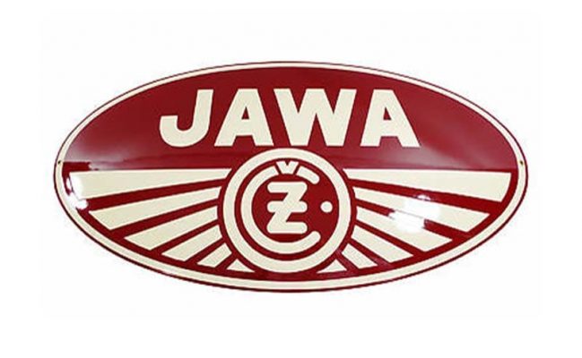
In 1954 the fancy monogram was replaced by a new symbol — “Z” placed inside the “C” (for the Czech Republic) and enclosed into a circular frame. The lines of the letters featured rounded ends, which were balanced by the redrawn rays, flared and softened to their ends. The rays got thinner, so more white color appeared on the badge again. As for the logotype, it changed the typeface to a more traditional and distinct sans-serif, with the full height of the letters.
1961 – 1997
The “Cz” monogram was changed again in 1961. This time it was just a double red circle, placed between the rays, which formed two wings, as a representation of speed and freedom, the first two things associated with the motorcycles in general. The symbol also looked like a wheel, so the new Jawa logo was pretty meaningful.
1997 – Today
The name of one of the world’s most famous motorcycle manufacturing company was formed by “Ja”, taken from the founder’s, Frantisek Janicek, surname, and “Wa”, from the “Wanderer”, the moto company Janicek bought from Winklhofer & Jaenike, a German manufacturer, in 1929. This is how the legendary brand was born.
Despite the really long and impressive history of the brand, with dozens of iconic motorcycle models, distributed all over the globe, the company has always been very conservative and stable in everything connected to its visual identity. The Jawa logo has never been redesigned, it could just switch the color palette, but nothing more.
The Jawa badge features a horizontally stretched elliptic shape, a large capitalized lettering, and an abstract geometric image under it. The official color palette of the brand’s visual identity is red and white, where both red details on a white background and its reversed version, are equally often used by the company.
The lettering on the Jawa emblem is set in the uppercase and executed in a simple and neat sans-serif typeface with medium-weight distinct lines and edges. As for the main element in the brand’s visual identity, its graphical symbol, it is composed of a double circle and ten thick faults coming out of it to the sides. The rays do not touch the oval frame of the badge, leaving some free space, which makes the whole composition lighter.
The graphical part of the Jawa badge looks like an aviation badge, with its rays forming two wings and representing freedom, motion, and speed. As for the circular element it resembles a wheel, though can also stand for the sun, its energy, and eternity.
In the early years of the company, the circle was replaced by a stylized “FJ” monogram, where two letters merged composing a crest-like shape. Another version featured a bold red letter “Z” for “Zbrojovka”, placed inside the smaller circle.
Font and color
The traditional all-caps inscription on the Java emblem is executed in a classy yet modest sans-serif typeface, which is very close to such famous fonts as Britanica Semi Condensed Black and Cairoli Classic Medium, with their standard shapes and contours of slightly narrowed letters. Though some lines of the Jawa wordmark are modified, it doesn’t make the inscription unique or recognizable, just pure lines and modest confidence.
The official red and white color palette of the Jawa visual identity uses a dark and calm shade of red, which looks chic and evokes a sense of trustworthiness and stability, while white details elevate the look, reflecting the loyalty and reliability of the brand.
The list of secondary color schemes of the Jawa emblem includes monochrome, gold on black, gold, and burgundy, and black on bright yellow. Sometimes the badge was placed on a contrasting circle, for example, in deep blue color, which made the image complete and added more professionalism and class to the whole badge.


