

![]() Gold Coast Titans Logo PNG
Gold Coast Titans Logo PNG
While, technically, the Gold Coast Titans logo can be broken into the pictorial emblem and the wordmark, the two parts merge seamlessly.
Meaning and history
![]()
The club was established in 2007. The team name was chosen two years earlier during a competition. The jerseys were also chosen by fans voting on the club’s website.
2007 – 2021
![]()
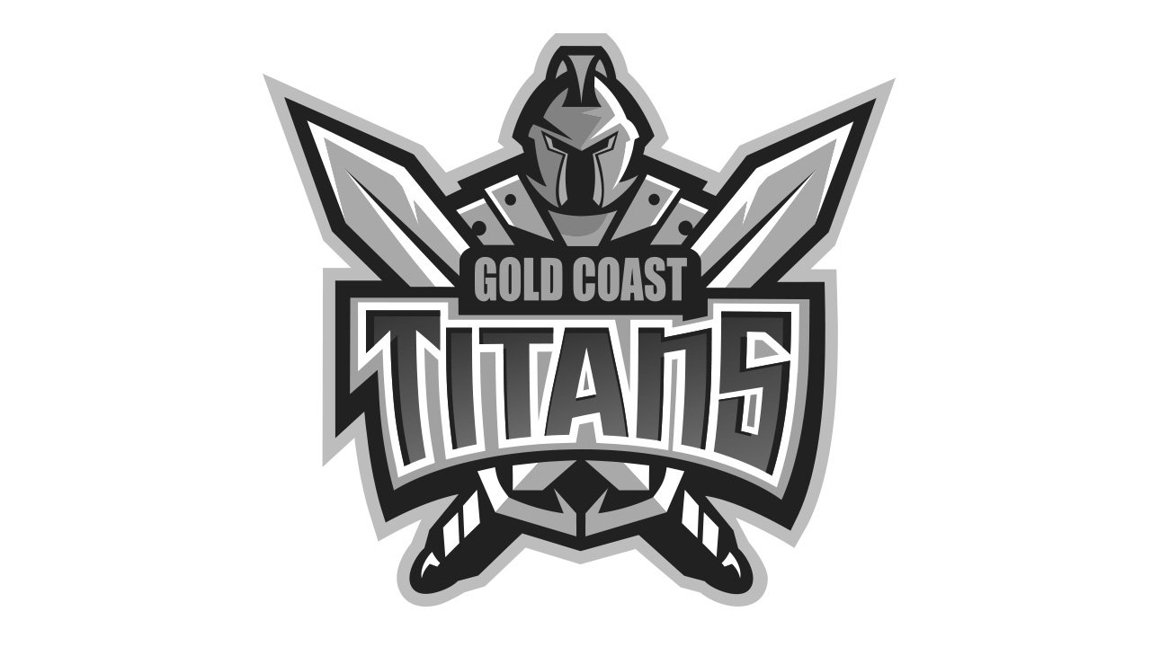
Originally, the logo depicted a gold-clad knight with two giant swords crossed in front of him. Then, there was also the wordmark of the team written in front if these two weapons: ‘Gold Coast’ a bit above in golden letters; ‘Titans’ below in bigger blue characters with golden framing.
2021 – Today
![]()
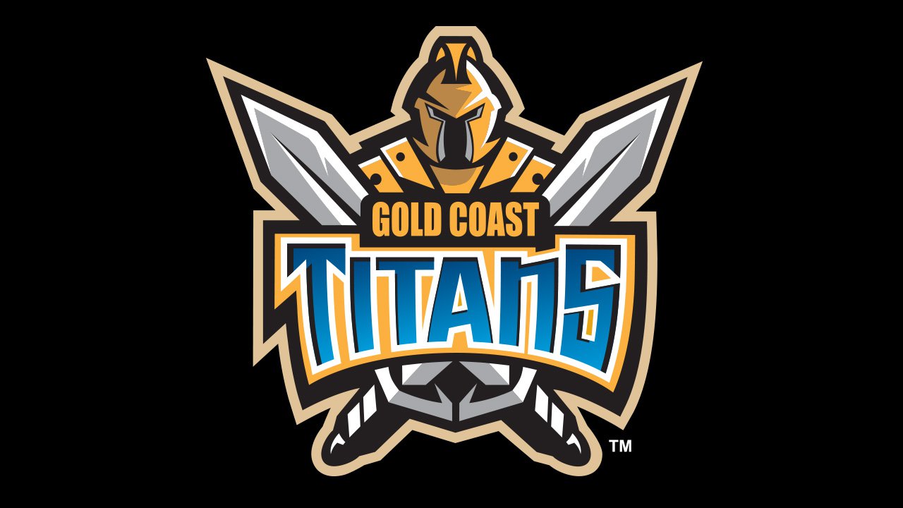
The 2021 emblem is a simplified version. They basically took a close-up of the knight, repainted the armor blue (although some gold was left around the eyes). The swords were also gone, so the written parts were immediately under the knight’s helmet. This time, they colored the word ‘Titans’ white and gave it a more modest dark blue outline.
Symbol
On the forefront, you can see the name of the team broken into two lines. Right behind it, come two crisscrossed swords. At last, there’s the head and torso of a knight in golden armor.
Why does the emblem work?
The logo has many small details that can be clearly seen only at larger sizes. When it’s small, you lose many important details: in fact, you just see the two crisscrossed swords and the word “Titans,” while the knight and the lettering “Gold Coast” disappear. So, if you want to feel the rough charm of this emblem, you’ll probably need to look at it when it occupies large surfaces.
In a way, it’s a drawback as it would be beneficial if the emblem worked well at any size. And yet, we can say that this fact doesn’t destroy the design. It’s not cluttered. Just it’s a type of design that has two levels. The simpler, rough level can be perceived even when the emblem is small, while at larger sizes the more complex level is revealed.
Font
The emblem combines two different typefaces. Or we’d better call them “typography styles,” as at least the word “Titans” is a custom artwork rather than just a combination of letters from an already existing font. While the word comprises two “T’s,” each of them is unique. The initial “T” has two sharp angles on its horizontal bar, while the vertical bar is slightly bent. By contrast, in the case of the second “T,” the horizontal bar has regular square ends, while the vertical bar is almost straight.
We can also point out that the sharp ends can be seen only on the first and last letters, all the other glyphs have square ends. Apparently, the designer was trying to create a visual “rhyme” with the sharp swords above the lettering. Also, such angles provide an illusion of symmetry within the word itself. The “A,” which is positioned in the very center of the design, “rhymes” with the multiple triangular shapes found on the pictorial part of the emblem.
As for the lettering “Gold Coast,” it has a pretty classic style. The letters are bold and heavy, which perfectly fits the knight and his heavy armor.
Colors
![]()
The official color scheme combines light blue, gold, white, and navy. As for the Gold Coast Titans logo, you can see several shades of blue (gradient), gray, white, gold, and black.


