

![]() Melbourne Storm Logo PNG
Melbourne Storm Logo PNG
While the logo of the rugby league team Melbourne Storm went through an update in 2018, it hasn’t changed dramatically. The brand identity has always preserved its three core values: the color purple, the depiction of Storm man, and the lightning bolt.
Meaning and history
![]()
Melbourne Storm became the first professional rugby club in its region, Melbourne, Victoria. The team was founded in 1997 and played its first season in 1998. The club was created as the initiative of Super League, the competition for Australian and New Zealand rugby clubs, which only existed for one season, in 1997. The Super League got defunct, but the Storm remained and joined the new league.
The new league, created as the successor of the Super League, was the National Rugby League, which today is a top-tier rugby competition in Australia and New Zealand. Today the league is composed of 16 teams, with just one from New Zealand, but starting the 2023 season, the number of clubs will be increased to 17.
What is Melbourne Storm?
Melbourne Storm is the name of a professional rugby club from Melbourne, Australia. Today the club, founded in 1997, competes in the National Rugby League, the top-tier Australian league in this kind of sport, plays in AAMI Park stadium and has Craig Bellamy as the head coach.
1998 — 2018
![]()
Anyone who has seen the current Melbourne Storm logo would have recognized the original one, too. Here, we also see the iconic Storm man, although the design is more complex. The Storm man’s torso goes out of a navy cloud, which appears to be boiling.
Interestingly, it wasn’t the first logo developed for the team. Before adopting the Storm man logo and the name Melbourne Storm, the cofounders were going to name the club Melbourne Mavericks. The initial brand identity supposed a completely different logotype – it featured a gunslinger with a fistful of dollars. However, they received a recommendation from News Limited’s Lachlan Murdoch, who told they should develop another brand identity as this one sounded too American. Among the multiple ideas discussed were Trams and Flying Foxes.
Eventually, Chris Johns and John Ribot opted for the themes of lightning, power, and storm, and the current brand identity was introduced.
2018
![]()
On 17 October 2018, the 20th Anniversary logo was unveiled depicting only the torso of the Storm man and the name of the team in a different font. The design was placed in a shield with the lettering “20 years.”
2018 — Today
![]()
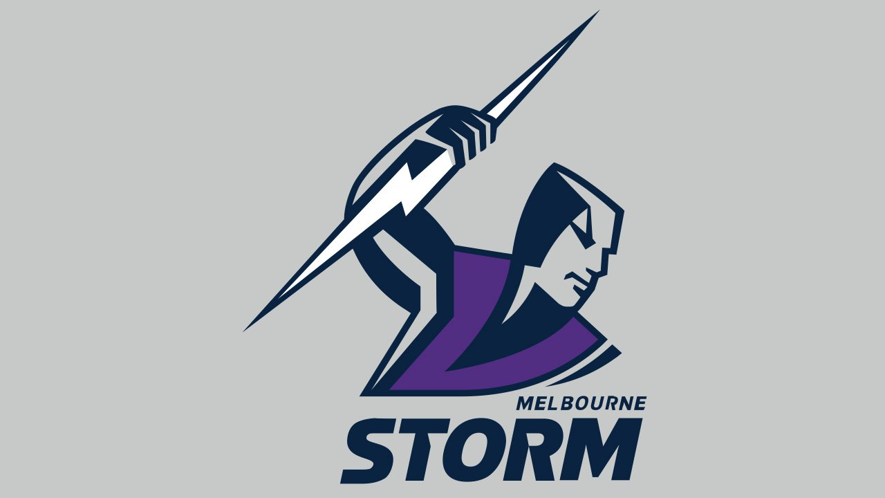
The anniversary shield was transformed into a new team logo. For this, the shield shape was removed and the type was slightly modified.
Font
The sharp elements on the letters fit the lightning bolt perfectly.
Colors
![]()
The co-founders wanted to build the palette upon the symbol of their state, Victoria (navy blue with a white “V”). They also received a recommendation from the JAG fashion house’s Peter McWhirter, the club consultant, who told they could make the brand identity more eye-pleasing by using purple and gold. The four colors were used from 1998 to 2004.
In 2005-2009, gold was replaced by gray. In 2010-2012, the gold returned, the gray disappeared, while the purple became the dominant color in the jersey. In 2013, the team introduced a new jersey, where the “V” was deeper and there was more navy. Gone were the gold and most of the white, while the lightning bolts grew purple.
In addition to the purple, which has been associated with the Melbourne Storm logo ever since the team was introduced, the current emblem also features navy, gray, and white. Out of these colors, gray is the only one that isn’t included in the list of the team’s official colors and isn’t used for the kits.


