![]() Jacobs Logo PNG
Jacobs Logo PNG
Jacobs is a German coffee brand, established in 1895. The brand, named after its founder, Johann Jacobs, is one of the biggest coffee suppliers in Europe and is a part of Jacobs Douwe Egberts Group.
Meaning and history
![]()
Jacobs is today sold in Europe by Jacobs Douwe Egberts. The brand traces its roots to 1895. By the time the Second World War ended, it was already an established marque with thousands of fans in different corners of the globe.
1944
![]()
The logo of that era featured the lettering “Jacobs Kaffee” in black. The words were positioned in two lines, above and below the pictorial emblem. The palette was dominated by golden and dark brown tones inspired by coffee.
1964
![]()
The pictorial part disappeared making the wordmark more compact. The type grew more elongated and slimmer, while it preserved some of its characteristic visual themes (for instance, the rounded rectangle of the “A’s” top and the shape of the “J”). The font was slightly italicized.
1970
![]()
The italics were replaced by a regular font, while the word “Kaffee” grew much smaller. It was now given in a different script – handwritten, with plenty of curls.
1987
![]()
The rectangular structure of the letters in the name of the brand was slightly rounded. The proportions between the width and height of the glyphs also changed a little – they became a bit flatter.
1990
![]()
This is when the era of the triangular “A’a” started. The new type looked plumper and wider. Also, the glyphs featured tiny yet distinctive serifs. Their shape was sharp and thin. The word “Kaffee” was replaced by “Café” in a simple sans.
Below the wordmark, a stylized cup of coffee appeared. It was depicted as seen from above and had a cloud of steam over it. The shape above the cup somehow echoed the shape of the accent above the “é.”
1995
![]()
The proportions were changed once again – the letters grew slightly higher. The coffee cup moved above the wordmark. It was a side view now, with two waves representing the steam. The color was red.
Also, there was a thick and prominent wave below the word “Jacobs,” which was also inspired by the steam.
2000
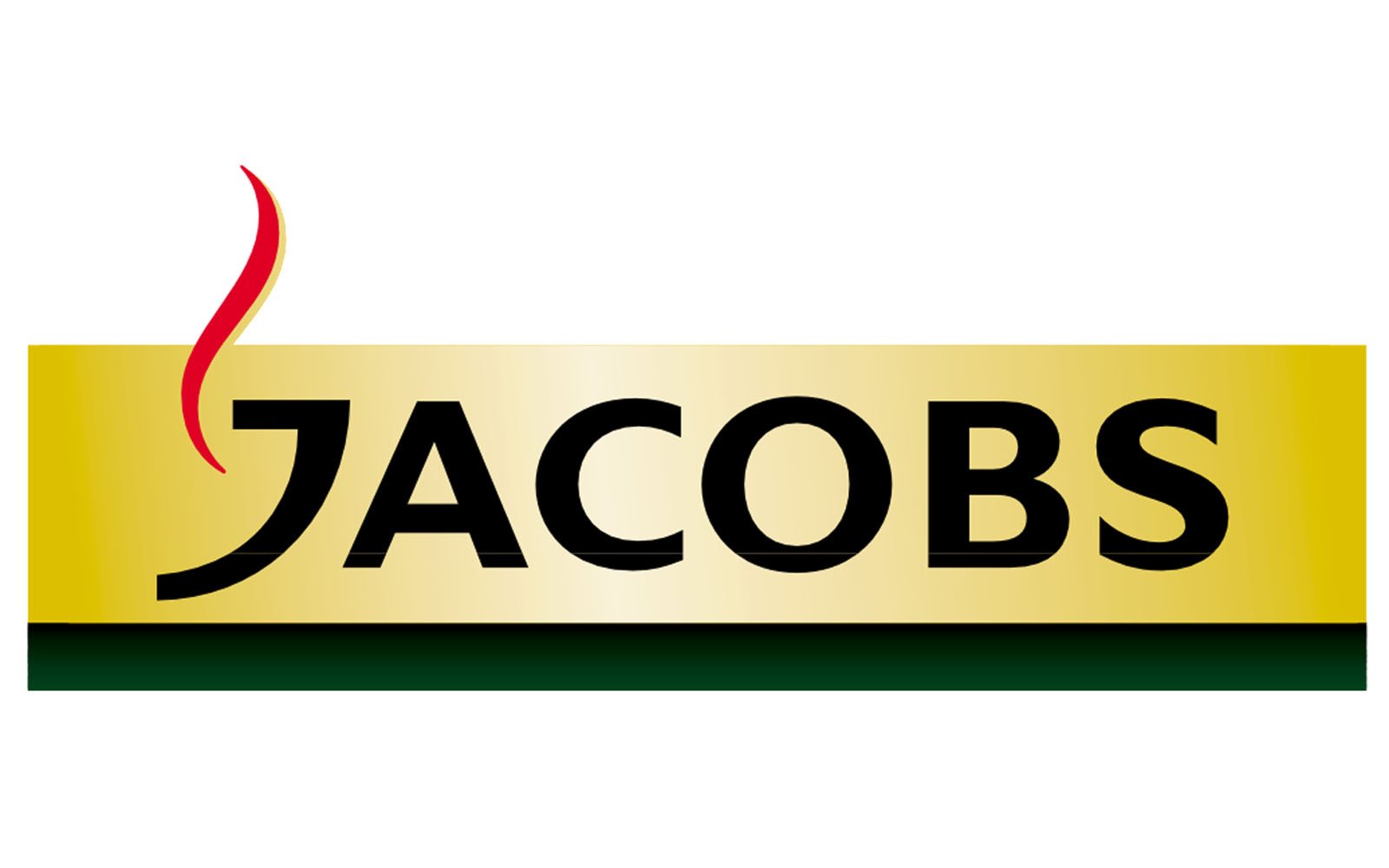
![]()
The red cup disappeared from the Jacobs logo leaving only the steam, which could now be seen to the left of the letter “J.” Interestingly, the shape of the “J” was reminiscent of the side of the cup.
While the previous logos featured the name of the brand in gold, this time, it was black on the gold background.
The type grew wider, flatter, simpler, lighter, and more dynamic (partly because of the “J” cup). The sharp serifs were gone.
2010
![]()
The type was given a facelift, due to which it grew a little more refined. The “J” cup became larger, while the steam became more prominent (it now consisted of two waves).
2013
![]()
Once again, the typography returned to a simpler version, while the second “wave” of steam disappeared.
2017
![]()
The steam theme has disappeared altogether. There “J” is still somewhat similar to the cup, although the resemblance is not as prominent as in the previous versions.
What makes this Jacobs logo different is that it has returned some of the elements from the earliest versions, including the dark green patches and the golden crown above the wordmark.
Font
![]()
While, at first glance, the typography may look somewhat simple, it reveals its beauty when you take a closer look and notice the play of the thicknesses of the glyphs, the elegant ends of the letters, and the gap in the “B.”