Jackass is the name of the MTV tv-series, which was first launched in 2002. The program, showing different pranks and jokes became instantly popular along with the young audience and grew into a big franchise, which today has millions of fans all over the world.
Meaning and history
The visual identity of the famous tv show is cool and really meaningful, as the Jackass program shows people who do different silly, funny, and sometimes dangerous stuff.
2000 – 2001
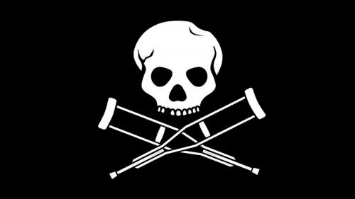
The Jackass logo is composed of a solid black rectangle with a white emblem and lettering on it. The emblem depicts a skull with one Thoth missing, and instead of two crossed bones, there are two crossed crutches. The skull’s upper part is also uneven, having a small dent on its right part. All these small details symbolize various traumas the guys from the show get while prancing and having fun.
As for the wordmark, it is written in the lowercase of a simple traditional sans-serif typeface and placed right under the emblem, executed in white.
The monochrome color palette of the Jackass visual identity is a good choice for the tv-show, as can be mixed with any other colors, placed on various backgrounds, and complemented by animation. But it also imitates the Holly Roger Pirates flag, which has always been black and white.
The Jackass logo is full of irony and has a rebellious spirit, just like the show itself, so it is a very successful design concept, which makes the logo instantly recognizable all over the globe.


