JAC is a Chinese brand of the commercial trucks manufacturing company, which was founded in 1964. The company is owned by the government of China and produces over 500 thousand vehicles yearly.
Meaning and history
JAC Motors was established on September 30, 1999, on the basis of Jianghuai Automobile Factory, founded in 1964. In fact, the company’s history dates back to the 1950s, when it was engaged in the production of equipment for sluices, which were used to correct the water flow from Chaohu Lake in Anhui Province. However, in 1964 the company was converted to the production of automobile parts, and it was then that the history of JAC began in the familiar form.
Already in 1969, the company produced its first model of truck, the name of which, Jianghuai, later became the name of the whole company. In the 1980s, the company started to produce buses, becoming one of the largest manufacturers of passenger vehicles in China.
In 1997, there was a change in structure, which resulted in the name JAC. In the middle of the 2000s, JAC started to produce passenger cars, which opened new perspectives for the brand. The first passenger car model was the Refine minivan developed together with Hyundai. And already in the mid-2010s, JAC reached the peak of its own-brand passenger car sales in the Chinese domestic market.
Currently, JAC is a leader in electric vehicles not only in China but also in the whole world. The company is based in Hefei City, Anhui Province. It is a large industrial and scientific metropolis in central China, located on the Huaihe River. Anhui is considered one of the most densely populated and economically developed provinces in China.
1997 – 2016
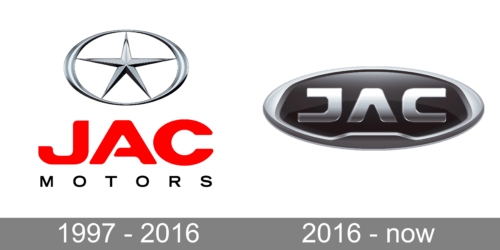
For the most part of the company’s history, its logo was composed of a wordmark and an emblem on its top.
The wordmark in red featured a modern smooth typeface with an open horizontal bar of the letter “A”. The emblem depicted a thin five-pointed Star, enclosed in a horizontally placed oval frame. The color palette was a traditional monochrome with a bold accent on the red nameplate. It was a strong visual identity, celebrating the confident and powerful company and showing its values of heritage and roots.
2016 – now
The redesign of 2016 brought a futuristic style to the JAC logo. The new version is composed of a wordmark enclosed in an oval medallion.
The new typeface features simple yet bold and strong lines. The letter “A” has no horizontal bar, and it makes the inscription balanced and harmonized. Letters “J” and “C” look almost like mirroring each other, but the contents of the “J” are sharper and the upper bar is a little shorter.
The color palette of the JAC logo includes silver and black. There are several tones of silver-gray color in order to create a three-dimensional effect.
The JAC logo is modest and minimalist yet strong, brutal and very modern. It is a reflection of a confident company, which values progress and innovation, and is ready for the future.


