Itala was a renowned automobile company founded in Italy. Established in 1903, it became synonymous with early 20th-century Italian automotive craftsmanship. Owned by its founders, Cesare Momo and Matteo Ceirano, the company was situated in Turin, a hub for car manufacturing. During its operational years, Itala was known for producing pioneering automobiles and racing in global competitions.
Meaning and history
Itala, founded in 1903 by Cesare Momo and Matteo Ceirano, stood as a testament to Italian automotive innovation during the early 20th century. Based in Turin, the company made its mark through remarkable achievements in car design and engineering. Their vehicles not only catered to everyday users but also made significant waves in international car races. Itala’s reputation soared due to their 1907 Peking to Paris race victory. However, by 1934, the automaker ceased its operations, leaving behind a legacy of iconic vehicles and racing triumphs.
What is Itala?
Itala was an Italian automobile manufacturer active from 1903 to 1934, known for its innovative designs and significant achievements in early car racing. Based in Turin, it left an indelible mark in automotive history.
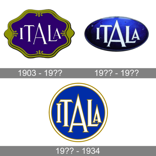
1903 – 19??
The complex design of the frame and the shape of the emblem instantly tell that it was created more than a century ago. The frame features a golden color with a pistachio tint as well as black lines that outline all the details. The center portion of the emblem is done in rich, royal blue that was a perfect background for the white inscription. Across this base, the designers printed “Itala” using all uppercase letters with bracketed serifs. Each character gets larger as it gets closer to the center with a large “A” being printed in the center, creating an illusion of perspective and depth.
19?? – 19??
This logo looks mesmerizing thanks to the blue color shade and the addition of a black gradient that gives the emblem some volume and richness. The logo now has an oval shape with a barely noticeable frame. To preserve the brand image recognition, they used the same font and style for the name, modifying it just a bit to make the strokes slightly thicker. Just like in the previous emblem, the white color and thin outline make the letters stand out against a dark background.
19?? – 1934
The designers took the inscription from the previous logo and slightly modified it. The white color now has a warmer tone and golden outline. In addition, they were all stretched out vertically to fill more of the empty space as the oval shape morphed into a circle. They preserved the blue color of the emblem, but now it was a solid color of a lighter shade. A white border with a golden line on either side complemented the inscription inside.


