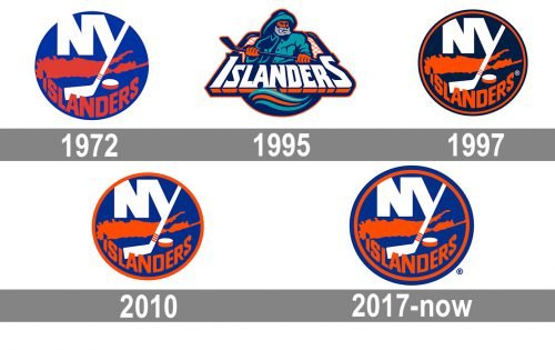
One of the most known US ice hockey teams, New York Islanders have had almost the same logo throughout their history, with the exception of two seasons.
Meaning and history
New York Islander is one of many hockey clubs, born in the 1970s, but unlike its colleagues, the team from New York has always been confident in itself, which is reflected in its logo design, which was changed only once in the club’s history, and still got back to its original version.
What are New York Islanders?
New York Islanders, or simply Islanders, is a professional hockey team, which was established in New York in 1972. A member of the NHL, the club has UBS Arena as its home stadium, Lou Lamoriello as the manager, and Lane Lambert as the head coach.
1972 — 1995
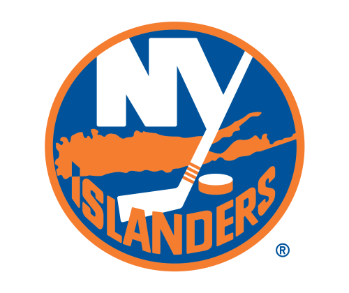
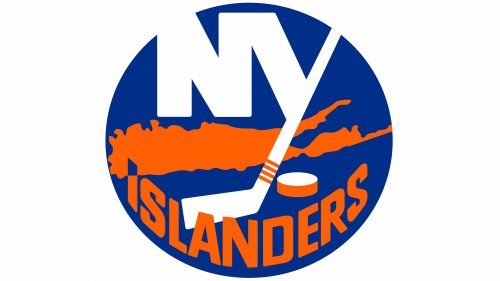
The original logo for Islanders was created by Jacob Morris Strongin in 1972 and featured a dark blue circular badge in a delicate yet thick orange outline. The “NY” lettering in white was placed on the upper part of the badge, with the long bar of the “Y” stylized as a hockey stick. The slick was crossing an orange silhouette of the Long Island part of New York and had a white and orange hockey puck on its right. The “Islanders” part of the nameplate was drawn in orange and arched around the bottom part of the emblem.
1995 — 1997
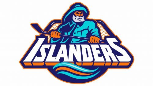
The redesign of 1995 was an experiment, where the team decided to change its iconic logo to something more ornate and detailed and failed. The logo, introduced in 1995, featured an image of an old fisherman with the hockey stick, executed in two shades of blue and orange and with his beard gray. The stylized bold “Islanders” wordmark was placed under the image of the man and executed in a modern serif typeface, outlined in blue and with an orange shadow. The logo stayed with the club for less than two years.
1997 — 2010
The iconic circular badge with the Long Island silhouette came back in 1996 with a renewed and strengthened color palette. The blue of the background was darkened and became more intense, as well as the orange. The emblem now featured a double blue and orange outline, which looked more balanced and professional.
2010 — 2017
The redesign of 2010 bright back the very first emblem, created in 1972, keeping its color palette and all the elements untouched. Even the outline of the badge is back to one orange line. Though there was one difference between the versions of the 1970s and 2010s — the white hockey stick, coming out of the letter “Y” now featured four horizontal orange stripes, as a celebration of the club’s titles.
2017 — Today
In 2017 the logo of the New York Islanders has been refined again, making the blue shade a bit more intense and strong, and adding a very delicate and thin outline to the “Islanders” part of the nameplate to add more visibility and distinctness to the bold orange letters.
Font
The bold sans serif typeface used for the word “Islanders” looks traditional without being old-fashioned. The letters are slightly transformed in order to fit into the circular shape. The letters “NY” are given in a different, more solid type. The “Y” looks unique due to the “hockey stick effect”.
Colors
The current Islanders logo features three colors: royal blue, orange, and white. It seems a perfectly natural choice taking into consideration that these are the club’s official colors used for their uniforms, too.
BLUE
PANTONE: PMS 287
HEX COLOR: #00539B;
RGB: (0,83,155)
CMYK: (99,75,8,1)
ORANGE
PANTONE: PMS 1655
HEX COLOR: #F47D30;
RGB: (244, 125, 48)
CMYK: (0,63, 93, 0)


