IMSS is an abbreviation for one of the most important social institutions of Mexico, Instituto Mexicano del Seguro Social, an organization specialized in social security services, which was established at the beginning of the 1940s. The institution is a part of the Ministry of Health and curates such directions as pensions, health, and other social services.
Meaning and history
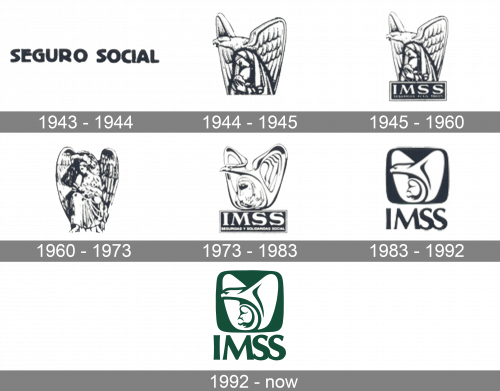
The Social Security Institution has been operating in Mexico since the beginning of the 1940s and got its iconic symbol introduced already in 1944. The logo was redesigned quite many times throughout the years, but the main idea and that mood, full of reliability and safety, have been perfectly kept since the creation of the initial version.
1943 – 1944
The very first IMSS badge had no graphical component. It was a bold uppercase “Seguro Social” logotype, executed in a very modern for its times’ sans-serif typeface, with massive shapes, clean contours, and smooth lines of the capital letters. Although the initial badge only stayed in use for a few months, it still was a good representation of the institution and its purpose.
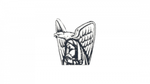
1944 – 1945
The first graphical emblem was created for IMSS in 144, and this time there was no lettering on the badge. It was a sleek and detailed image of an eagle sitting with its head turned to the left and a woman with is the child between its strong wings. The bird was drawn in black, white, and gray gradients and looked very powerful like it was securing something precious.
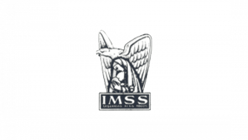
1945 – 1960
A year later, in 1955, the banner with the lettering was added to the graceful eagle emblem. The bird was now sitting on a horizontally oriented rectangle, with the two-leveled inscription set on it. The upper line featured a bold enlarged “IMSS” in white serif capitals, while the bottom line contained a full name of the organization, written in very small, barely visible uppercase letters.
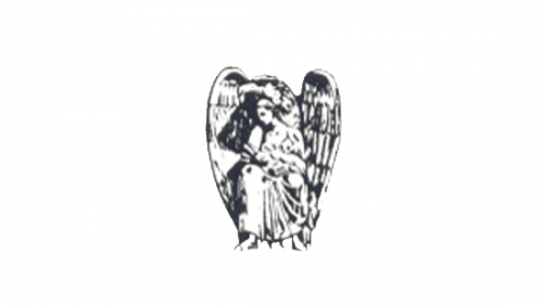
1960 – 1973
After almost fifteen years of use of the previous logo, IMSS runs another redesign in 1960. The lettering was removed from the badge again, and the graphical part was redrawn in a more elegant and traditional way. Now the woman with a child in her arms was drawn in full length, thus the eagle too. The elongated wings of the bird added a sense of warmth and care.
1973 – 1983
In 1973 something cool and modern was created for IMSS. Although the initial concept remained the same, both the bird and the woman were redrawn in a sleek futuristic manner, with smooth bold lines and interesting rounded shapes. The new emblem was set above the rectangular banner with a dark background and white two-leveled inscription over it.
1983 – 1992
In 1983 the logo was refined and modernized even more. All contours got cleaned up, and now the white emblem was set on a dark solid square with rounded angles. The square was placed inside a vertical white rectangle, over the two lines of the lettering, with the bold sans-serif “IMSS” significantly enlarged, compared to light and small full wordmark, written under it.
1992 – Today
The deep green color was brought to the IMSS visual identity in 1992. All the elements remained untouched, but with the new color, everything started looking smoother and more interesting. Green is a representation of growth and new life, and this dark moss shade evokes a sense of safety and trustworthiness, working great with smooth lines of the bird, guarding a woman with a child.


