Imaginarium is a brand of the popular Spanish toy retailing company, which was founded in 1992 and today operates in almost 30 countries across the globe. The brand is known for its educational toys, as well as furniture and baby care items.
Meaning and history
The Imaginarium visual identity is like an invitation to the new world, full of creative ideas and new knowledge. The logo is composed of a wordmark with an emblem on its left, which is also used as a brand’s icon and a central element of all the store’s interior designs.
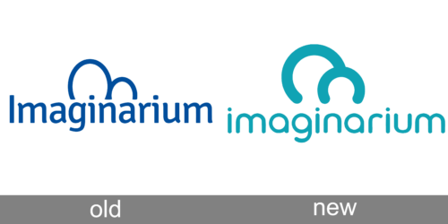
Old Logo
The original Imaginarium nameplate was written in a traditional serif typeface, where all the letters were placed close but did not touch each other. It looked solid and confident, evoking a sense of expertise and professionalism.
New Logo
After the brand’s redesign, the typeface was changed to a more modern one, with sleek playful lines and slightly curved tails of the letters.
The Imaginarium emblem is an abstract symbol, resembling a letter “M”. It is com-posed of two arches of different sizes — the large one in the left, and the small one on the right — which is connected to each other.
On the brand’s icon, the emblem is drawn in black in a white background. When used in the logo, it is colored blue and has bolder lines. As for the stores’ design, the signature emblem forms the entrance to the store — two arched doors, one for parents, another one for kids.
The Imaginarium wordmark is usually placed on a blue background and is executed in white. Sometimes the lettering has a blue accent light around its perimeter. In some stores, the inscription is placed right on the blue arches.


